Exterior House Color
🏠 25 Real Ideas
⏱ Quick Read
🔥 Always Trending
25 Exterior House Color Trends
for 2026 That Are Transforming Modern Home Design
The Exterior House Color Trends taking over 2026 are bolder, warmer, and more intentional than anything homeowners have seen in the last decade. If your home is still wearing a coat of builder beige from years ago, you are genuinely missing out on one of the most exciting design shifts happening right now. Color is no longer just about looking presentable on the block. It is about expressing personality, elevating architecture, and making a statement that feels both fresh and timeless from the very first glance.
This article walks you through 25 stunning color directions that designers and homeowners are embracing this year. From moody deep greens to sun-warmed terracottas and sophisticated two-tone pairings, every idea here is practical, beautiful, and built for real homes. Whether you are planning a full exterior repaint or simply exploring what is possible, these house exterior color ideas will give you the clarity and confidence to finally make your home the one people slow down to admire.
01
Dusty Sage Green Revival
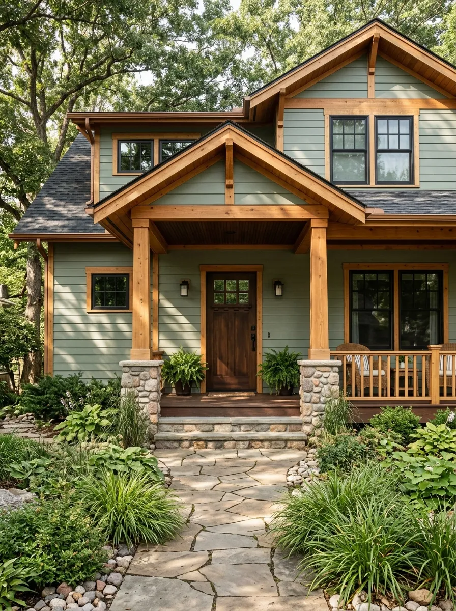
Dusty sage green is having its biggest moment yet in 2026, and it deserves every bit of attention it is getting. This color sits at the intersection of earthy and refined, offering enough green to feel connected to nature while staying muted enough to read as genuinely sophisticated. It photographs beautifully in both morning light and golden hour, making it a natural choice for anyone who wants their home to look effortlessly put together year round.
The real magic of dusty sage is how well it pairs with natural materials. Cedar trim, stone foundations, and warm wood front doors all look like they were designed specifically around this color. It reads especially well on craftsman-style homes with their layered architectural details and wide front porches. I have noticed that homes with this color tend to look more expensive than the budget spent, which is exactly the kind of win every homeowner wants.
The Key: Dusty sage green works best when paired with warm wood tones and matte black accents rather than cool whites that can make it look dull.
02
Warm Terracotta Facades
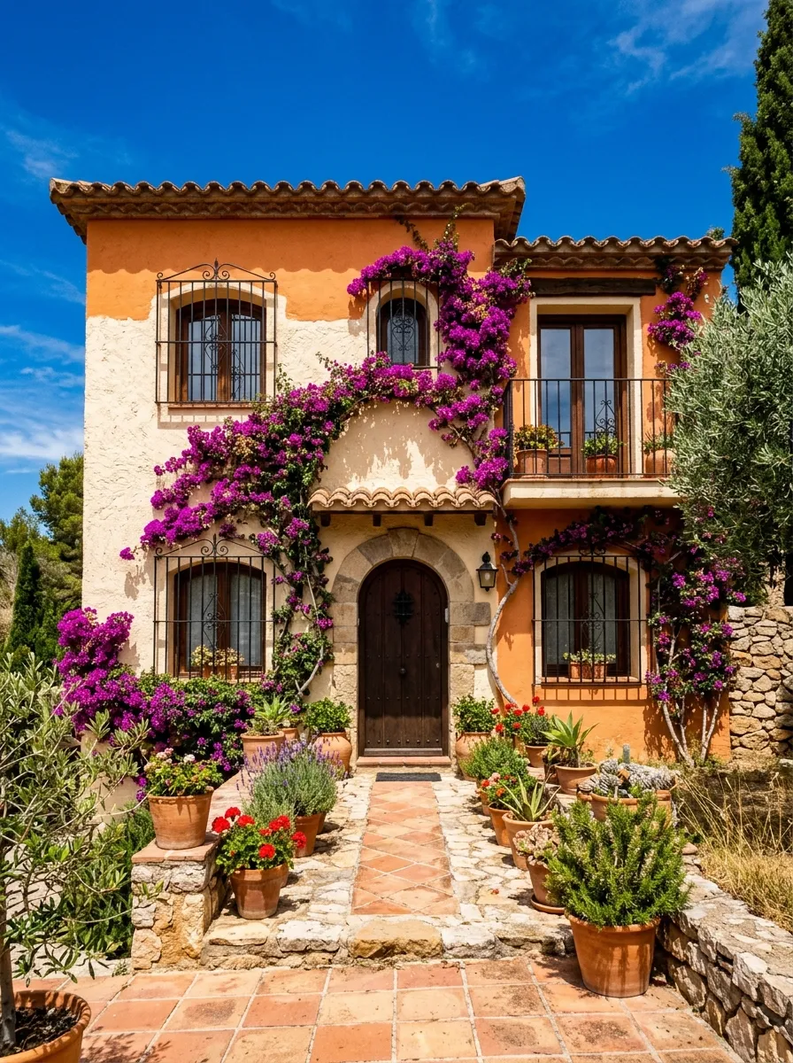
Terracotta has made a full comeback, and this time it is staying. The warm, sun-baked quality of this color brings a sense of history and groundedness that newer, cooler palettes simply cannot replicate. When applied to stucco or smooth board siding, terracotta creates that golden-hour glow that makes a home look lit from within even on an overcast day. It is unapologetically warm and confident in the very best possible way.
This color sings on Mediterranean and Spanish Revival homes where clay roof tiles, wrought iron details, and lush greenery already set the stage for richness. Pair terracotta walls with cream window trim, sage or olive shutters, and dark bronze hardware for a palette that feels layered and lived-in. The combination creates exactly the kind of curb appeal that stops people mid-sidewalk and makes them wish they lived there. Deeply satisfying from every angle.
The Key: Terracotta reads best on textured surfaces like stucco or rough-cut siding where it can show its depth and warmth fully.
03
Soft Greige Sophistication
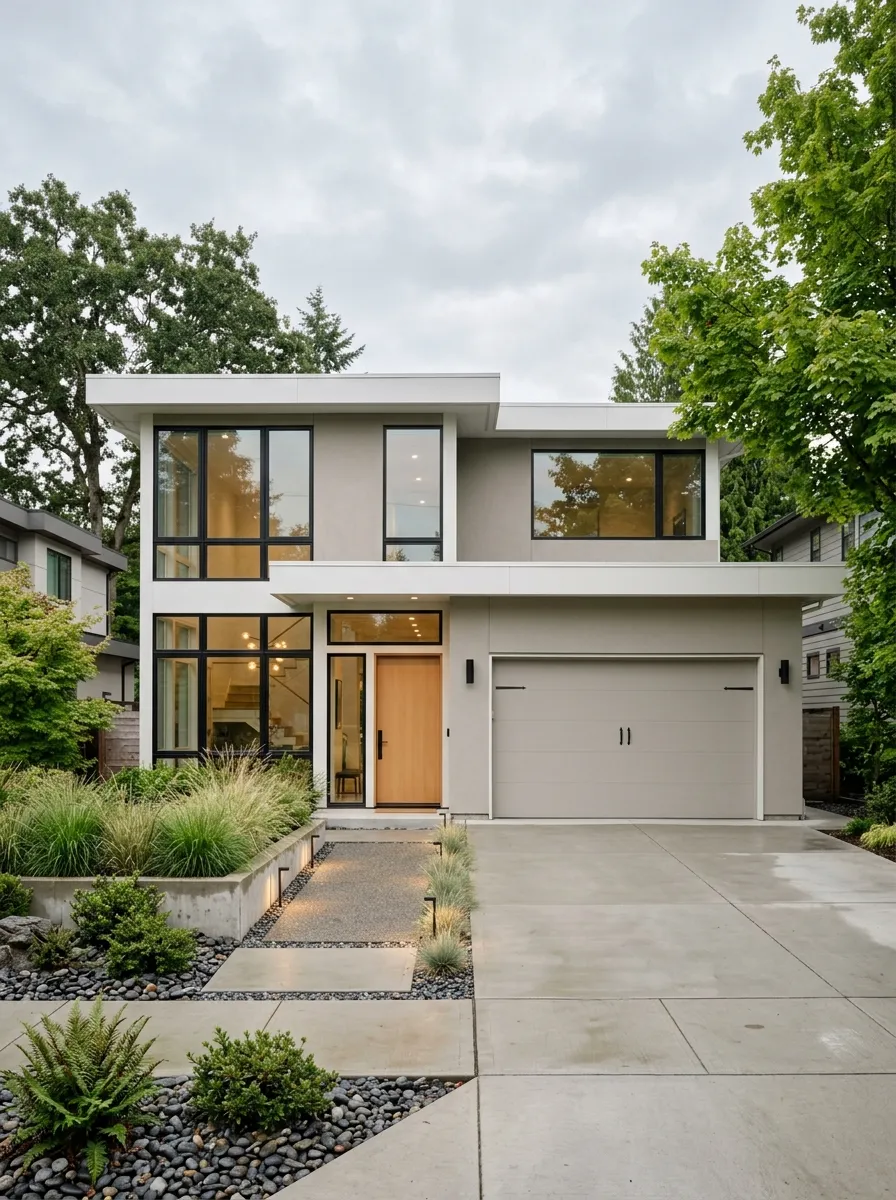
Greige, the perfectly balanced blend of grey and beige, has evolved far beyond its safe suburban roots. In 2026, soft greige reads as genuinely sophisticated, especially when paired with bold black trim and warm wood accents that prevent it from feeling flat. It is the color equivalent of a well-tailored neutral outfit. Nothing shouts, everything works together, and the result always looks more intentional than the effort it actually took to achieve it properly.
What makes soft greige such a strong contender this year is its extraordinary flexibility. It suits both minimalist modern homes with clean flat rooflines and traditional colonial styles with detailed millwork. The color shifts subtly depending on the light, feeling cooler in the morning and warmer in the afternoon. This chameleonic quality means your home always looks considered regardless of the season or weather, which is something very few other neutral tones can genuinely offer.
The Key: Greige earns its sophistication through contrast. Pair it with matte black frames and rich wood doors rather than all white accents for best results.
04
Slate Blue Drama
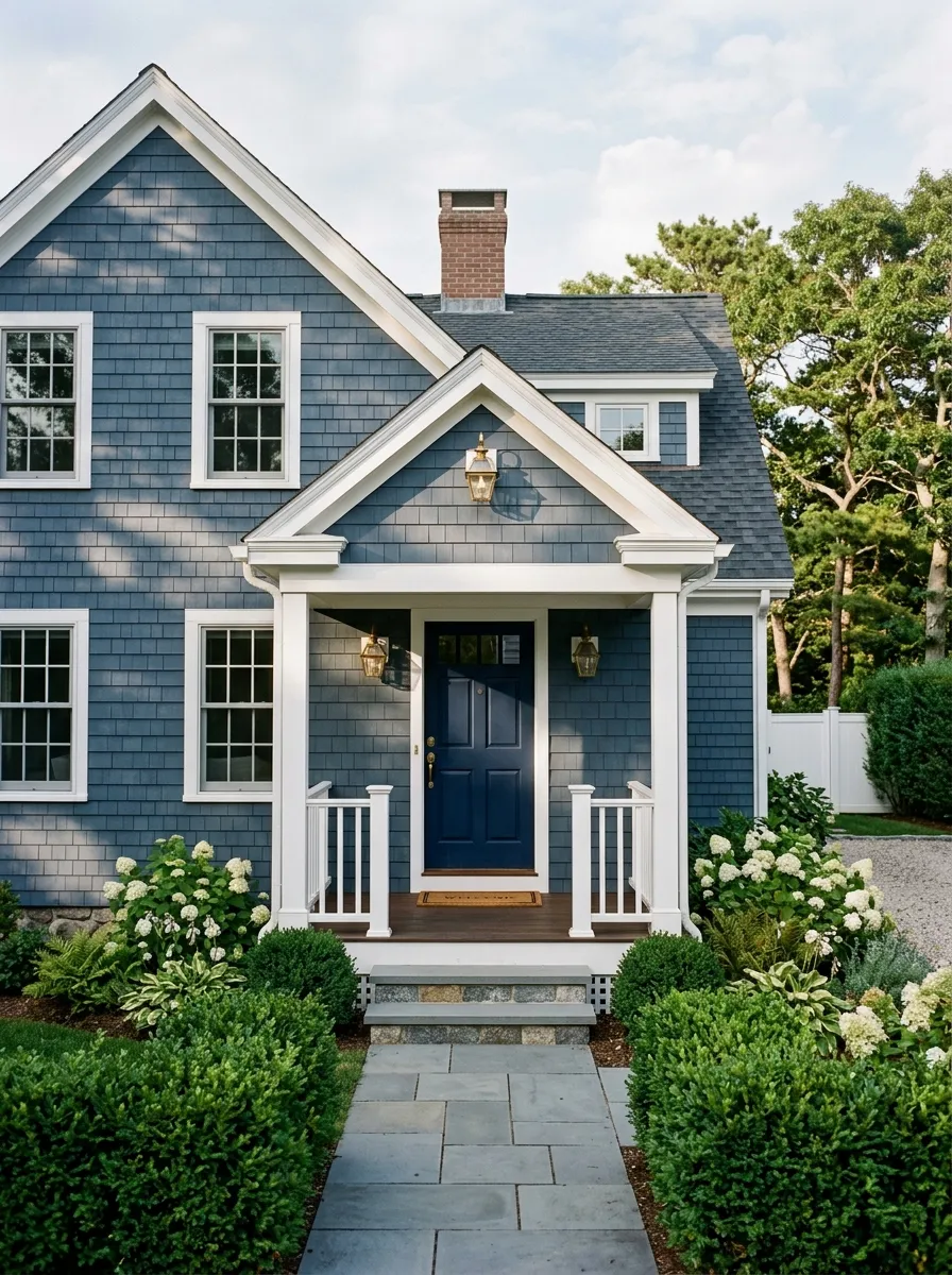
Slate blue carries a quiet drama that almost no other color can match on a home exterior. It shifts from silvery pale in bright morning light to a deep moody tone as afternoon clouds roll in, giving the home a living quality that makes it constantly interesting to look at. In 2026, this color is being embraced by homeowners who want their home to feel grounded and calm rather than trying hard or overly trendy. It succeeds on virtually every architectural style with ease.
Cape Cod and lake house style homes were practically born to wear slate blue. The color mirrors water and sky in a way that feels organic rather than contrived. Pair it with crisp white trim, weathered wood accents on a porch or deck, and brass or aged bronze hardware to create a palette that is quietly coastal without being cliché. This combination has incredible staying power and will look just as fresh in ten years as it does right now on any home.
The Key: Slate blue gains its drama from contrast. White trim and a darker navy or charcoal door give it the depth it needs to stand out properly.
05
Soft Black Statement Homes
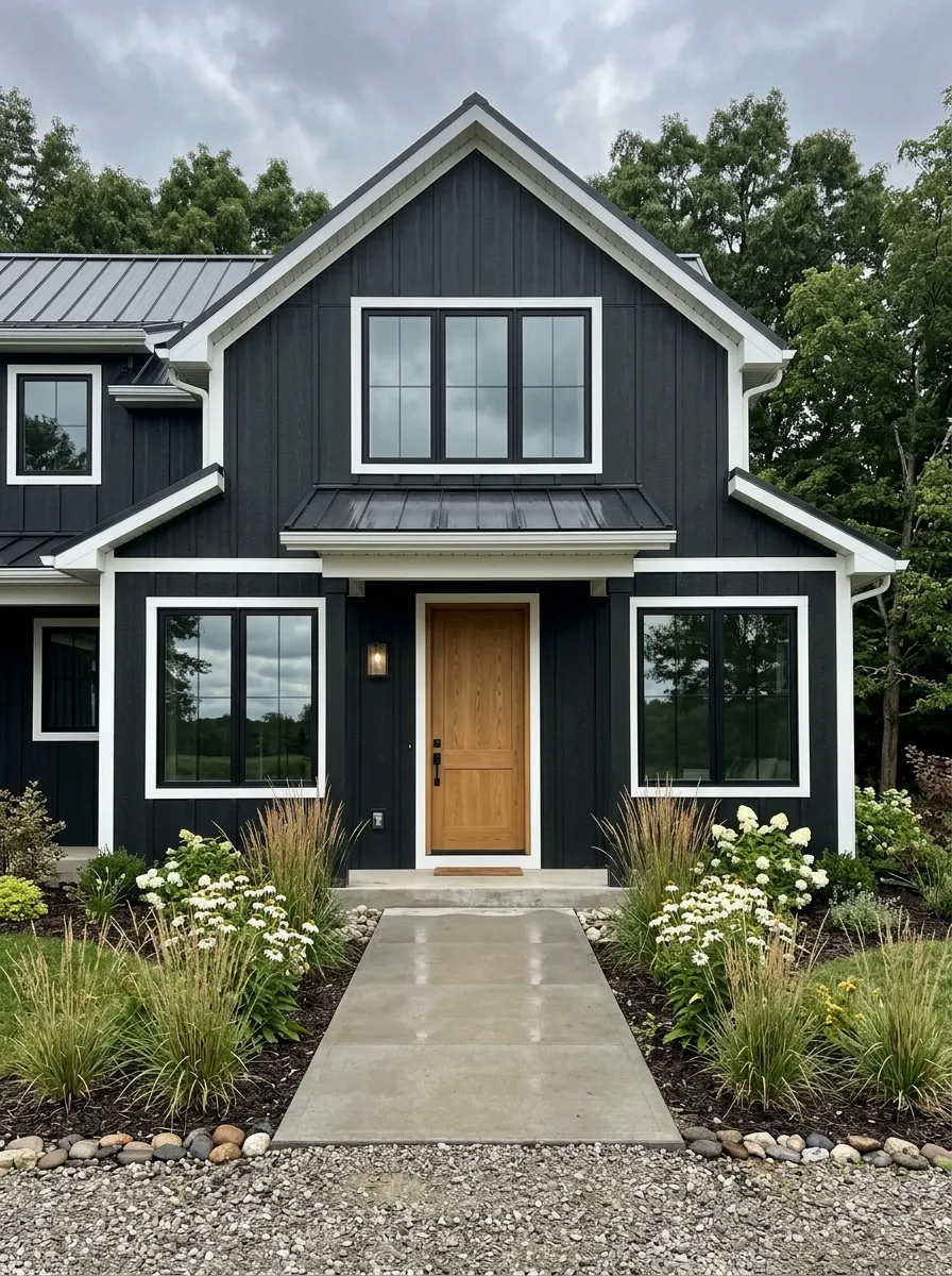
Soft black is the boldest move on this list, and it consistently delivers the highest visual impact of any color a homeowner can choose. Unlike true jet black which can feel harsh and flat, soft black carries subtle warmth that makes it live beautifully on textured surfaces like board and batten siding or rough cedar. It creates crisp architectural lines that make any home look more deliberate and premium than its original construction may have suggested. The effect is transformative and immediate.
The secret to making soft black work is in the contrast choices. White trim, a warm wood door, and bright green landscaping give the dark facade the balance it needs to feel welcoming rather than intimidating. Matte black porch lights and dark hardware lean into the palette rather than fighting it. I have seen this combination completely redefine homes that previously blended into the neighborhood. A single coat of soft black can do what years of landscaping improvements never quite accomplished alone.
The Key: Soft black needs warmth nearby to succeed. A natural wood front door is the single most important pairing decision for this dramatic color choice.
06
Warm White Refresh
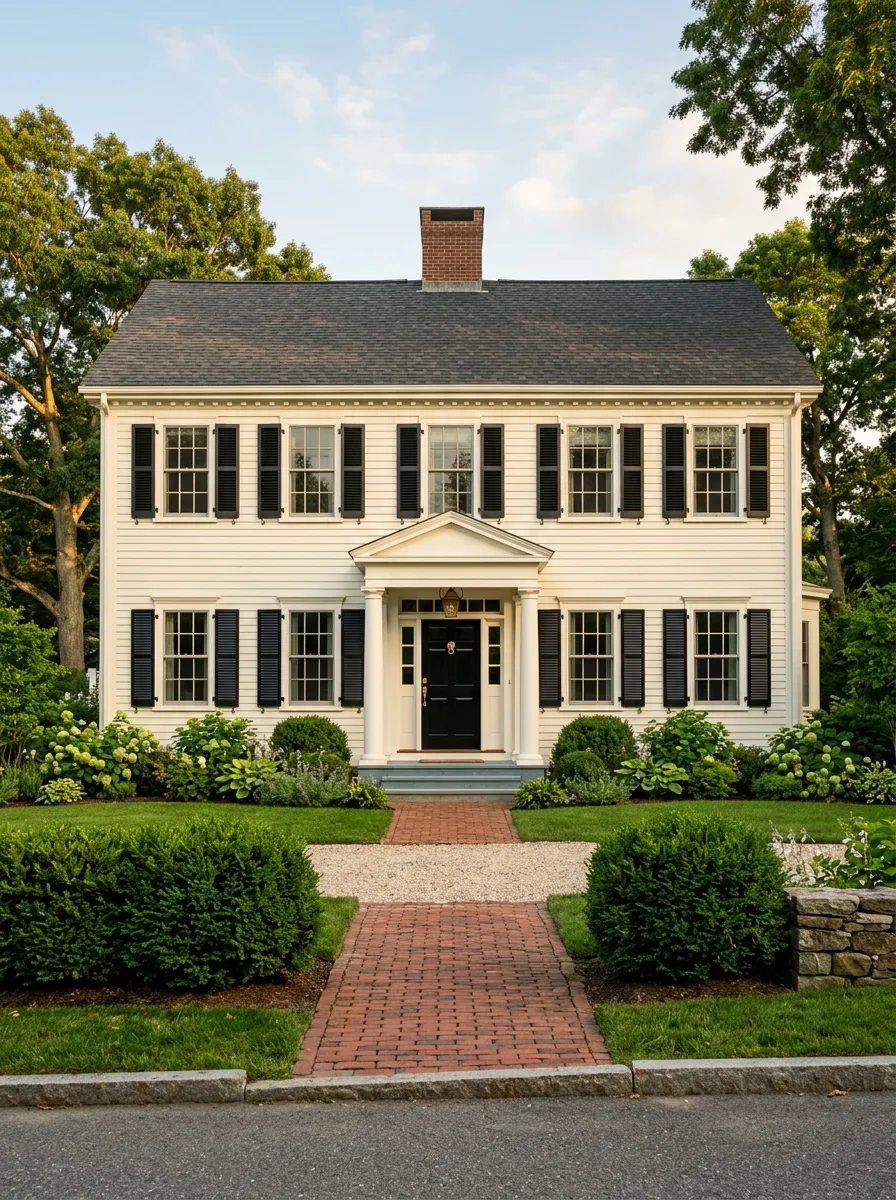
Warm white never truly goes out of style, but the version dominating 2026 is very specific. It is not the stark, cool white of hospital walls. It is a creamy, slightly warm white that flatters wood trim, brick accents, and traditional architectural details without washing them out. This tone reads as clean and fresh without the harshness that true white delivers, especially under the intense sunlight of summer when cooler whites can look almost blindingly flat on a large facade.
The key to warm white curb appeal is in the accents. Deep charcoal or glossy black shutters provide the contrast needed to prevent the facade from disappearing into itself. A bold front door in navy, deep green, or classic red anchors the entry and adds personality without disrupting the overall palette. Brass hardware and lantern style porch lights complete the picture. This is the kind of home that photographs beautifully in every season and appeals to virtually every buyer and visitor alike.
The Key: Warm white succeeds through its trim and door choices. Without strong contrast from shutters and a bold door, the facade reads as flat rather than refined.
07
Deep Forest Green Depth
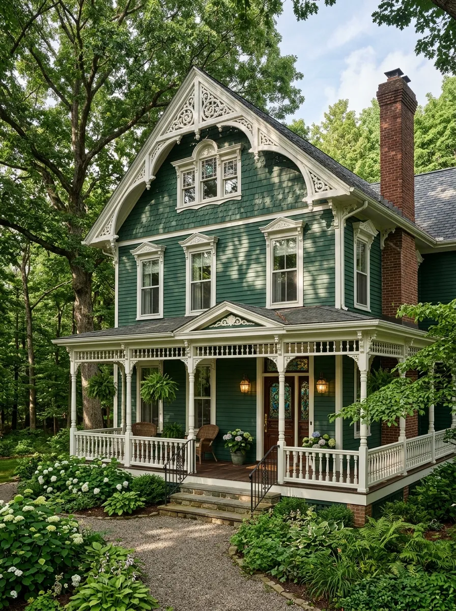
Deep forest green is the color for homeowners who want their home to feel rooted, serious, and deeply beautiful all at once. This rich, dark tone works in harmony with mature landscaping, brick accents, and traditional architectural details in a way that makes everything around the home look more considered and elegant. It is a color that improves with age, growing more distinguished rather than dated as the years pass, which makes it one of the smartest long term investments in curb appeal available right now.
Victorian and traditional homes benefit enormously from deep green because the color honors their architectural complexity rather than competing with it. The darkness reads as a backdrop that allows white trim details, decorative brackets, and ornate moldings to pop with incredible clarity. Brass lanterns, dark bronze hardware, and a rich mahogany or walnut front door complete the palette to perfection. This is a combination that looks custom and considered from across the street, which is exactly the goal every homeowner should be aiming toward.
The Key: Deep forest green requires crisp white or cream trim to prevent the facade from absorbing too much visual weight and feeling closed off or heavy.
08
Muted Navy Blue Power
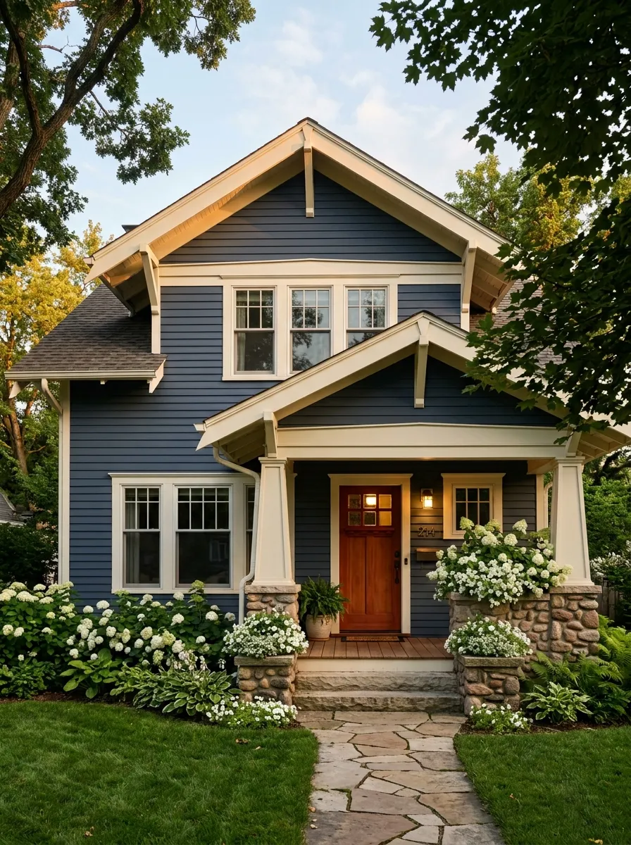
Muted navy is not the bright, nautical blue of a beach cottage. It is deeper, quieter, and far more sophisticated than that. In 2026, this tone is appearing on craftsman bungalows, suburban colonials, and even contemporary homes where it delivers a sense of confidence and permanence that lighter blues simply cannot achieve. The muted quality softens what could otherwise feel like an aggressive choice and makes it accessible for homeowners who want bold results without high risk. It delivers on that promise consistently.
The warmth of the accents makes or breaks a navy exterior. Natural wood doors in cedar, mahogany, or walnut introduce organic warmth that prevents the cool blue body from feeling cold or corporate. White trim at the roofline and around windows creates satisfying contrast without the starkness that black trim would bring. Stone or brick porch columns add natural texture and a grounding element. Built in planter boxes with white flowers finish the palette with a softness that makes the whole composition breathe.
The Key: Muted navy needs warm wood tones in the door and trim to avoid reading as cold or corporate rather than refined and welcoming to visitors.
09
Earthy Clay and Adobe
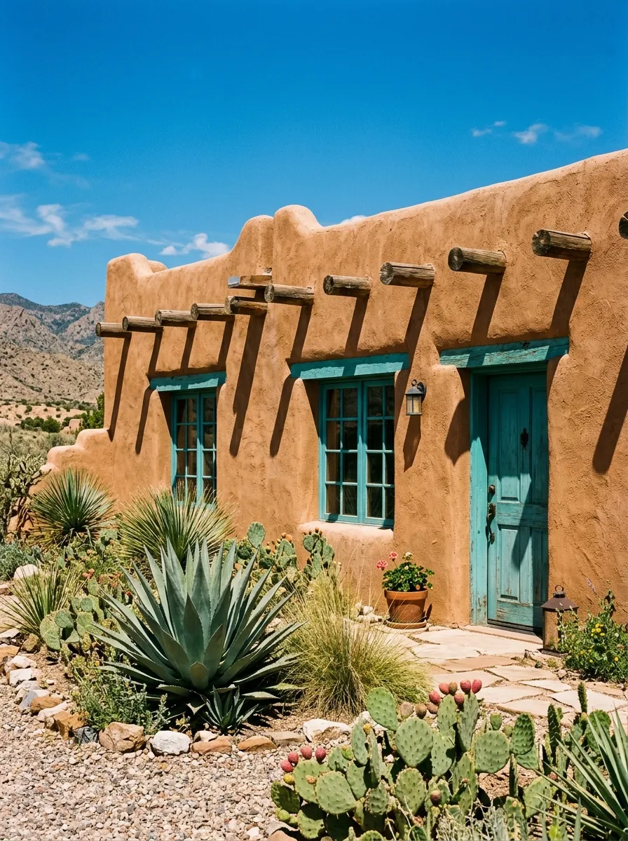
Clay and adobe tones are among the most regionally authentic colors a homeowner in the Southwest can choose, and in 2026 they are getting a wider national audience than ever before. The warmth of these tones comes from their connection to the earth itself, mimicking sun baked soil, terracotta pottery, and canyon walls in a way that feels entirely natural on a home surface. Applied on smooth or rough stucco, clay reads as genuinely handcrafted and deeply rooted in place rather than chosen from a generic paint chart.
The accents that make clay sing are often unexpected. Turquoise window trim, a deep blue painted door, or sage green wooden shutters provide the vivid contrast that keeps this warm palette visually alive rather than monotonous. Native desert landscaping with agave, ornamental grasses, and terracotta pots completes the picture. This is the color scheme that photographs like a magazine spread in the late afternoon sun, where every shadow and warm reflection tells a story. It is both humble and deeply beautiful at once.
The Key: Clay exteriors need a strong accent color on doors or window trim to prevent the monochromatic warmth from flattening the entire facade visually.
10
Pale Blush and Dusty Rose
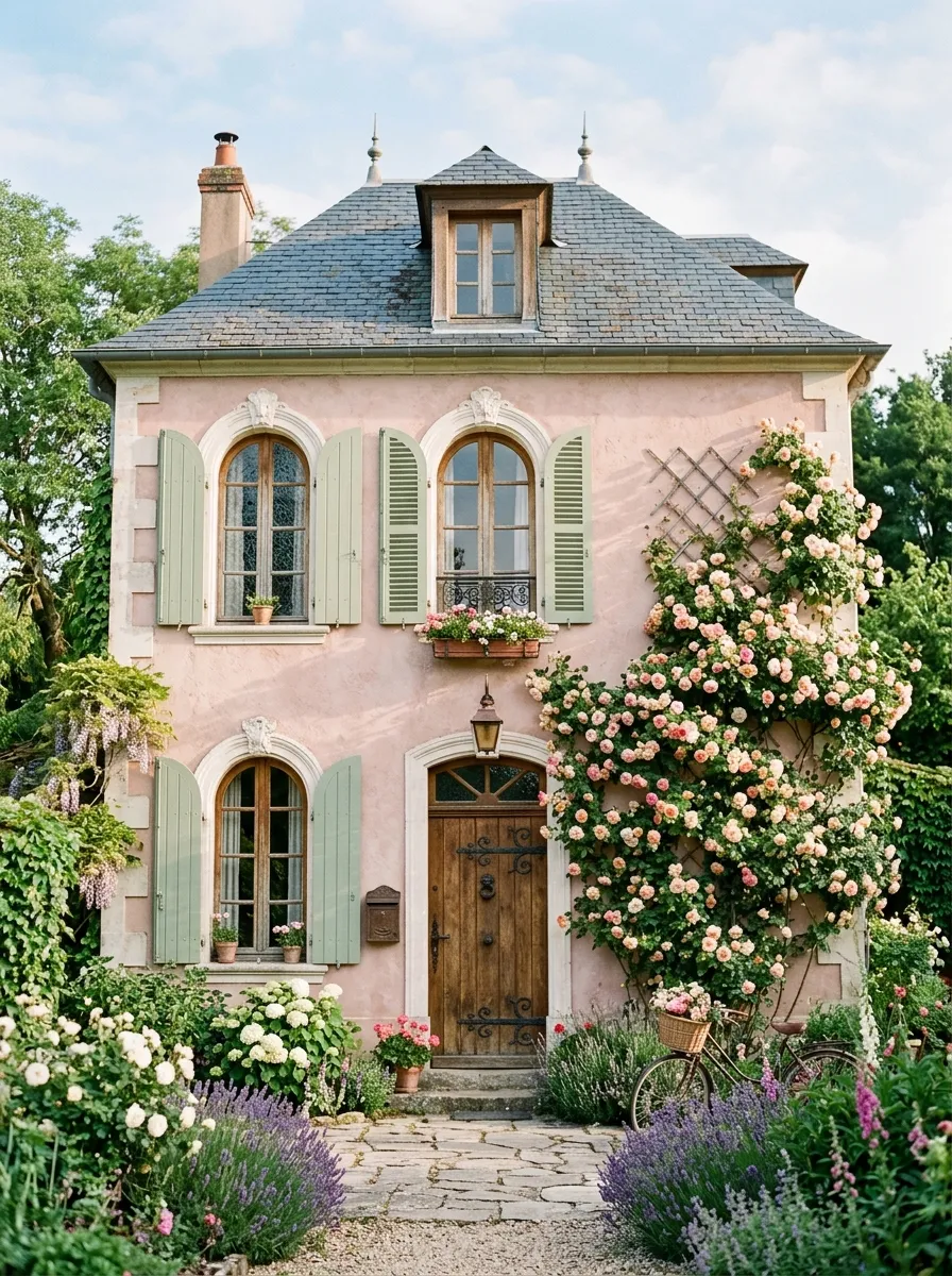
Dusty rose and pale blush exteriors are making a genuine statement in 2026 for homeowners willing to step outside traditional neutral territory. These soft pinkish tones work because they are warm without being garish, feminine without being precious, and distinctly European in their sensibility. Applied on French cottage, Tudor, or romantic Victorian styles, pale blush reads as deeply intentional rather than accidental, like a color choice made by someone who studied design in Paris and brought the whole aesthetic home with them.
The surrounding context does a great deal of work with blush exteriors. White or cream trim keeps the facade feeling fresh and polished rather than overly sweet. A natural aged wood door adds warmth and organic texture that grounds the softness. Climbing roses, lavender plantings, and soft grey slate roofs complete a composition that is genuinely hard to look away from. This is the color that generates the most saved Pinterest posts on any given home design board, and the real world results justify that response completely.
The Key: Pale blush works best on homes with natural stone, aged wood, or detailed white trim nearby that adds texture and prevents the soft tone from reading as flat.
11
Charcoal and Warm Wood Pairings
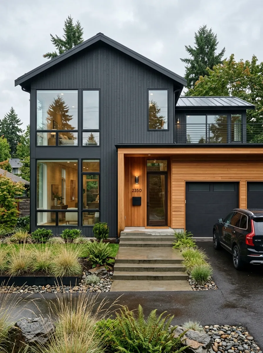
The pairing of charcoal grey with natural cedar wood cladding is one of the most architecturally sophisticated combinations in residential design right now. Charcoal provides the visual weight and modern edge while cedar introduces warmth, grain texture, and an organic quality that prevents the palette from feeling cold or industrial. Together they create a facade that looks custom designed rather than painted over, a distinction that immediately elevates the home’s perceived value on the street or in online listings.
This combination is most powerful when the cedar is applied as a feature panel rather than covering the entire facade. A cedar clad garage door, entry surround, or upper gable against charcoal lower walls creates a visual hierarchy that makes the architecture read as thoughtfully composed. Large windows with slim black aluminum frames reinforce the contemporary feeling without adding visual clutter. Concrete pathways and minimal landscaping with architectural grasses complete a look that is both livable and genuinely stunning from any angle or distance.
The Key: Use cedar in natural or lightly oiled finish rather than stained dark to preserve the warm contrast it provides against the cool depth of charcoal grey.
12
Creamy Butter Yellow Charm
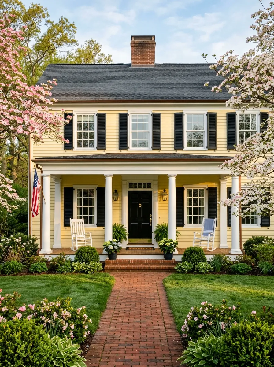
Butter yellow has a way of making every home look like it was built to welcome people, and in 2026 this soft, creamy tone is experiencing a well deserved revival. Unlike the bold sunflower yellows of past decades, the version trending now is quiet and warm, closer to the interior of a fresh croissant than a school bus. It creates immediate warmth and friendliness at the curb, which is exactly what a home exterior should communicate before anyone even reaches the front door to knock or ring.
Colonial and traditional homes respond best to butter yellow because the color honors their proportioned symmetry and classic detailing. Black shutters provide crisp contrast against the warm walls, while white columns and trim prevent the palette from feeling too heavy or nostalgic. A glossy black front door with aged brass hardware is the perfect finishing touch that gives the whole composition a polished, intentional quality. Mature flowering trees in front of a butter yellow home create a scene that feels genuinely joyful and rooted in something beautiful.
The Key: Keep butter yellow paired with black or deep charcoal accents to prevent the warm tone from looking sugary or overly playful on a larger facade.
13
Moody Plum and Berry Tones
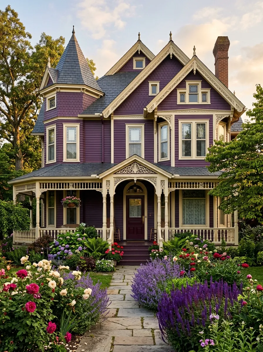
Moody plum and deep berry tones are the most daring choice on this list, and for the right home they deliver an impact that is simply unmatched. Victorian Queen Anne homes in particular have the architectural complexity to carry a deep purple body without looking overwhelming, because the ornate trim, layered details, and varied rooflines give the eye so many places to land and appreciate. This is not a color for the timid, but for homeowners who commit to it fully, the results are genuinely breathtaking and completely unforgettable to anyone who passes by.
The secret to making plum work on a home exterior is in treating the trim and accents as partners rather than afterthoughts. Cream or soft ivory trim against plum walls prevents the facade from becoming a dark monolithic mass, while a deep burgundy or forest green front door adds richness and depth at the entry. A garden filled with lavender, deep roses, and purple salvia ties the home to its landscape in a way that makes the whole composition feel choreographed. This is the house that everyone on the street stops to photograph and admire.
The Key: Plum exteriors need multiple trim tones, typically a body color plus two accent tones, to reveal their full architectural richness and prevent visual flatness.
14
Exterior House Color Trends in Two Tone Palettes
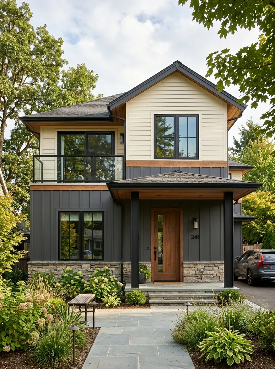
Two tone exterior palettes are one of the defining Exterior House Color Trends of 2026, and the reason is simple. Dividing a home facade into two distinct color zones creates visual interest, architectural emphasis, and a custom designed quality that a single color approach cannot replicate on its own. The most popular version contrasts a dark, grounded lower half with a lighter upper story, which visually anchors the home to the ground and makes even modest two story houses look more deliberate and architecturally thoughtful than they were originally built to appear.
The placement of the color break matters enormously in this approach. A horizontal shift at the first floor windowsill or just below the second floor overhang creates the cleanest and most visually satisfying division. Using contrasting materials at the break point, such as transitioning from smooth board siding below to horizontal lap siding above, amplifies the effect beautifully. Stone veneer at the base adds a third textural element that grounds the whole composition. This is a trend that requires planning but rewards homeowners with a result that looks professionally designed from street level.
The Key: Place the color division at a natural architectural transition such as a roofline, overhang, or windowsill for a result that looks intentional rather than arbitrary.
15
Warm Rust and Copper Tones
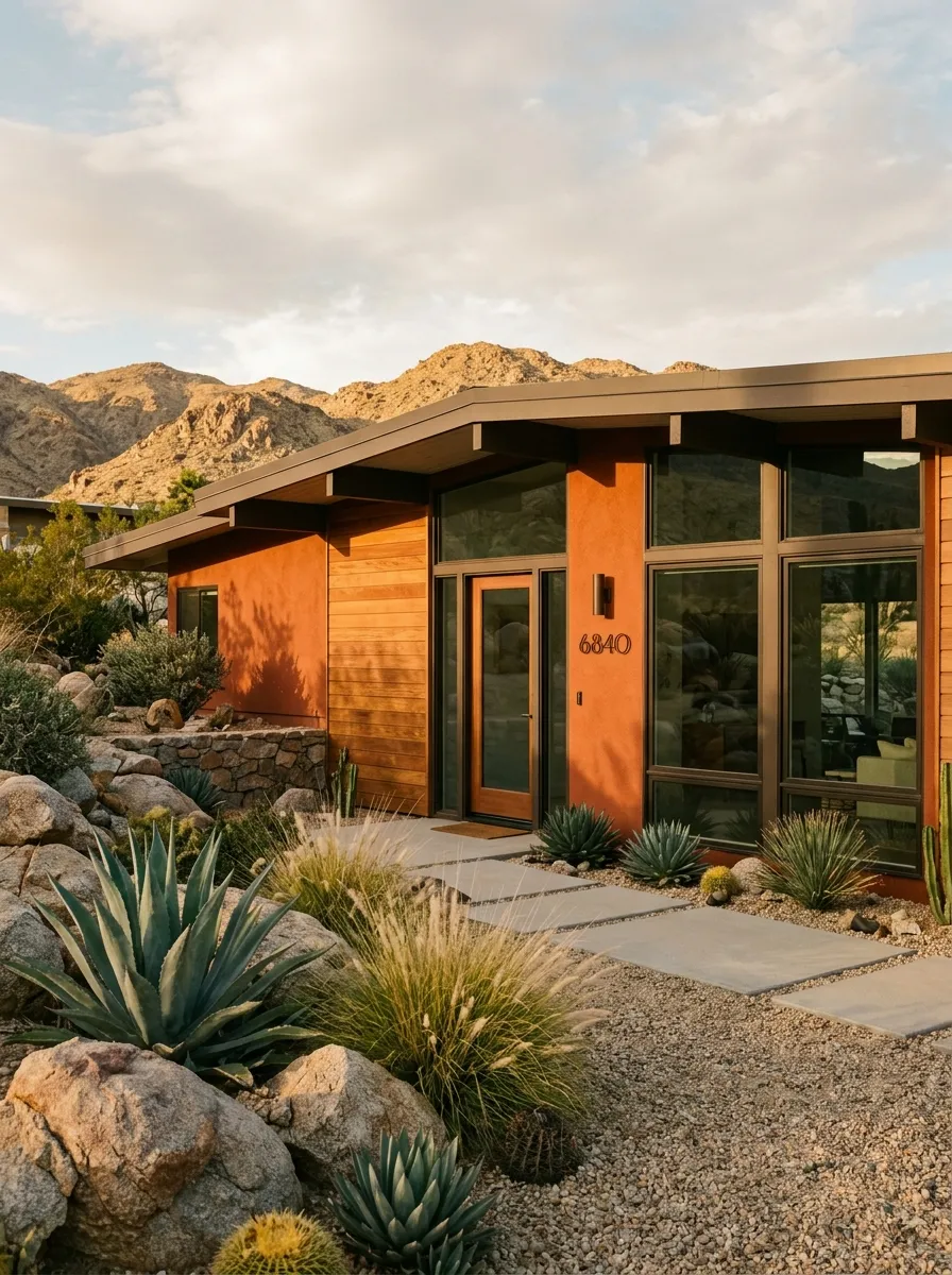
Warm rust and copper inspired exterior tones are claiming serious attention in 2026 as homeowners shift toward colors that feel authentic, grounded, and connected to the natural world. These tones occupy the space between terracotta and deep red, carrying a richness that reads as both bold and organic depending on the surface they cover. On mid century modern homes with low rooflines and horizontal proportions, warm rust is especially powerful because it reinforces the earthward orientation that defines the entire architectural vocabulary of that beloved style.
The materials rust pairs with best are also among the most beautiful in residential design. Dark bronze hardware, weathered steel, and natural cedar wood all share the warm metallic undertone of rust and create a palette that feels unified and deeply intentional. Desert inspired landscaping with ornamental grasses, agave, and smooth river rock completes the picture in a way that makes the home feel entirely at home in its landscape rather than placed on top of it. This is curb appeal that is rooted rather than applied, and the difference is always visible.
The Key: Rust exteriors gain their character from oxidized metal and natural wood accents that echo the warm tones in the paint and unify the full composition.
16
Coastal Blue and Sea Glass
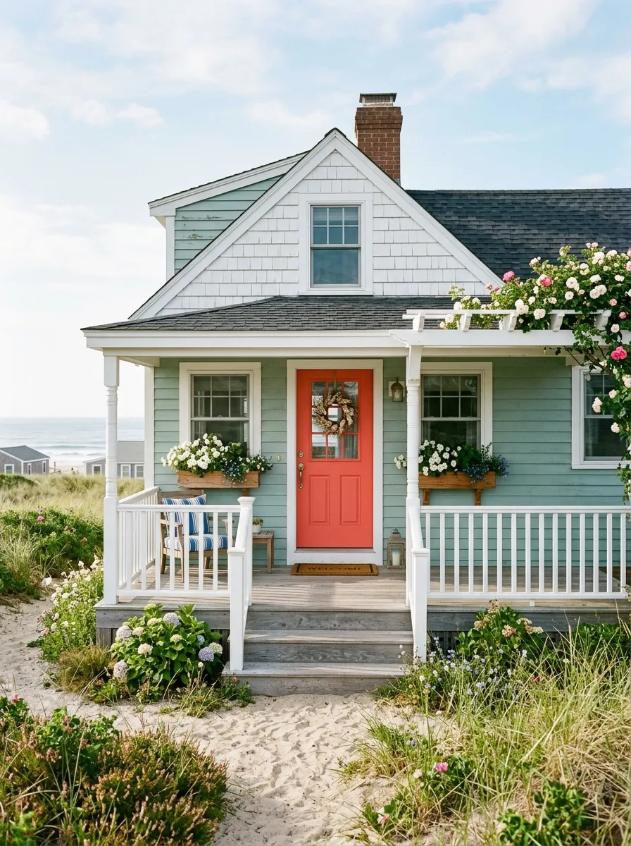
Sea glass tones occupy a unique position in the color spectrum that is simultaneously cool and warm, blue and green, calm and cheerful. In 2026, this soft coastal color is expanding well beyond beach towns and appearing on homes in landlocked neighborhoods where homeowners want to bring that breezy, light filled quality to their curb. The color has an instantly recognizable freshness to it that feels like standing next to moving water, which explains why it generates such consistent positive emotional responses from anyone who encounters it on a home.
The front door choice is everything with sea glass exteriors. A coral, terracotta, or warm persimmon door provides the warm contrast that prevents the cool body color from reading as chilly or unwelcoming. White shingle siding at the gable, weathered grey porch decking, and simple window boxes with white flowers create a layered coastal composition that looks collected rather than decorated. This is the color that makes a modest cottage look like the most beloved and well considered home on the entire block without any complicated renovation required
The Key: Sea glass needs a warm toned front door in coral, terracotta, or warm orange to balance its cool body and prevent the facade from reading as cold.
17
Warm Taupe and Mushroom Neutrals
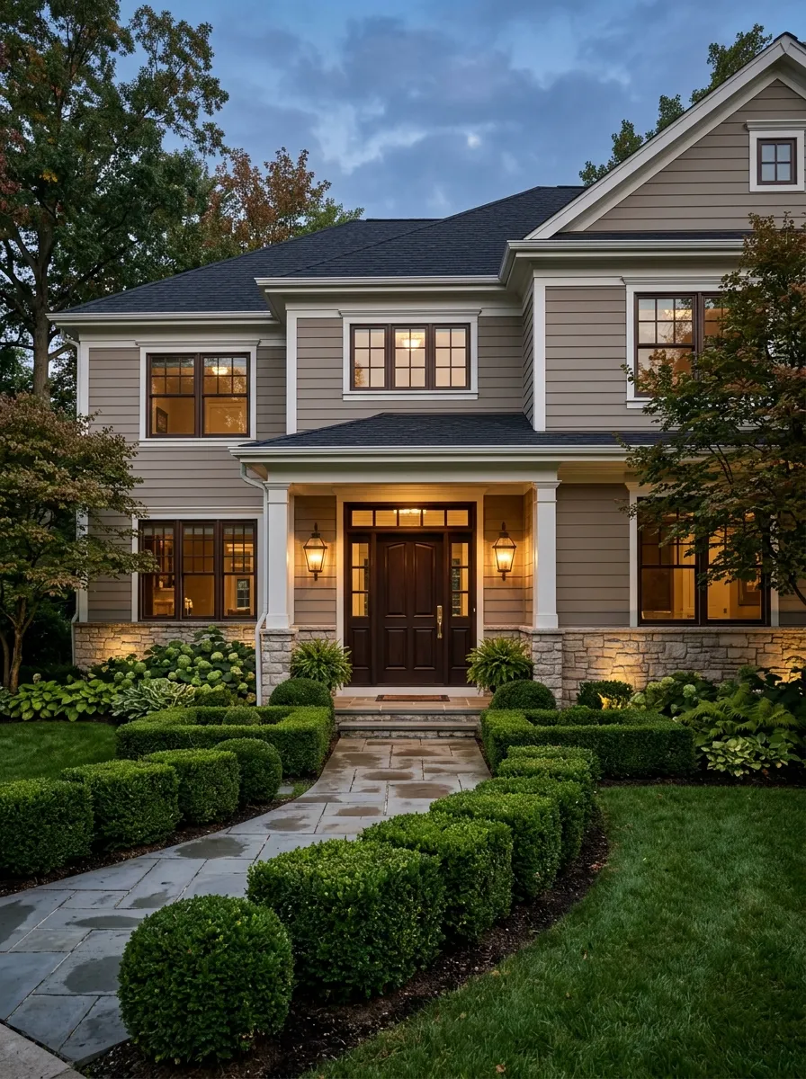
Warm taupe and mushroom neutrals are the quiet overachievers of the 2026 color landscape. These tones sit closer to warm brown than they do to beige, carrying an organic, earthy quality that feels genuinely grounded rather than generically neutral. On traditional two story homes with detailed millwork and varied rooflines, warm taupe reads as polished and intentional, like the color was selected by someone who understood exactly what the home’s architecture was trying to communicate and gave it the perfect platform to do so fully.
What distinguishes warm taupe from ordinary beige is the depth and richness that emerges when paired with dark wood accents. Walnut stained window trim, a deep espresso front door, and bronze hardware create a palette that is warm, layered, and visually complex in the best possible way. Stone foundation accents add texture and natural variation that lifts the whole composition beyond what a flat neutral could achieve on its own. Professional landscape lighting at dusk makes this color glow beautifully and adds genuine evening curb appeal that few other tones deliver.
The Key: Warm taupe demands dark, rich accents to reveal its depth. Paired with only whites, it reads as forgettable beige rather than the warm, sophisticated neutral it actually is.
18
Deep Teal Drama
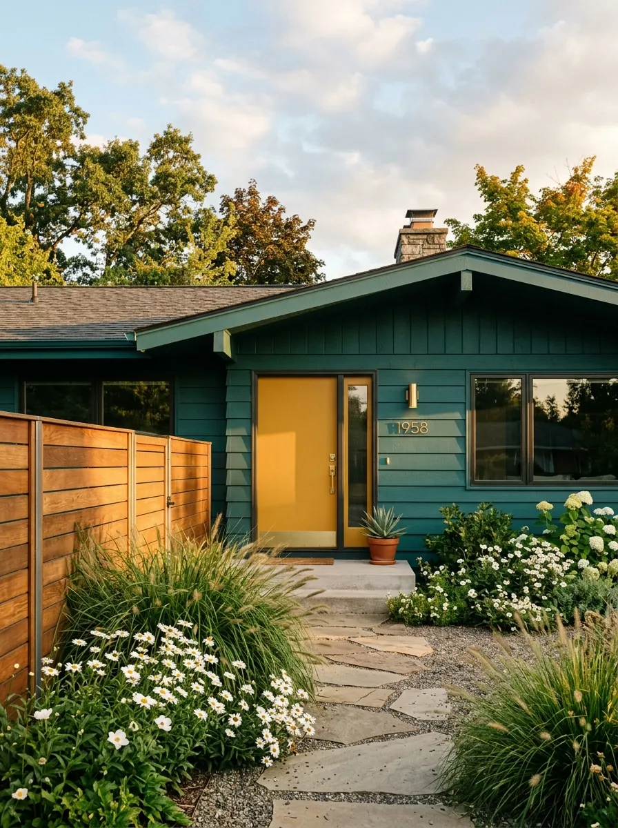
Deep teal is the color that most confidently bridges the gap between the cool and warm sides of the palette, and on mid century modern and ranch homes its impact is genuinely electric. The green blue depth of teal creates a richness that makes a home look expensive and carefully considered from across the street. It ages beautifully on horizontal siding, developing subtle tonal variation over time that adds character rather than looking worn or faded. In 2026, teal is being embraced by homeowners ready to commit to something genuinely striking and memorable as their exterior color choice.
The most exciting aspect of deep teal is how brilliantly it works with warm accent colors. A mustard yellow or golden yellow front door is the single most effective pairing, creating a complementary contrast that reads as retro modern and completely intentional. Warm cedar fencing, brushed brass hardware, and white or cream window trim round out a palette that covers every temperature range simultaneously and succeeds at each one. This is a color combination that design professionals recommend regularly because it delivers consistent, photogenic results that look as good in person as they do in photography.
The Key: Pair deep teal with a warm toned door in mustard, golden yellow, or terracotta for the complementary contrast that makes this bold color truly sing at the curb.
19
Stone Inspired Greige Blends
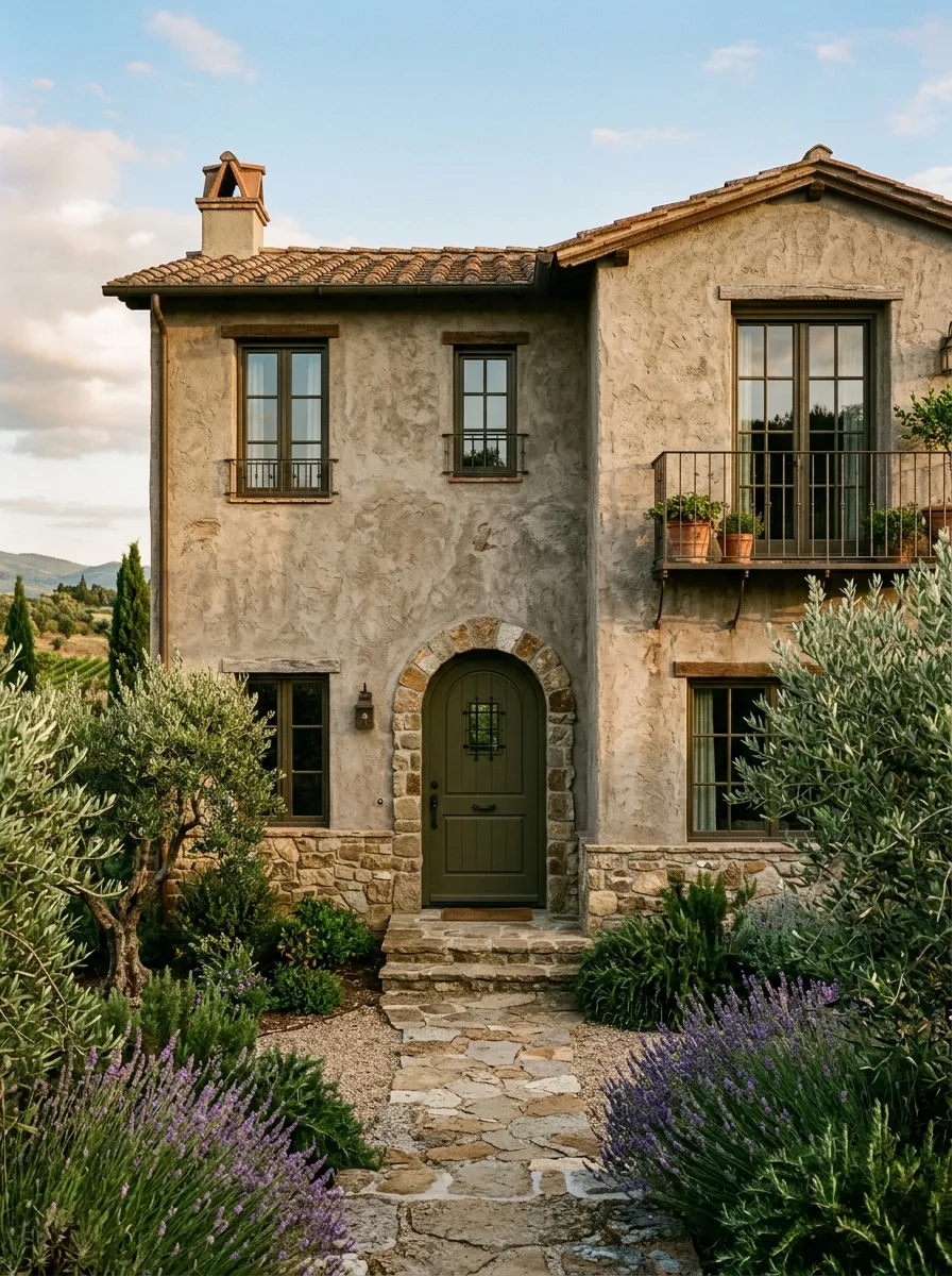
Stone inspired greige blends are gaining enormous traction in 2026 precisely because they occupy that highly coveted space between color and neutral that makes every architectural detail shine without the color itself demanding attention. These tones mimic the natural variation found in limestone, travertine, and fieldstone, creating a warmth and visual texture that feels like it belongs rather than was applied. On European inspired or Tuscan style stucco homes, this palette is so natural looking that the home appears to have grown from the ground rather than been built on top of it.
The textural quality of the stucco application matters enormously with these stone inspired tones. A rough, hand applied texture allows the greige to catch light differently across the surface, creating the kind of organic tonal variation found in actual stone. Aged bronze window frames, a deep olive or forest green arched front door, and a clay tile roof complete a palette that is unquestionably beautiful and genuinely timeless. Mature olive trees and lavender plantings at the foundation tie the home to its inspiration in a deeply satisfying and photogenic way.
The Key: Choose a greige with both warm yellow and cool grey undertones to achieve the most convincing stone like quality on smooth or textured stucco surfaces.
20
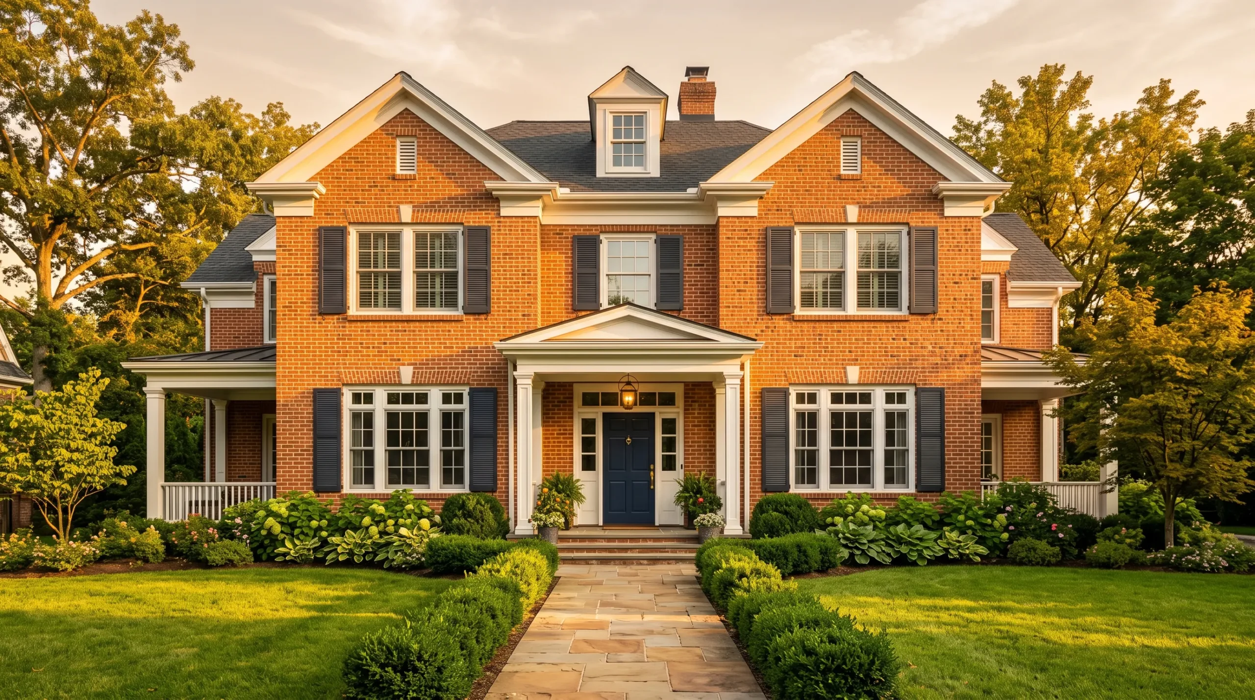
Bold Red Brick Revival
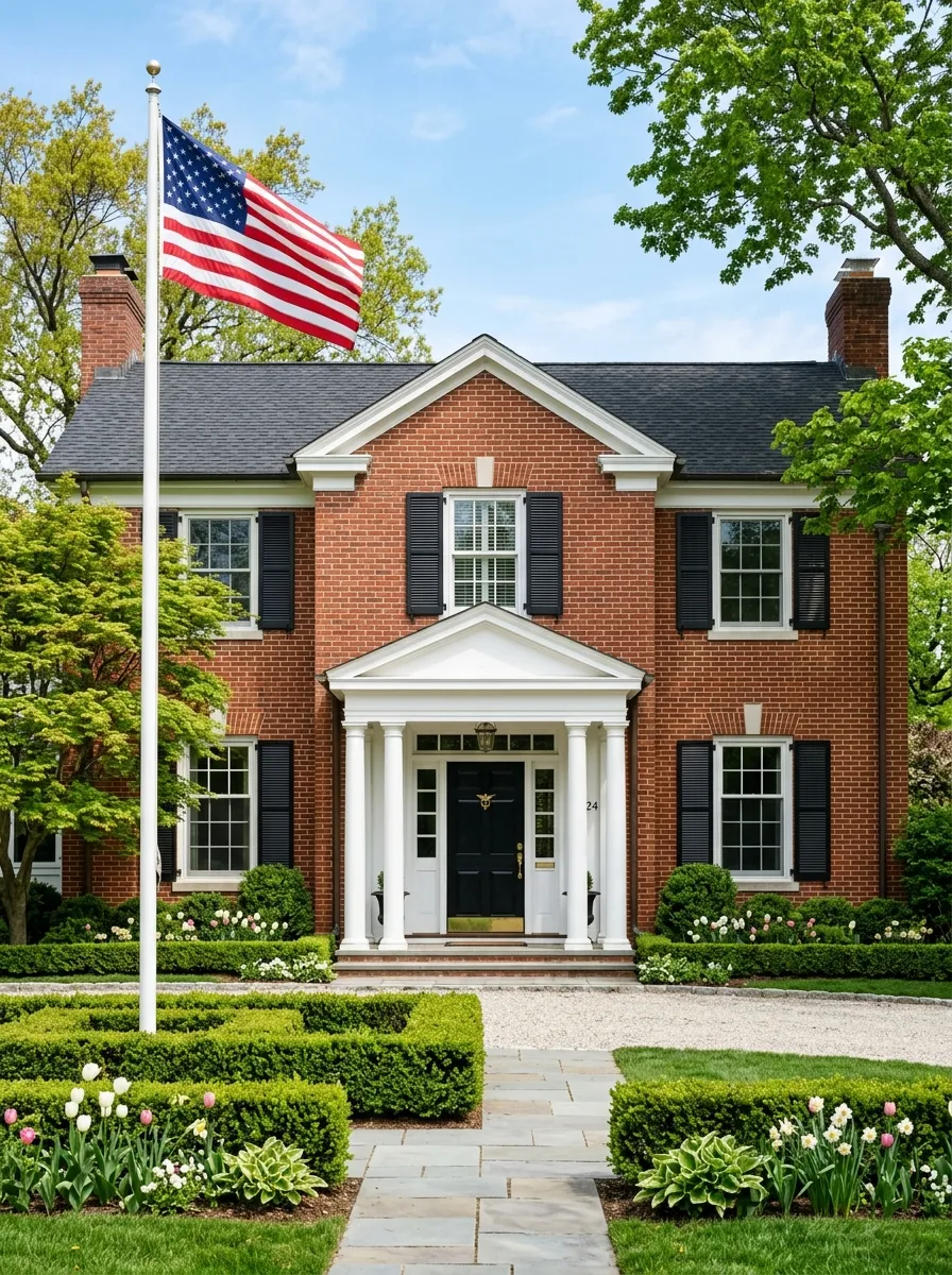
Natural red brick is experiencing a strong revival in 2026 as homeowners and designers push back against the painted over brick trend that dominated the previous decade. Exposed red brick brings an authenticity and permanence to a home that no paint color can fully replicate because it is both the material and the color simultaneously. The variation in individual brick tones creates organic richness that reads as deeply valuable and historically rooted, which is why homes with natural brick facades consistently appraise above their painted counterparts in most residential markets today.
The secret to maximizing red brick curb appeal is entirely in the trim and accent choices that frame it. Crisp painted white wood trim at windows, rooflines, and the entry portico creates the contrast that makes the brick pop with maximum visual intensity. Black shutters and a glossy black front door with aged brass hardware tie the whole composition together in a palette that is both dramatically striking and timelessly appropriate for virtually any traditional architectural style. Repointing mortar with a clean grey tone rather than matching brick color is the professional finishing touch that transforms the overall result.
The Key: Repoint mortar lines in medium grey rather than red matching tones to create the subtle contrast that makes each brick face read clearly and the overall facade glow.
21
Fresh Mint and Soft Aqua
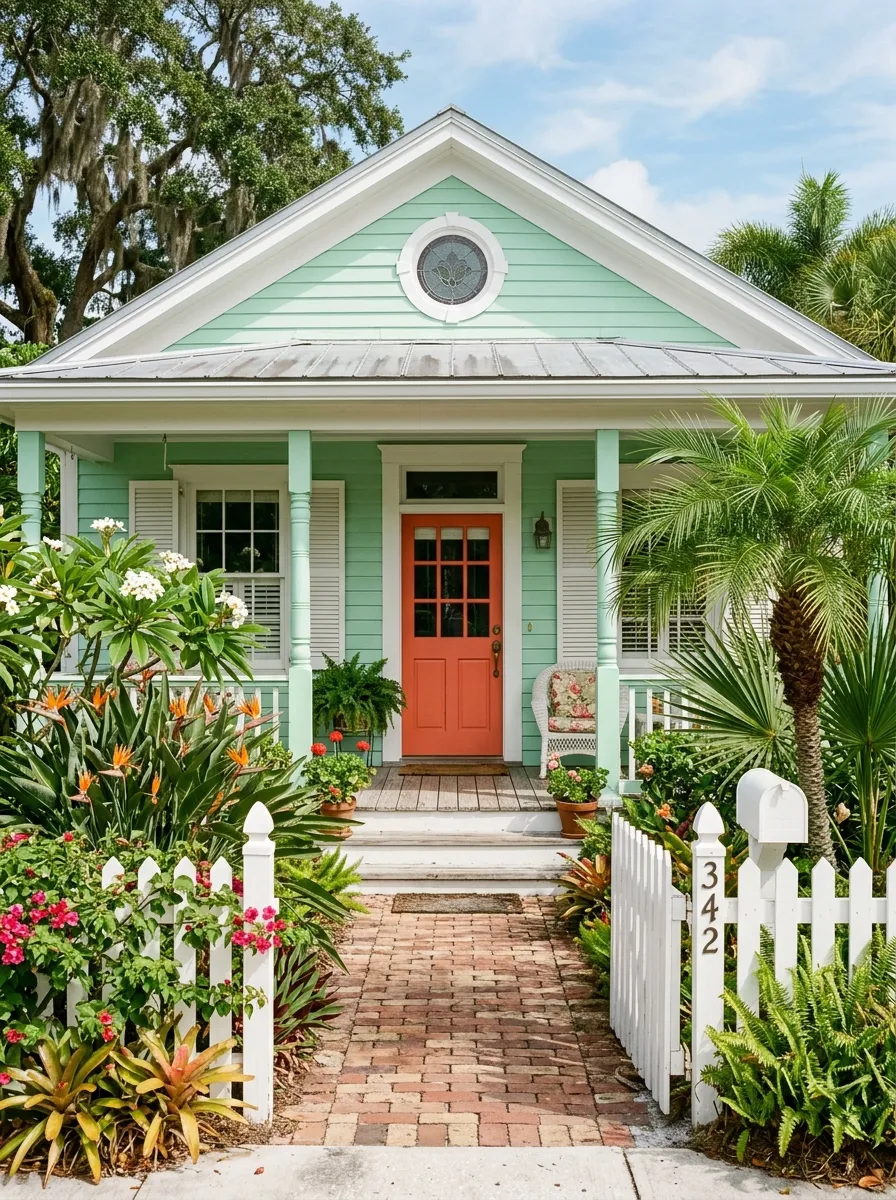
Soft mint and aqua exteriors are having a joyful, nostalgic moment in 2026 that celebrates the retro tropical aesthetic of Florida bungalows, Key West cottages, and California beach cottages with genuine affection. These soft, cool greens carry a freshness and optimism that is genuinely hard to achieve with any other color on the palette. Applied on shiplap, horizontal lap, or wood shingle siding, mint reads as both vintage and current simultaneously, which is a quality that very few colors in residential design can honestly claim to possess with any consistency.
The color combinations that make mint sing are built around warm contrast. A coral, orange red, or warm persimmon front door creates an immediate energy at the entry that makes the cool mint body feel alive rather than cold. White shutters and trim keep the palette feeling clean and well maintained. Tropical plantings with big glossy leaves and colorful blooms at the foundation complete the picture with an exuberance that suits the cheerful personality of the color entirely. This is the exterior color that generates the most genuine smiles from passersby of any palette in this collection.
The Key: Mint exteriors need a warm toned door and at least one warm accent color to prevent the cool green from reading as cold or clinical rather than joyful and fresh.
22
Sophisticated Lavender and Lilac
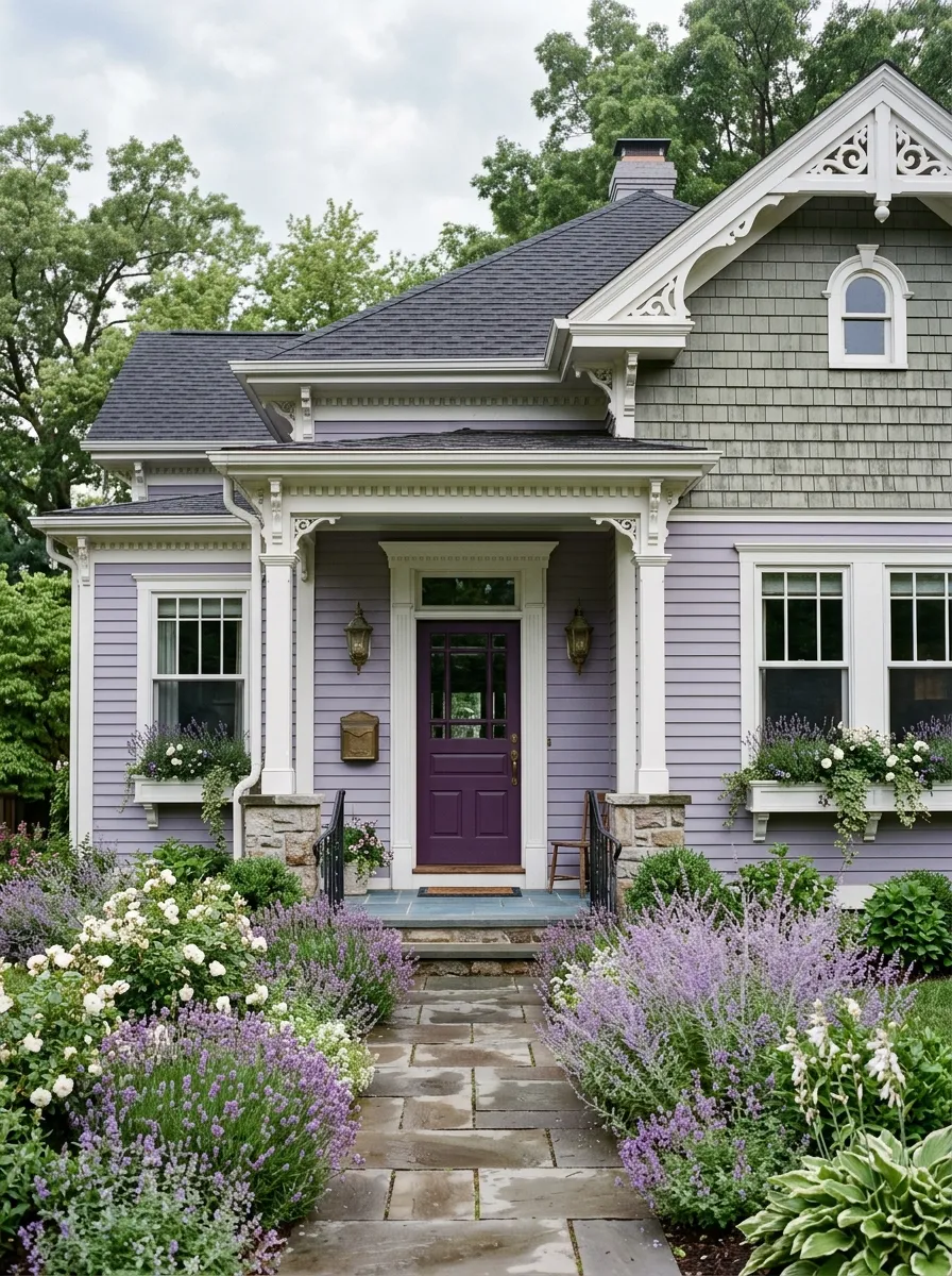
Sophisticated lavender and muted lilac tones are emerging as one of the most genuinely surprising exterior color directions of 2026 for homeowners willing to move past conventional neutrals. Unlike the bright, childlike purples that most people associate with this color family, the sophisticated version trending now is dusty, muted, and deeply grown up in its sensibility. It reads as an evolved neutral rather than a statement color, and on traditional homes with detailed trim and varied architectural elements it delivers a result that is quietly extraordinary and completely unforgettable.
The lavender exterior palette succeeds because of how intentionally the accents are chosen. White or cream trim at the windows and roofline brightens the cool body without fighting it. A deep eggplant or rich purple front door creates a tonal progression from light to dark that feels deeply designed. Grey green cedar shingles at the upper gable introduce a natural note that prevents the composition from feeling overly precious. A garden filled with actual lavender, Russian sage, and white roses at the foundation creates a real world connection between the paint and the landscape that is genuinely extraordinary.
The Key: Choose lavender with a grey undertone rather than a pink one to keep the color reading as sophisticated and architectural rather than sweet or whimsical.
23
Warm Ivory and Natural Linen
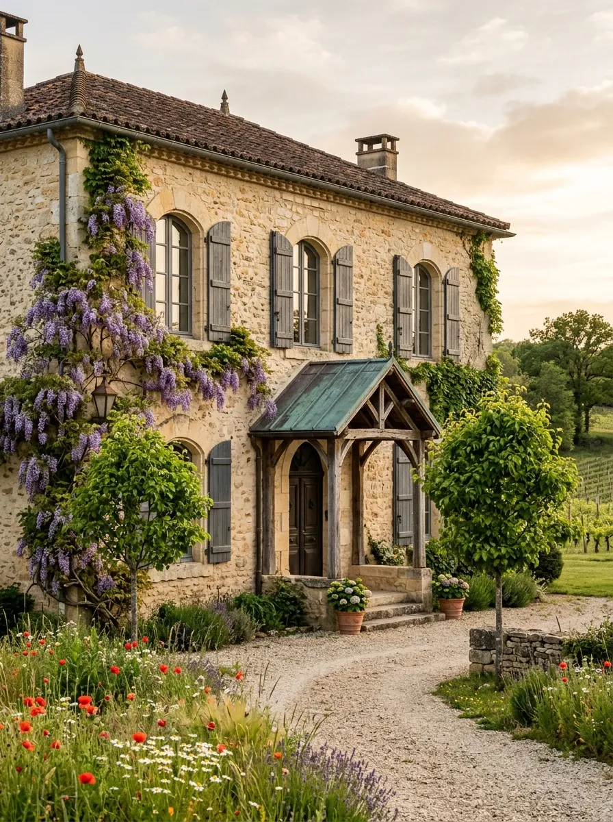
Warm ivory and natural linen tones are the most versatile and reliably beautiful choices in the entire 2026 exterior color landscape. These tones are not white, not beige, and not cream in the traditional sense. They carry a fabric like warmth that references natural materials like raw linen, unbleached cotton, and aged parchment, creating a home facade that looks both naturally aged and freshly intentional at the same time. On French country, farmhouse, and European inspired homes, this palette is essentially perfect from every angle and in every season of the year.
What sets warm ivory apart from builder beige is the richness it develops when surrounded by natural materials. Rough limestone detailing, aged copper or patinated bronze roof accents, and charcoal grey shutters create a palette that is stratified and deeply interesting rather than flat and forgettable. Climbing wisteria or roses against warm ivory create a scene that looks like it belongs in a French village rather than a suburban neighborhood. This is the color that makes a home feel genuinely loved and carefully tended over many years, which is the highest possible compliment any exterior can receive.
The Key: Warm ivory gains its depth from surrounding natural materials. Without stone, aged metal, or rich wood nearby, it risks reading as a slightly improved builder beige.
24
Earthy Olive and Bronze
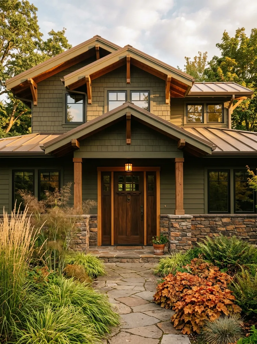
Deep earthy olive paired with bronze and warm metal accents is one of the most richly satisfying color combinations in residential design, and it is gaining serious momentum in 2026 among homeowners who want their home to feel genuinely rooted in the natural world. This shade of olive is darker and more saturated than the dusty sage that opened this list, carrying a depth that reads as forest inspired rather than garden fresh. On craftsman homes with exposed structural details, natural material accents, and generous rooflines, this color creates an experience of visual and tactile richness that is deeply compelling.
The bronze and warm metal accents that make this palette exceptional are the details that are most easily overlooked and most powerfully felt. A standing seam metal roof in aged bronze or corten inspired tones, cedar rafter tails in a natural or oiled finish, and aged bronze door hardware unify the facade in a tonal language of warmth and natural oxidation. Landscaping with bronze fennel, rust orange heuchera, and ornamental grasses at the foundation completes the composition in a way that makes the home feel like a collaboration between architecture and nature rather than a structure imposed upon it.
The Key: Deep olive requires warm metallic accents in bronze or aged copper to fully express its richness and prevent the dark green from absorbing all surrounding light and detail.
25
Timeless Black and White Contrast
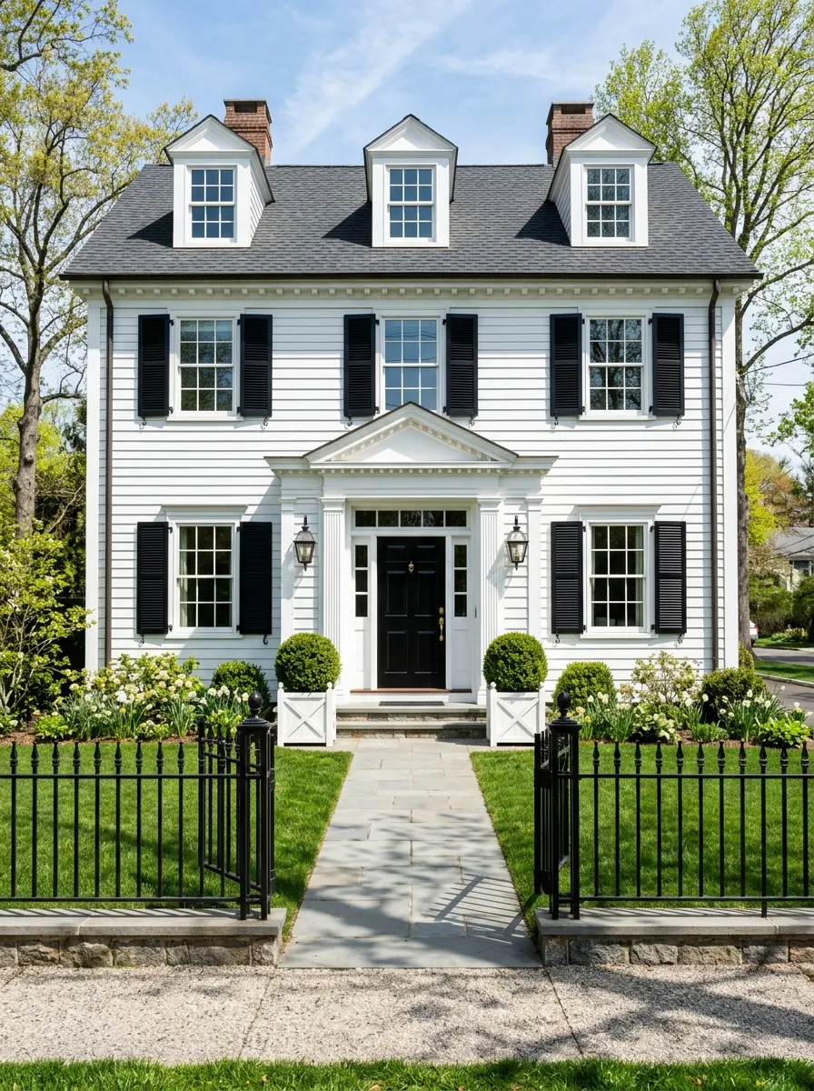
The classic black and white exterior palette closes this collection as the most timeless and architecturally certain choice available to any homeowner regardless of style, location, or budget. Nothing in residential design is more reliably beautiful, more universally photographable, or more lastingly appropriate than crisp white walls against deep black architectural accents. In 2026 this combination is experiencing a formal revival on Georgian colonials, traditional Federals, and symmetrical Neoclassical homes where its clarity and confidence are not just appropriate but essential to the integrity of the architecture itself.
The execution of black and white is everything. Pure white walls demand absolute perfection in every trim detail, which means caulking, painting, and maintaining every edge with precision. The black must be truly black rather than dark charcoal, and the finish must be gloss or semi gloss to achieve the reflective depth that makes the contrast electric rather than merely stark. Clipped boxwood topiaries in white planters, a black wrought iron fence, and polished brass coach lanterns complete a picture that is not just beautiful but genuinely correct for homes that were designed with this level of formal dignity in mind.
The Key: True black and white requires flawless execution. Even small lapses in trim precision or surface prep become glaringly obvious against the high contrast palette.
The 25 Exterior House Color Trends explored in this article represent a genuine shift in how homeowners approach one of the most visible and emotionally powerful decisions they will ever make about their home. From the earthy groundedness of deep olive and warm clay to the crisp confidence of black and white, each palette tells a specific story about what a home stands for and how it wants to be remembered by everyone who encounters it. Color is not cosmetic. It is the first conversation your home has with the world, and these trends give you everything you need to make that conversation remarkable.
If even one of these ideas has sparked something in you, save this post to your Pinterest boards so you can come back to it when the paint swatches come out. Share it with a friend who is planning a repaint or renovation, because the right color idea at the right moment is genuinely one of the most generous gifts you can offer someone. In my experience, the homes that get remembered are the ones where someone made a deliberate and loving choice about color. Yours can be that home starting right now with any one of these extraordinary 2026 palettes.