Living Room Wall Art
🏠 21 Real Ideas
⏱ Quick Read
🔥 Always Trending
21 Living Room Wall Art Ideas
That Create Stunning Focal Points Through Strategic Layering
Picture this: you finally have a sofa you love, lighting that works, and a rug that ties everything together. But the wall behind it all? Bare, beige, and utterly forgettable. That blank space is not just a missed opportunity it is the single most powerful focal point in your entire home, just waiting to be styled. The right living room wall art ideas can transform that emptiness into something that stops guests in their tracks.
This article walks you through 21 strategic, layered approaches that go far beyond hanging one frame and calling it done. Whether you are drawn to gallery walls, sculptural accents, mixed textures, or bold statement pieces, every idea here is rooted in real design principles. You will leave knowing exactly how to create a focal point that feels intentional, cohesive, and completely yours.
01
Oversized Canvas Anchor Piece
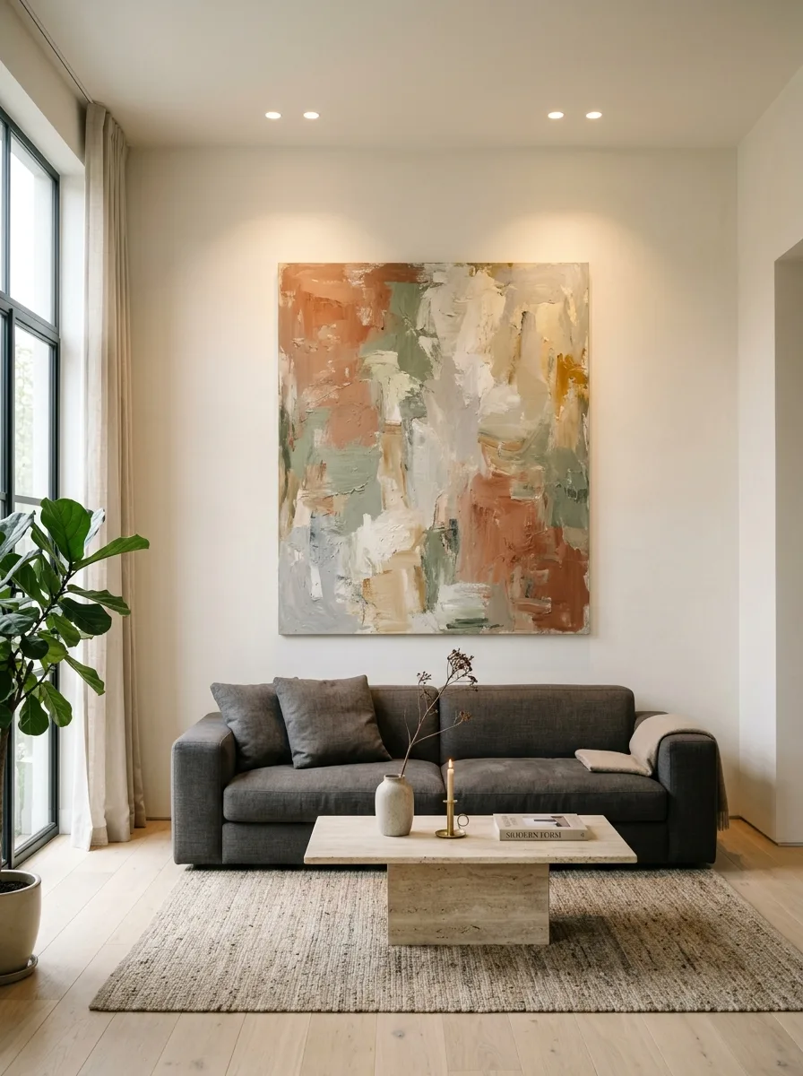
One single oversized canvas is often the most powerful tool in any decorator’s arsenal. Nothing else anchors a seating area with quite the same confidence. When the piece spans at least two thirds the width of your sofa, the entire wall gains structure, purpose, and a natural resting place for the eye.
The key is choosing art with enough visual weight to hold its own without extra pieces competing around it. Abstract textures in organic palettes, large scale botanicals, or gestural brushwork all perform beautifully. Keep the frame simple or go frameless so the artwork itself commands the attention it deserves.
The Key: Choose a canvas that fills two thirds of your sofa width to anchor the seating zone with visual confidence and intentional proportion.
02
Curated Gallery Wall Cluster
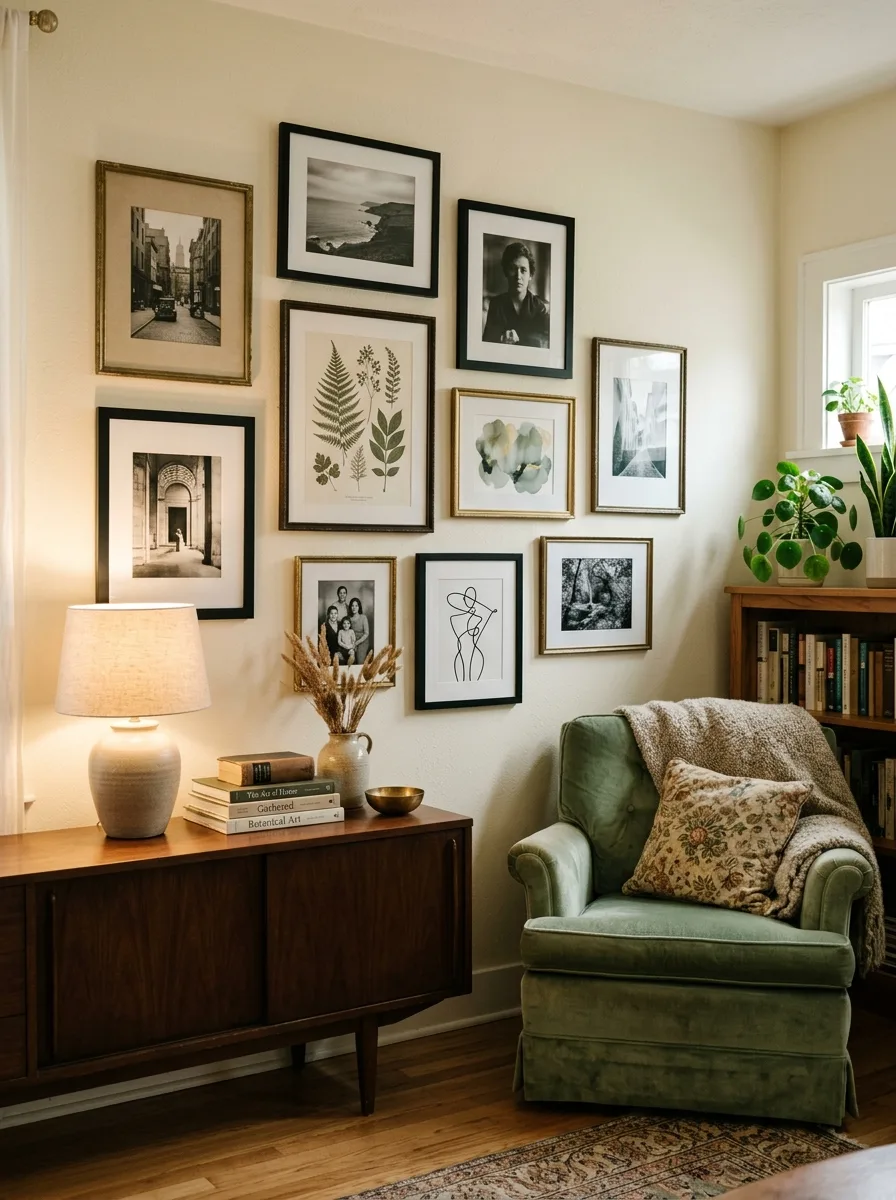
The gallery wall remains one of the most beloved living room wall decor approaches for good reason: it tells a layered visual story no single piece ever could. The trick is treating it like a composition rather than a random collection. Anchor the arrangement with a large center piece, then build outward with smaller frames that vary in shape and content.
Stick to a consistent color palette across frames and artwork, even if the subjects differ. Two or three frame finishes maximum, consistent mat colors, and roughly equal spacing between pieces. Lay the full arrangement on the floor before committing a single nail to the wall.
The Key: Consistent frame finishes and mat colors hold a gallery wall together even when the artwork styles vary widely across the collection.
03
Leaning Floor Art Layers
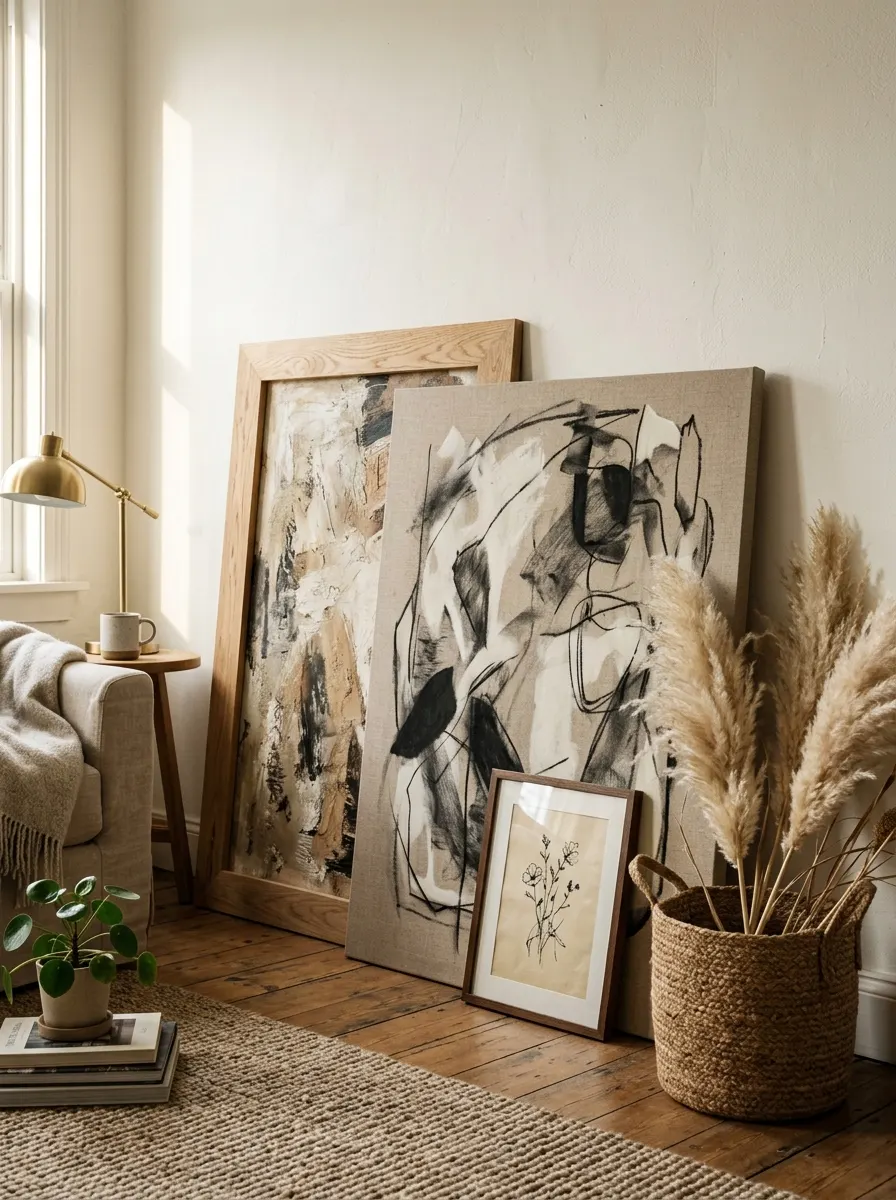
Leaning art against the wall instead of hanging it brings an effortlessly curated, gallery studio energy that feels fresh and current. Layer two or three pieces of varying heights, with the tallest leaning directly against the wall and smaller pieces propped in front. This depth creates dimension that flat, hung arrangements simply cannot replicate.
This approach works especially well in corners or behind a console table. Mix materials: one raw wood frame, one metal, and one unframed canvas creates beautiful textural contrast. Anchor the base with a woven basket or small sculptural object to ground the composition and prevent it from looking accidental.
The Key: Layering three pieces at varying depths and heights creates the illusion of a collected, styled space without a single nail in the wall.
04
Mixed Media Texture Display
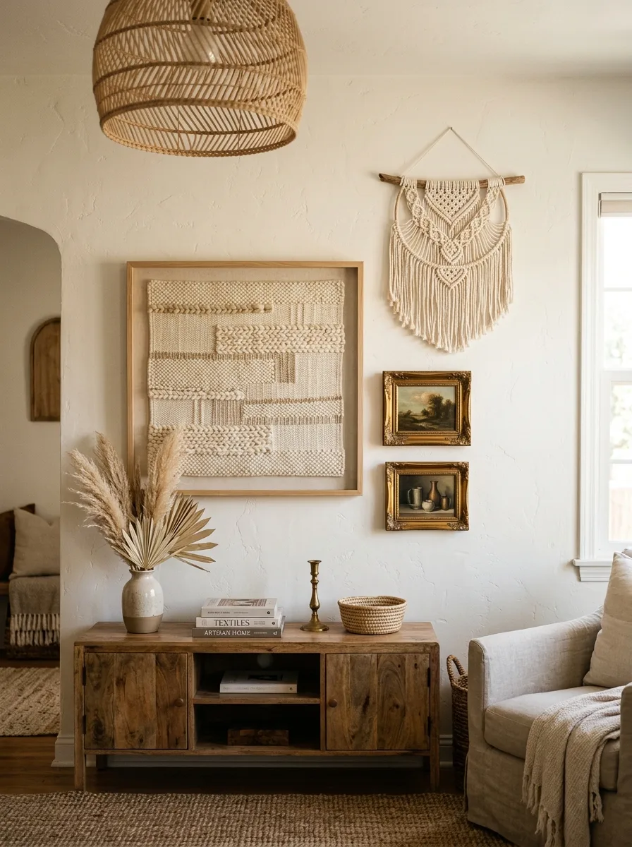
Combining different media on a single wall is one of the most underused wall art ideas for living rooms that designers rely on constantly. When framed textiles, woven macramé, and oil paintings share the same wall, the visual richness becomes something no single medium could achieve alone. The contrast between rough fiber and smooth canvas creates a tactile dimension you can practically feel.
To keep the mix feeling cohesive rather than chaotic, anchor every piece within the same warm or cool tonal family. A sandy ivory textile pairs naturally with cream toned abstracts and aged gold frames. Repeat one material, such as the natural fiber element, at least twice across the arrangement to create a subtle visual rhythm.
The Key: Repeating one texture or material twice across a mixed media wall arrangement creates the visual rhythm that makes the display feel intentional.
05
Statement Mirror With Art Surround
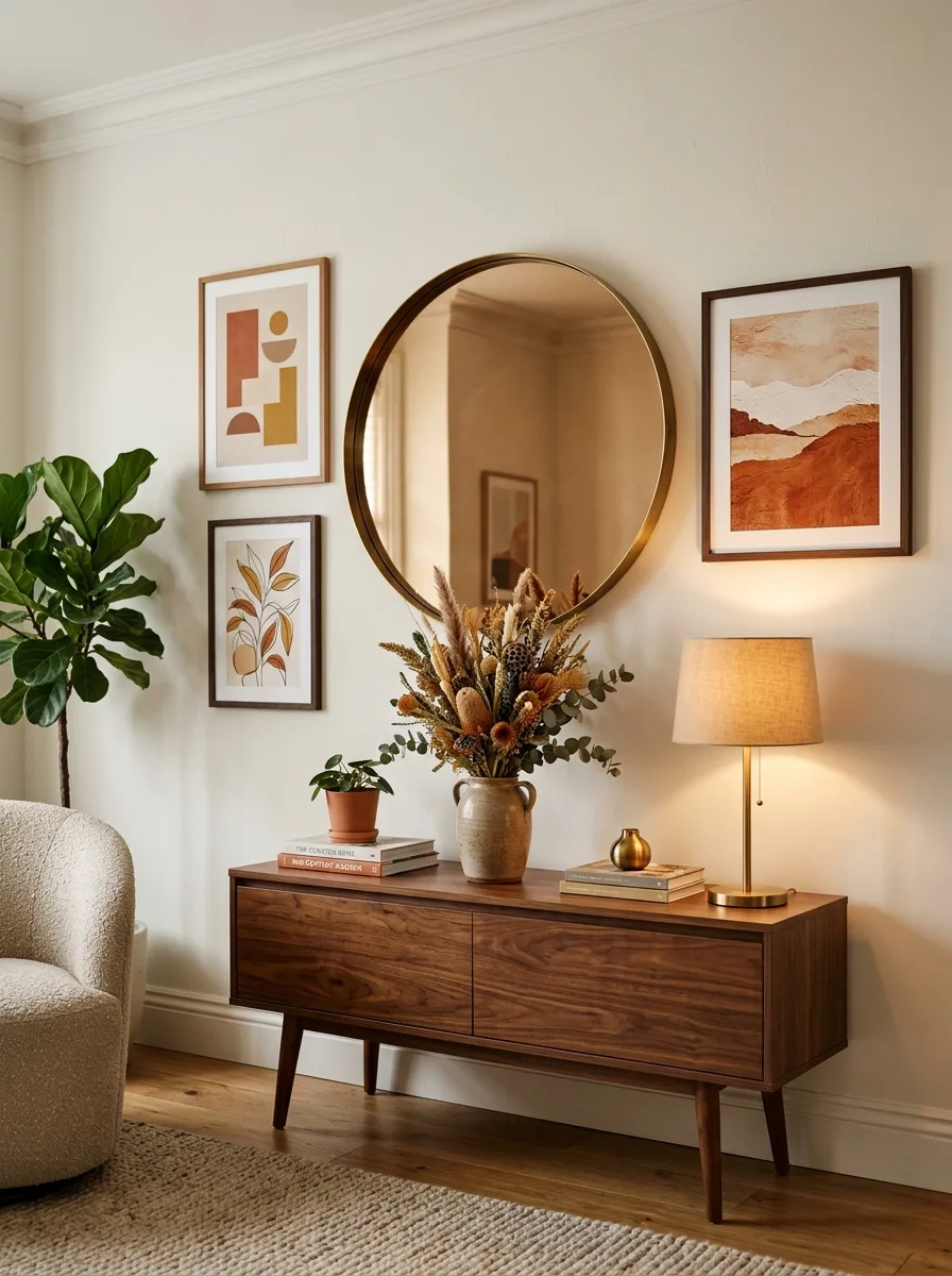
A large mirror paired with smaller art pieces is one of the smartest living room wall art ideas for spaces that need both light and visual depth. The mirror reflects natural light back into the room while the surrounding art pieces give the wall its focal point structure. Together, they accomplish what neither could do independently.
Position the mirror as the clear center point, then frame it with two or three smaller prints at shoulder height on either side. Keep the surrounding art tonal and understated so it supports rather than competes with the mirror’s reflective presence. A round mirror softens a room full of straight lines beautifully.
The Key: Centering a large mirror within a small art grouping doubles the light in a room while creating a layered focal point with real design depth.
06
Botanical Print Grid
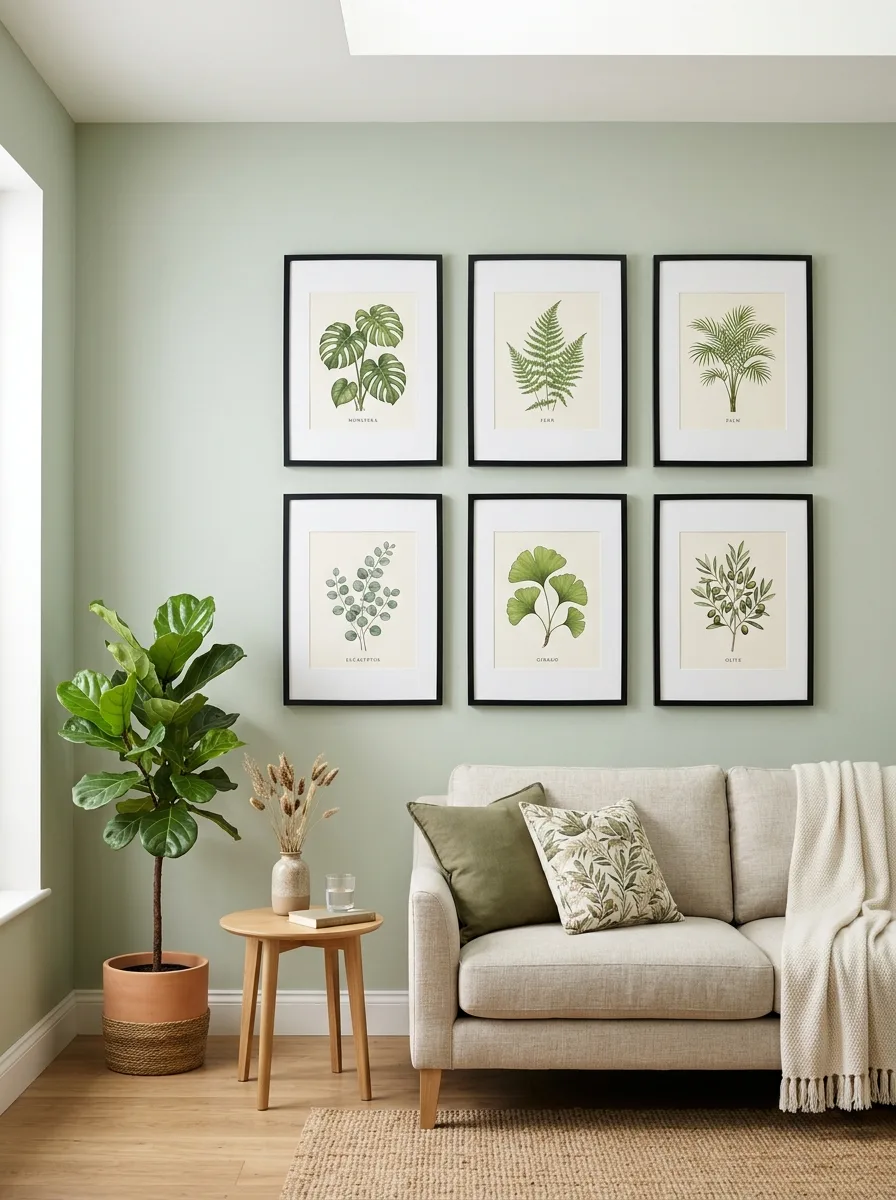
A symmetrical grid of botanical prints is one of those rare wall art for living room ideas that manages to feel both orderly and organic at the same time. The repetition of the grid creates a satisfying rhythm, while the natural subject matter keeps the arrangement from feeling sterile or overly rigid. This approach works especially well on a single accent wall in a room with otherwise simple decor.
Matching frames and identical mat widths are non negotiable for a grid to succeed. Even one inconsistency in matting size or frame finish breaks the clean visual line the arrangement depends on. Six prints in a two by three configuration sit comfortably above most standard sofas and do not overwhelm smaller rooms.
The Key: Uniform mats and matching frames are the only things standing between a botanical grid looking polished and looking like a rushed Pinterest attempt.
07
Sculptural Wall Objects
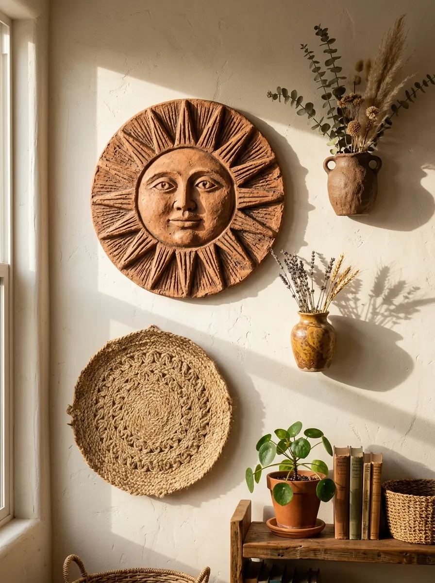
Moving beyond flat art entirely opens up a world of possibility. Sculptural wall objects, including ceramic discs, woven circles, hand formed clay pieces, and carved wood elements, bring a three dimensional quality to your wall that creates shadows, depth, and genuine visual surprise. I have noticed these pieces generate more conversation than any framed print ever does.
Group sculptural objects in odd numbers and vary the scale deliberately. One large anchor piece surrounded by two smaller complementary objects creates balance without symmetry. The shadows these pieces cast change throughout the day as light shifts, meaning your wall display subtly evolves from morning to evening.
The Key: Odd numbered groupings of sculptural wall objects in varied sizes create dynamic focal points that shift visually as natural light moves across the room.
08
Black and White Photography Wall
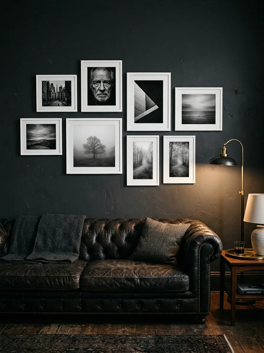
A black and white photography wall brings timeless sophistication to any living room artwork collection, and it works across virtually every interior style. The monochromatic palette removes the complexity of coordinating colors entirely, allowing you to focus purely on composition, scale, and subject variety. Street photography, architectural details, portraits, and nature all coexist beautifully within the same framework.
The secret to a stunning black and white wall is contrast in subject matter paired with consistency in treatment. Mix wide open landscapes with close crop abstract textures. Keep frames identical and mats consistently white or off white. The visual tension between very different subjects, all rendered in the same palette, is precisely what makes the arrangement compelling.
The Key: Contrasting photographic subjects within a single monochromatic palette creates the visual tension that makes a black and white wall genuinely captivating.
09
Woven Tapestry Focal Point
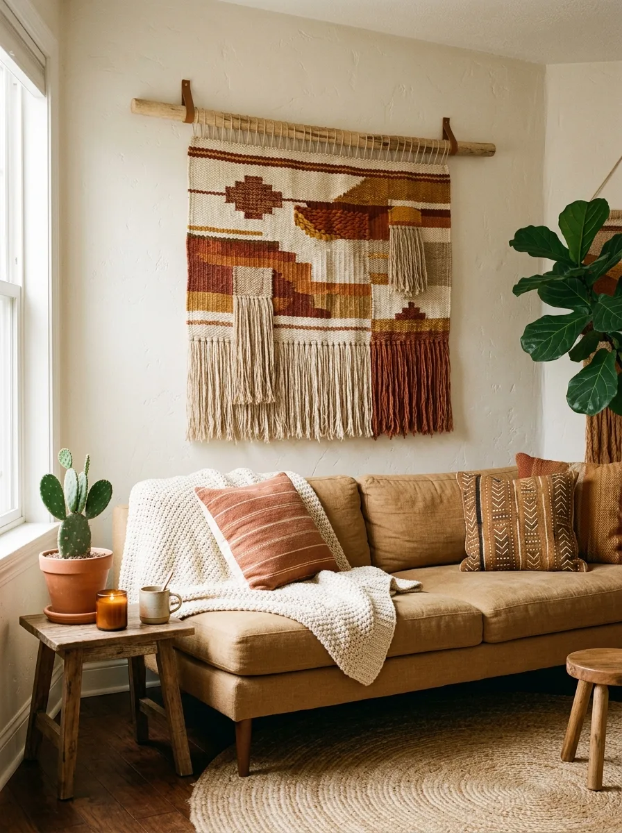
A large handwoven tapestry can single handedly transform a blank wall into the most compelling corner of your room. Unlike framed art, tapestries introduce fiber, movement, and genuine artisanal quality that photographs can only approximate. In my experience, a well chosen tapestry brings warmth to a room faster than almost any other single decor decision.
Hang a tapestry from a raw wooden dowel to preserve its organic aesthetic rather than using traditional curtain hardware. The dowel itself becomes part of the display. Choose a piece whose color palette pulls at least two tones from your existing furniture or rug so the tapestry feels anchored within the room rather than dropped in as an afterthought.
The Key: Pulling two existing room colors into your tapestry choice ensures the piece feels like a natural extension of the room rather than a standalone addition.
10
Floating Shelf Art Vignette
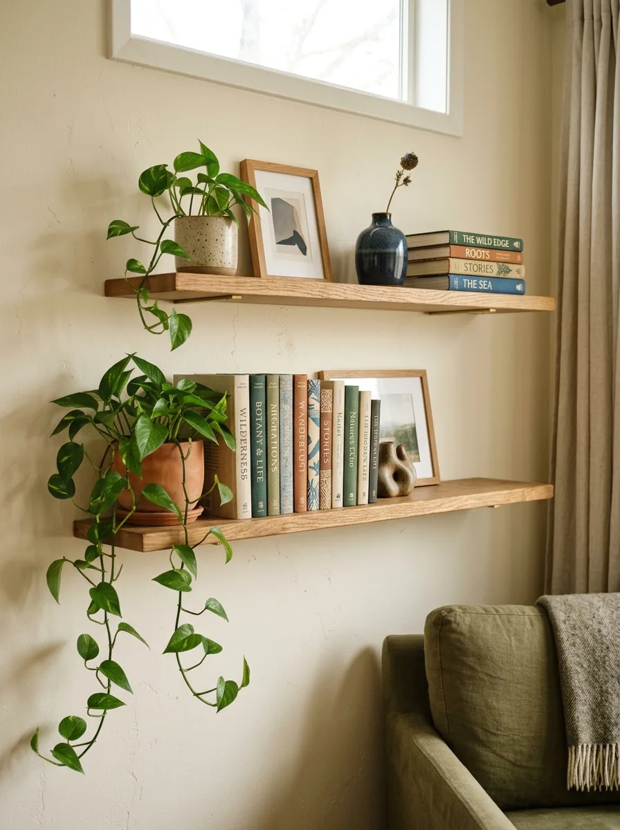
Floating shelves give you the freedom to layer art with objects, books, and plants in a way that feels genuinely personal rather than styled for a catalog. The combination of flat art and three dimensional objects at varying depths creates a vignette quality that is difficult to achieve any other way. Each shelf becomes its own small curated world.
Stagger two shelves at different heights rather than aligning them side by side for a more dynamic display. Vary the height of objects on each shelf so the silhouette created across both levels feels interesting rather than flat. Leave deliberate negative space on each shelf: restraint in shelf styling always reads more intentionally than fullness. For ideas on which plants work best when tucked into shelf displays, our post on houseplant corners in every room is a helpful companion.
The Key: Staggering shelf heights and leaving deliberate negative space on each level creates a vignette wall display that feels curated rather than crowded.
11
Vintage Map Collection
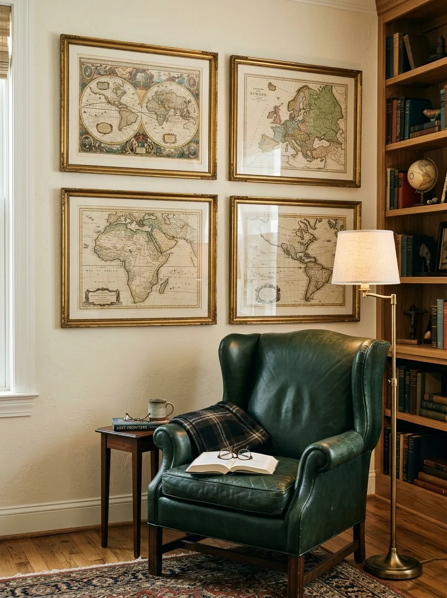
Vintage maps bring a sense of history, curiosity, and worldly sophistication to living room wall decor that no reproduction print can replicate. Whether antique originals or beautifully printed reproductions, maps command attention because they reward close inspection. Every guest finds something new to study each time they look.
Choose maps that connect to places meaningful to you: where you were born, where you honeymooned, cities that changed your perspective. That personal layer transforms a decorative choice into a narrative. Antique gold or aged brass frames reinforce the vintage quality while keeping the overall palette warm and refined.
The Key: Choosing maps tied to meaningful personal locations transforms a wall display from decorative to genuinely narrative and deeply personal.
12
Monochromatic Abstract Series
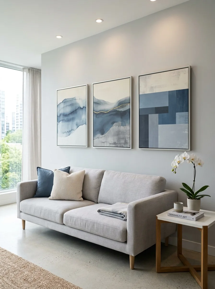
A series of three canvases in the same color family but varying tonal values is one of the most quietly powerful living room artwork ideas a minimalist space can hold. The repetition creates rhythm while the tonal variation within each piece adds enough visual movement to keep things interesting. This approach always looks intentional because it clearly is.
Hang the three canvases in a horizontal line with equal spacing, treating them as one connected piece rather than three separate works. The combined horizontal form echoes the length of a sofa or console table below, reinforcing the visual relationship between the wall and the furniture anchoring it. Vary the brushwork or texture within the series so each canvas rewards individual attention.
The Key: Hanging a tonal series as one connected horizontal form ties the wall display directly to the furniture below, strengthening the overall focal point.
13
Neon Sign With Art Backdrop
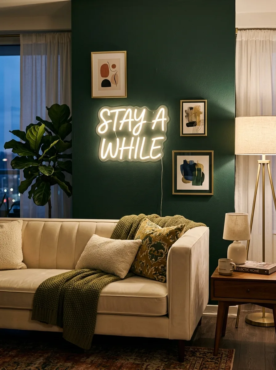
A neon sign used as part of a layered art display, rather than a standalone novelty, elevates the look from trendy to genuinely considered. The key is treating the neon sign as one element within a curated wall composition, not the entire statement. Mount it against a painted wall panel in a deep, saturated color so the sign glows rather than simply hangs.
Warm white or soft amber neon integrates more elegantly into a styled living room than primary colored options. Surround the sign with a few smaller framed prints that complement rather than compete. The result feels editorial and current without sacrificing the warmth the rest of the space works hard to create.
The Key: Mounting a neon sign against a richly painted panel and surrounding it with subtle art transforms it from a novelty into a cohesive focal point element.
14
Framed Fabric and Textile Art
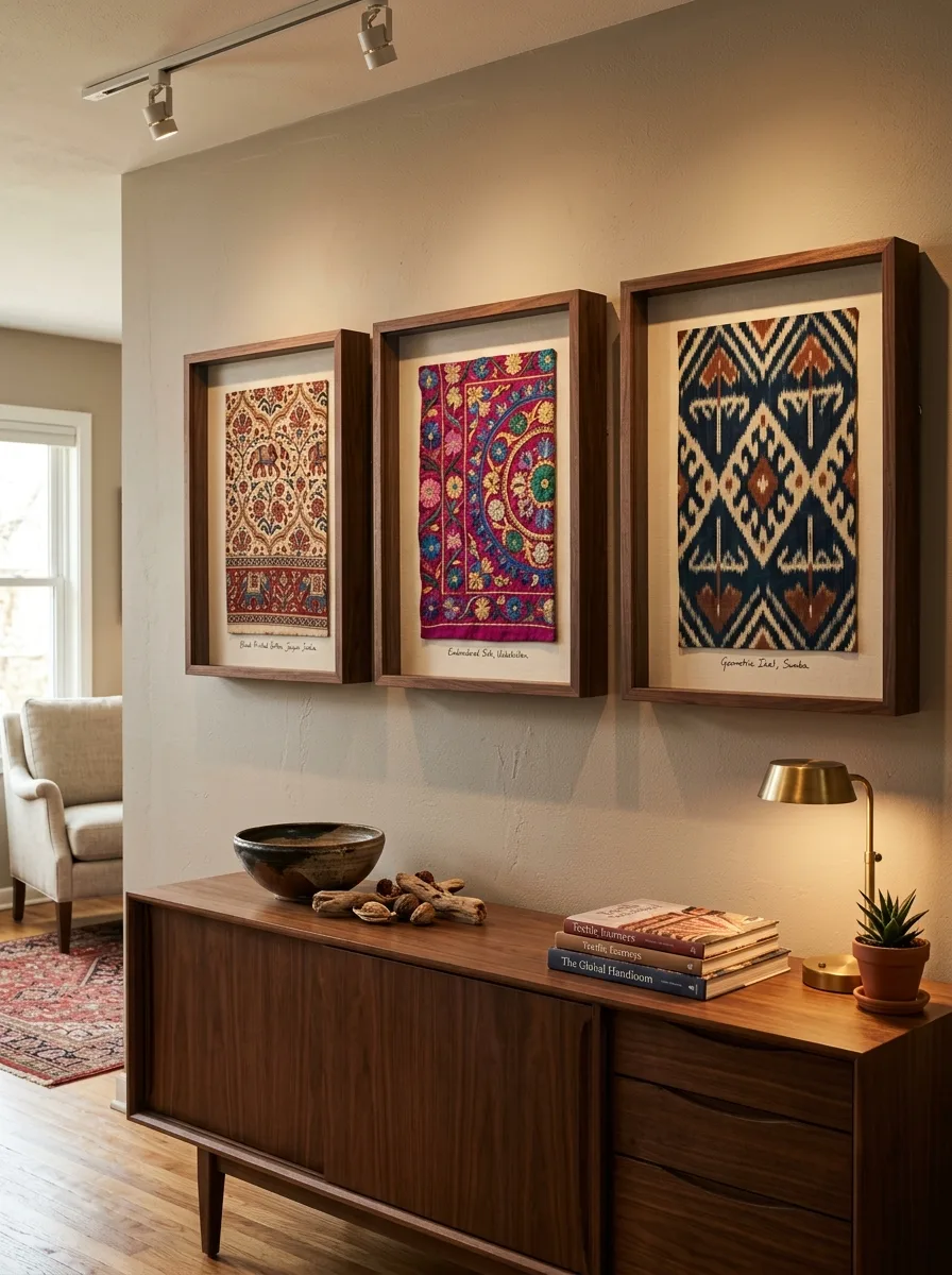
Framing beautiful textiles as wall art is one of those design moves that immediately signals a sophisticated, well traveled eye. A section of hand blocked Indian cotton, a fragment of embroidered silk, or a geometric ikat weave pressed into a deep shadow box becomes genuinely gallery worthy. The fabric introduces pattern, color, and texture simultaneously without overwhelming the room.
Shadow box frames with deep profiles allow the textile to sit slightly raised within the frame, casting a subtle shadow that reinforces its three dimensional quality. Group three framed textiles from a similar cultural origin or color family for a cohesive collected look. Neutral mat colors keep the focus on the fabric rather than the framing.
The Key: Deep shadow box frames let textiles sit raised within the frame, creating subtle dimension that elevates fabric art far beyond standard flat hung prints.
15
Architectural Drawing Collection
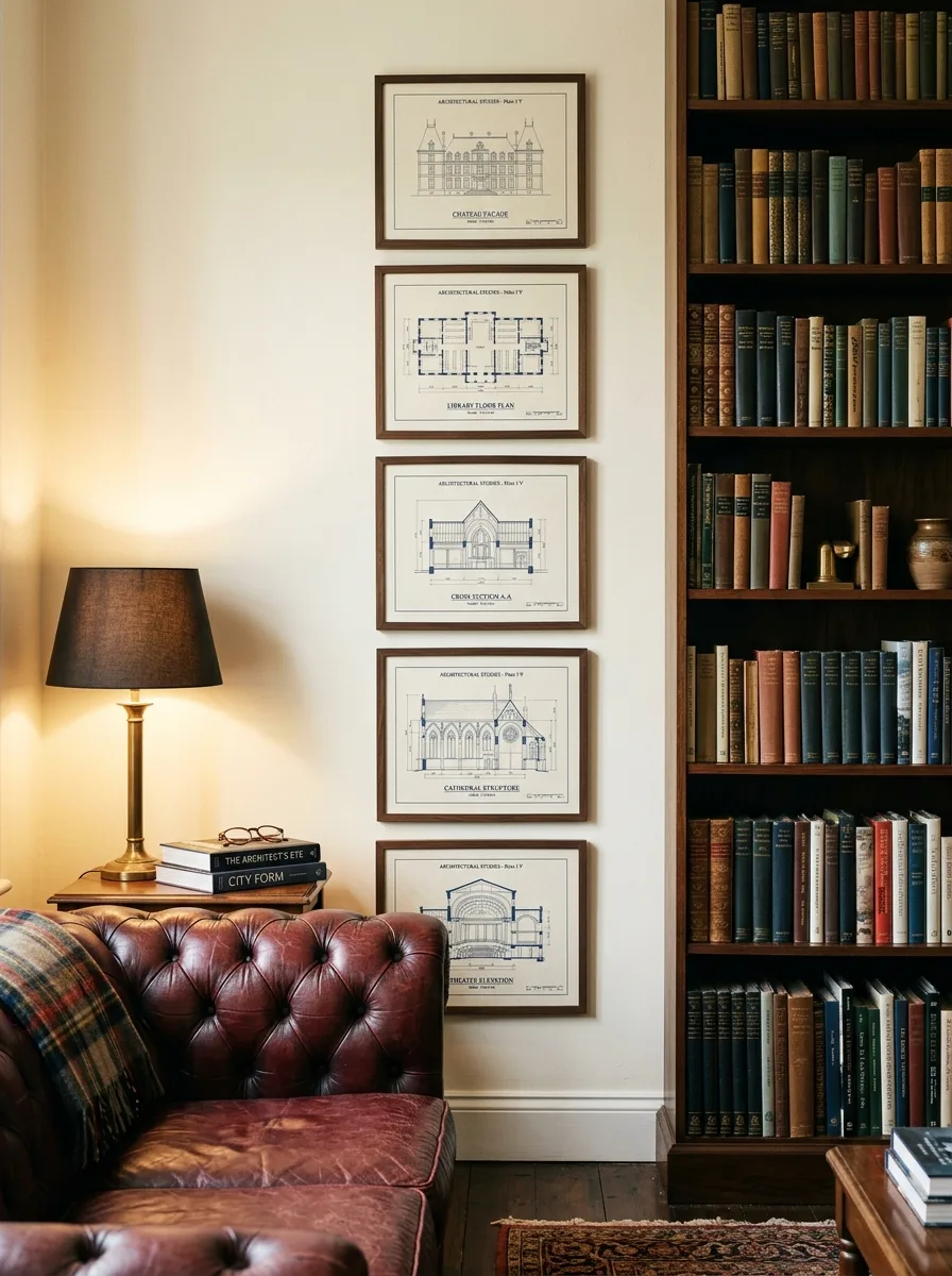
Architectural drawings, blueprints, and technical illustrations make for some of the most underrated living room wall art ideas available to a home decorator. They communicate precision, intelligence, and history in equal measure. When framed consistently and arranged as a deliberate collection, they create a wall display that feels both scholarly and beautifully graphic.
Arrange a vertical column of four or five prints along a narrow wall section beside a bookshelf or fireplace surround. A vertical arrangement draws the eye upward, making ceilings feel taller and the room feel more expansive. Limit the palette to the original blueprint colors: navy, white, and sepia tones that age beautifully over time.
The Key: Arranging architectural prints in a vertical column rather than a horizontal cluster draws the eye upward and makes any ceiling feel dramatically taller.
16
Color Blocked Panel Art
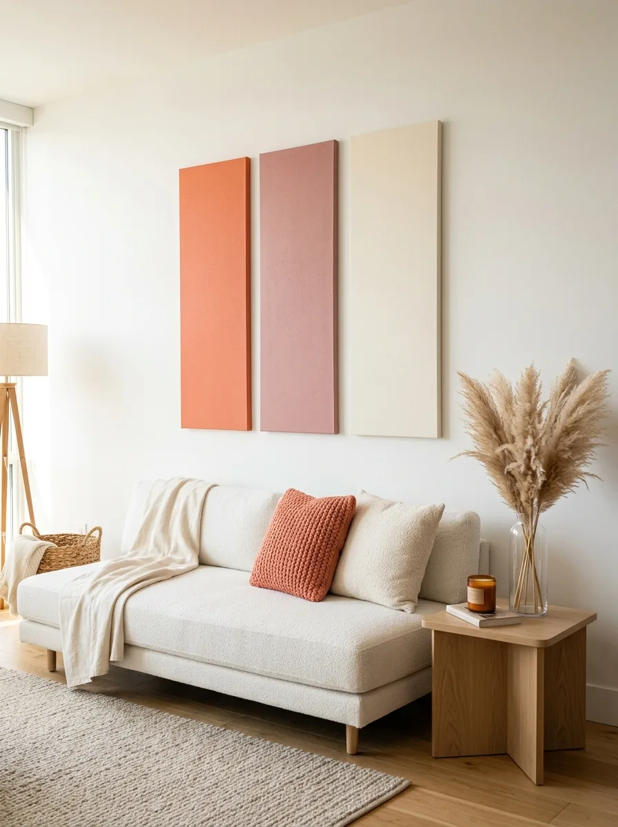
Solid color blocked panels hung as a triptych deliver maximum visual impact with absolute minimum complexity. Three tall, narrow canvases in a deliberate color sequence pull from the room’s existing palette while introducing the kind of graphic boldness that a room with restrained furniture often needs. The simplicity of the execution makes the color choices themselves the entire statement.
Space the panels closely, with no more than two inches between each canvas, so they read as one connected horizontal composition rather than three separate pieces. Pull the chosen colors directly from existing cushion, rug, or upholstery tones to ensure the wall display integrates rather than interrupts. Slight tonal variation across the three panels adds movement while preserving the clean graphic quality.
The Key: Spacing color blocked panels closely so they read as a single composition creates graphic impact without the visual complexity of mixed subjects or styles.
17
Nature Inspired Branch Installation
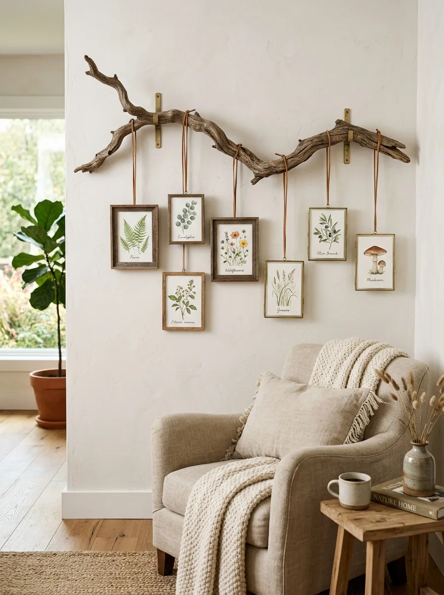
Mounting a naturally dried branch on the wall and hanging small framed prints from it blurs the boundary between art installation and living decor in the most satisfying way. It is one of those wall art for living room ideas that looks complex but requires very little beyond a beautiful branch and the confidence to commit to something unexpected. The organic material instantly softens any room it enters.
Choose a branch with gentle curve and natural character rather than one that looks overly uniform. Hang between three and five small prints from leather cord or thin jute twine at varying heights, creating a cascading mobile like effect. The negative space between hanging prints is as important as the prints themselves.
The Key: Varying the drop length of each hanging print below the branch creates a cascading rhythm that makes the installation feel alive and genuinely organic.
18
Personal Photo Story Wall
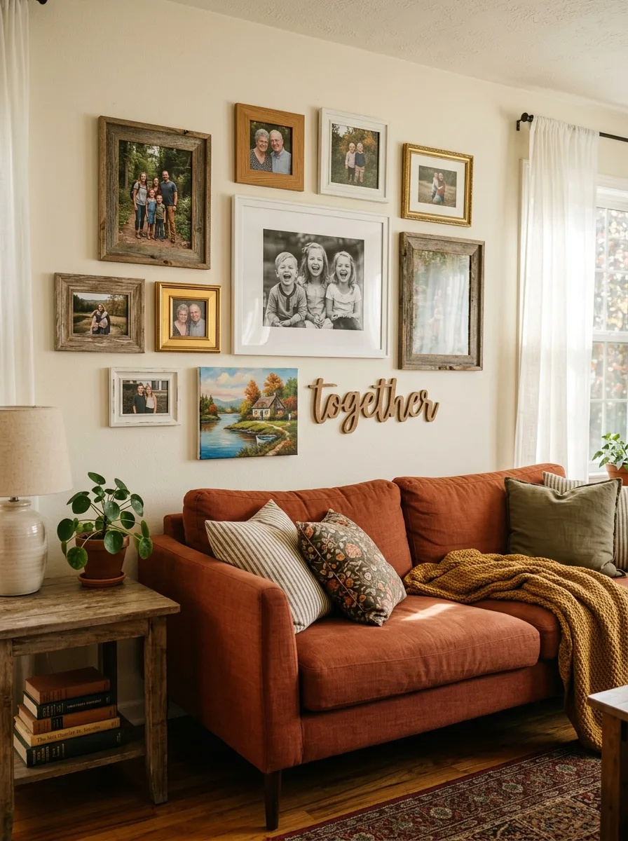
A personal photo wall done well is one of the most deeply satisfying forms of living room wall decor because it turns a room into a true reflection of the people who live in it. The mistake most people make is framing everything in the same format, which creates a flat, uniform result. The magic happens when you mix photo sizes, frame styles, and non photo elements into a single cohesive story.
Anchor the arrangement with one or two large prints at the center, then build outward with smaller images. Include at least one non photo element: a small hand lettered art piece, a painted canvas, or a meaningful object framed as art. Limit the frame palette to two or three complementary finishes to prevent the personal warmth from tipping into visual chaos.
The Key: Including at least one non photo element within a personal photo arrangement elevates it from a family bulletin board to a genuine curated wall display.
19
Vertical Triptych Landscape
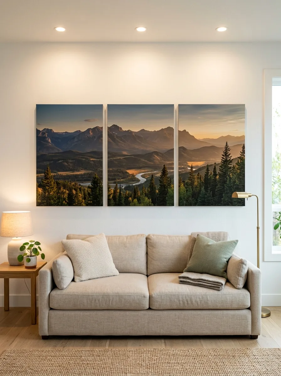
A single panoramic image split across three vertical canvases creates an effect that is far more dramatic than the same image printed on one canvas. The slight separation between panels introduces graphic rhythm while allowing the full image to breathe and expand across the wall. Landscape photography works especially well because the horizontal sweep of the subject reinforces the width of the furniture below.
Choose a subject with strong tonal contrast: dramatic mountain ridges at golden hour, a coastal horizon at dawn, or an architectural skyline at dusk. The image should carry enough visual information in each individual panel to reward close inspection, while reading as a complete unified scene from a seated viewing distance.
The Key: Choosing a landscape with strong horizon lines ensures each panel of a split triptych reads as complete on its own while contributing to the full panoramic story.
20
Abstract Line Drawing Series
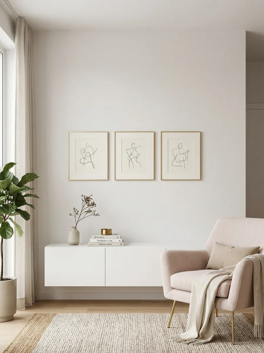
Minimalist abstract line drawings carry an elegance far disproportionate to their visual simplicity. Three small pieces in thin gold or brass frames, arranged in a tight horizontal row at eye level, create a quietly refined focal point that suits contemporary and transitional rooms equally well. The restraint in the artwork itself allows the composition and framing to do the work.
Look for line drawings with a single continuous gesture, human form, botanical outline, or architectural sketch. Avoid anything too detailed, since the power of this format lies in what is left empty rather than what is rendered. The negative space within the art echoes the clean white wall around it, making the entire wall feel intentionally designed.
The Key: Line drawings succeed through restraint the empty space within the image is just as important as the drawn line itself in creating visual elegance.
21
Layered Ledge Art Display
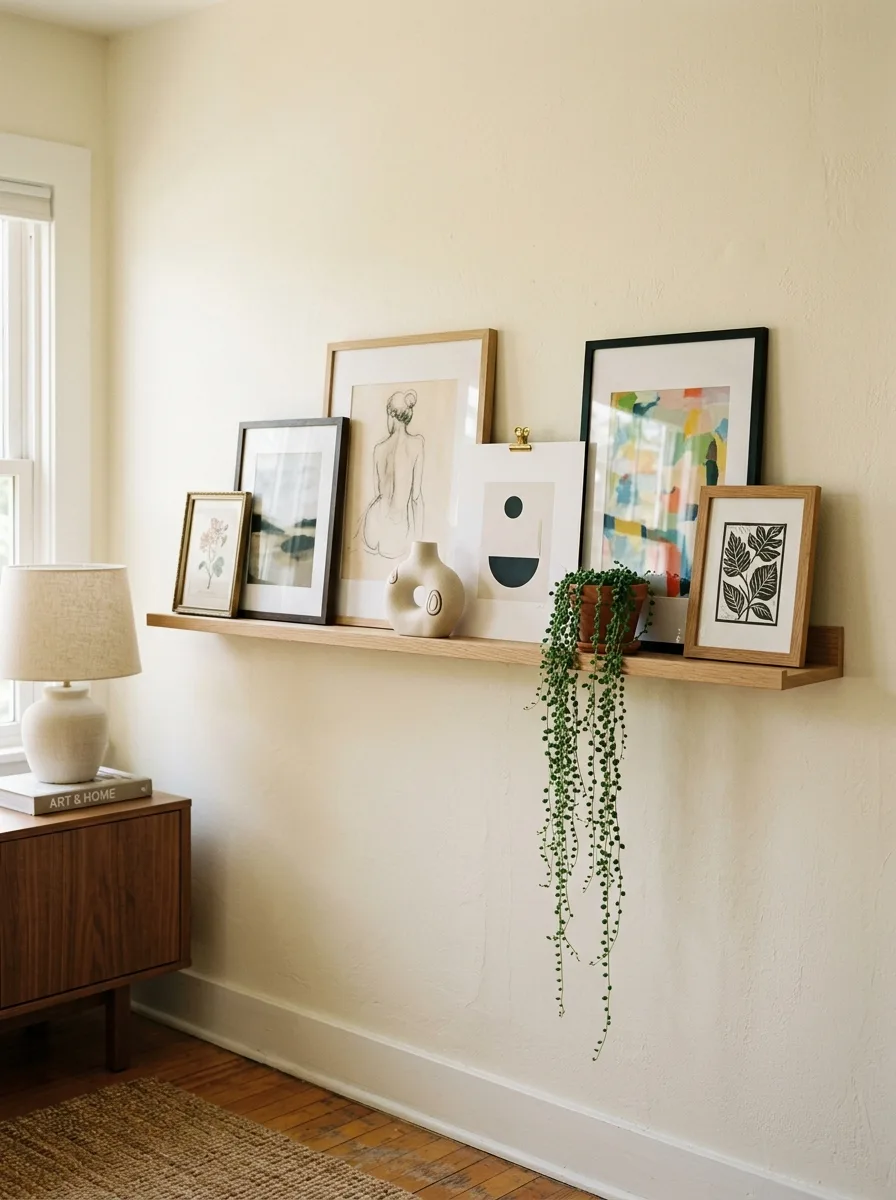
A picture ledge shelf transforms wall art from a fixed commitment into a living, ever evolving display. Prints lean casually rather than hanging rigidly, which means you can rotate artwork seasonally, rearrange the composition whenever the mood strikes, and add new pieces without ever reaching for a hammer. In my experience, this is the format that gets updated most often because it is simply the easiest to change.
Layer prints of deliberately varied sizes so some lean against others, creating depth across the ledge. Mix at least one plant element and one small sculptural object into the lineup so the ledge reads as a vignette rather than a simple shelf of frames. Repeat a common color thread across three pieces minimum to anchor the rotating display visually.
The Key: Repeating one color across at least three pieces on a picture ledge provides the visual anchor that keeps a casually layered display feeling deliberately cohesive.
There is something deeply satisfying about standing back from a wall you have just styled and feeling like the room finally makes sense. The ideas in this guide are proof that great living room wall art ideas are not about spending more or collecting more, but about composing more thoughtfully. Whether you went straight for the oversized canvas anchor or fell in love with the layered ledge display, the real goal is a wall that reflects who you are and gives your room the focal point it has always deserved.
Save this post to your Pinterest boards so you can come back to it when you are ready to tackle the next blank wall in your home. Every room has at least one space that is waiting for this kind of attention, and now you have 21 different directions to take it. Share this with a friend who is standing in front of a bare wall right now, wondering where to even begin. The best focal points are the ones you build with intention, and those always start with a single great idea.