Warm Neutral Kitchen Color
🏠 21 Real Ideas
⏱ Quick Read
🔥 Always Trending
21 Warm Neutral Kitchen Color Ideas
That Always Feel Right
There’s a particular kind of calm that washes over you when you walk into a kitchen that just feels right. Not loud, not cold — simply warm and alive. The secret? Almost always comes down to the right kitchen color ideas. Warm neutrals have a quiet power: they make small kitchens feel spacious, busy kitchens feel grounded, and everyday moments feel a little more beautiful. Once you find your palette, everything else falls into place.
In this guide, you’ll find 21 carefully curated kitchen colors and styling ideas that go far beyond beige. Whether you’re renovating or just refreshing a few details, these warm neutral kitchen tones are practical, timeless, and endlessly photogenic. Each idea comes with real advice on how to use it, not just what it looks like. Read on — your dream kitchen palette is closer than you think.
01
Creamy White With Wood Accents
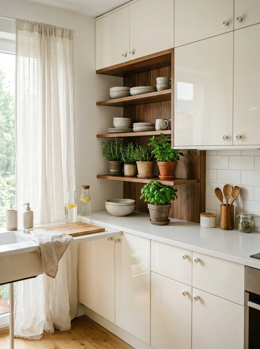
Creamy white is the ultimate neutral and when paired with warm wood accents, it transforms from plain to deeply beautiful. I have noticed that homes with cream and wood kitchens always feel lived in and loved. The key is choosing a white with yellow or beige undertones, not blue. That small shift makes the entire space feel softer and more welcoming.
Think walnut floating shelves above a cream island, a butcher block countertop beside white shaker cabinets, or a honey oak floor beneath all cream cabinetry. The contrast adds warmth without adding color. This combination photographs beautifully too, which is why it’s one of the most pinned kitchen colors of the last five years.
The Key: Cream works best when paired with warm toned wood, not cool grey that subtle contrast is what makes the kitchen feel rich and grounded.
02
Greige Cabinetry and Stone Counters
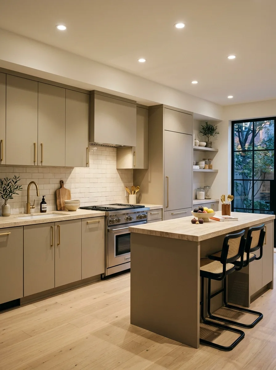
Greige the perfect blend of grey and beige is one of the most versatile best colors for kitchen spaces today. It reads sophisticated without feeling cold. Paired with honed travertine or limestone countertops, greige cabinetry becomes a true design statement. I have seen this combination hold its appeal across farmhouse, modern, and transitional kitchens alike.
The real magic of greige is its flexibility. Under warm lighting, it leans sandy and cozy. Under cool daylight, it sharpens into something more architectural. Pair it with brushed gold hardware and a soft off white backsplash, and you’ve created a kitchen color that looks like it belongs in a design magazine without the magazine budget.
The Key: Greige is the neutral that never fights with anything it unifies bold elements like dark hardware or patterned tile without competing with them.
03
Soft Sage Green Walls
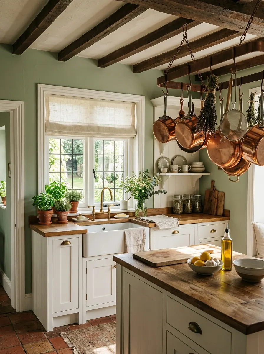
Soft sage green is having a well deserved moment and for good reason. It brings nature indoors without overwhelming the space. Unlike bold greens, sage is gentle enough to let other elements shine: timber beams, white trim, copper fixtures. It’s one of those warm kitchen tones that makes guests stop and say “I love your kitchen.” Every. Single. Time.
Sage works beautifully as a wall color when cabinetry stays light. Try white shaker cabinets with sage walls and a cream linen backsplash. Or go bolder: sage on the island only, white on perimeter cabinets. Either way, the herbal calm this color brings to a kitchen is genuinely mood lifting it’s practical color therapy you can cook in.
The Key: Sage green connects the kitchen to nature without the commitment of a dark botanical green a perfect middle ground for first time color adopters.
04
Warm Taupe on Every Surface
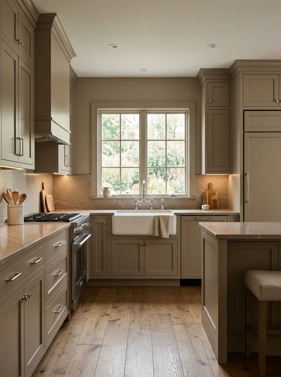
A tonal taupe kitchen where the walls, cabinets, and countertops all live in the same warm family creates one of the most calming rooms imaginable. The secret to pulling it off is varying the texture, not the color. Matte cabinets, honed countertops, and glazed backsplash tile all look different even when they’re the same neutral family.
Taupe on taupe reads luxurious rather than flat when you layer materials thoughtfully. Add a white farmhouse sink for crisp contrast, or bring in a warm brass faucet to introduce a single metallic accent. The result is a kitchen that feels both designer curated and completely liveable the dream combination in any neutral palette.
The Key: Monochromatic taupe kitchens succeed through texture variation smooth, rough, matte, and sheen surfaces turn one neutral into a rich, layered story.
05
Buttery Yellow Cabinet Doors
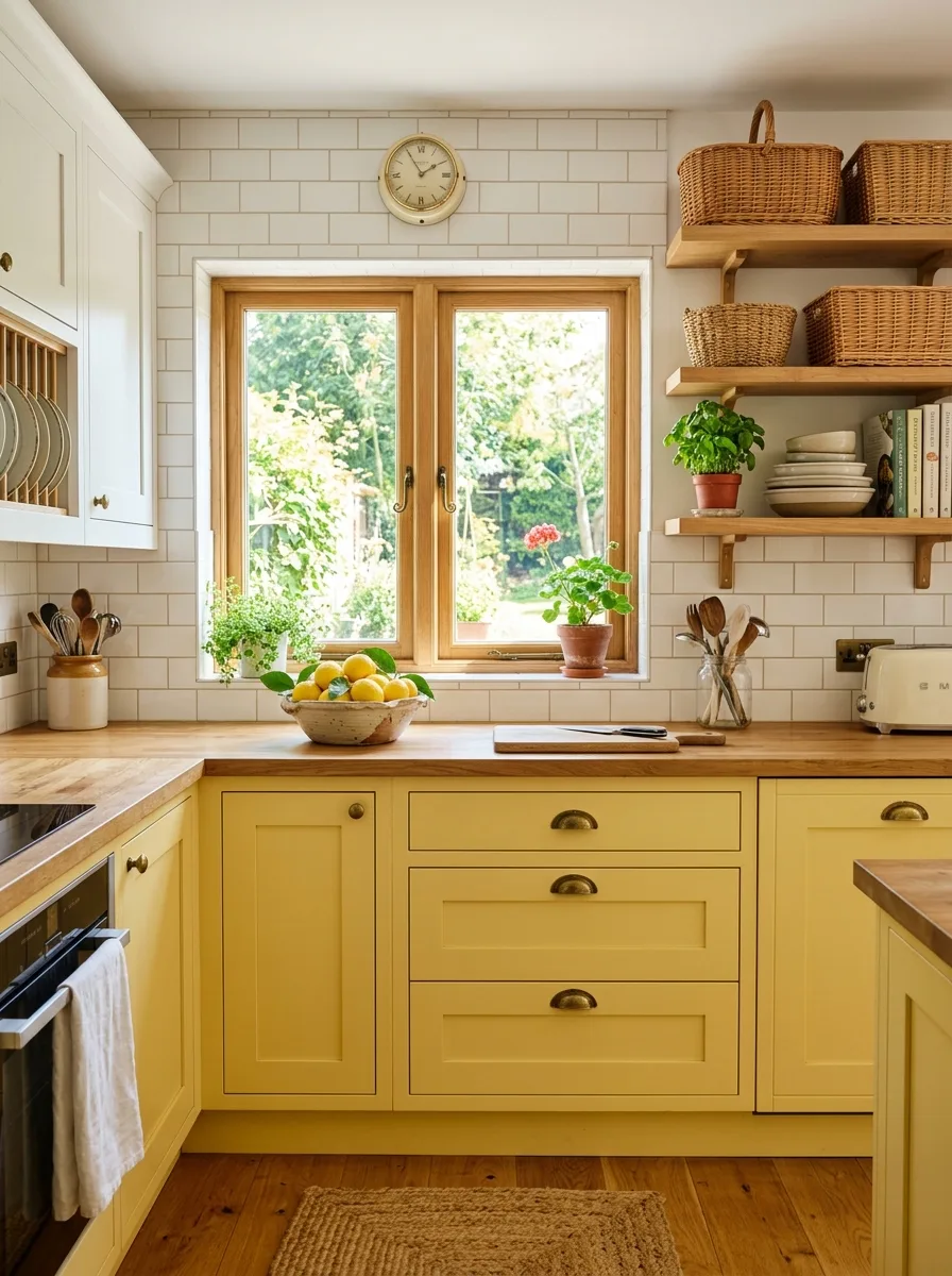
Butter yellow is the warmest kitchen cabinet color that still reads as neutral. It’s not paint box yellow it’s the soft, creamy warmth of afternoon sunlight. Used on lower cabinets with white uppers, it feels balanced and cheerful without tipping into retro territory. It’s one of those kitchen color ideas that surprises people: warm, bright, and infinitely charming.
Pair butter yellow with aged brass or unlacquered brass hardware for an old world richness that feels lived in. A white subway tile backsplash keeps things fresh and clean. Add a natural wood countertop and you’ve created a kitchen that feels like the heart of a real home welcoming, textured, and full of warmth even when nothing is cooking.
The Key: Butter yellow works hardest in kitchens with abundant natural light in dim spaces, it can shift muddy. Test in your actual light before committing.
06
Terracotta Tile and Neutral Walls
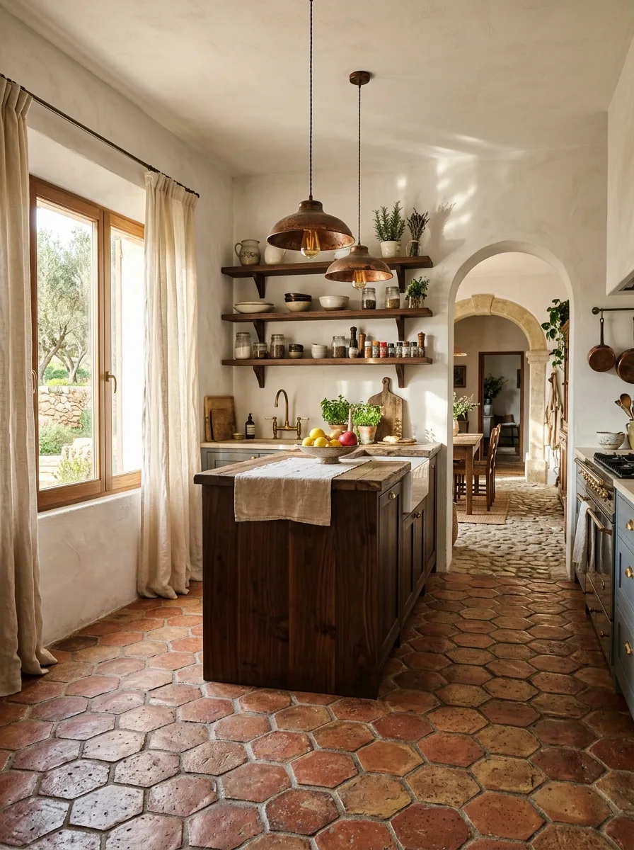
Terracotta tile is one of the oldest and most beloved kitchen elements and it’s back with full force. Used on the floor beneath neutral walls and cream cabinetry, terracotta provides all the warmth your kitchen needs without a single drop of paint. The handmade, irregular surface catches light beautifully and improves with age.
In my experience, terracotta floors pair best with walls in plaster white or soft greige colors that don’t compete with the tile’s natural warmth. Dark walnut shelves and copper or bronze fixtures complete the Mediterranean look. It’s a kitchen that feels like it has a history, and that kind of authenticity is worth every compliment you’ll receive.
The Key: Terracotta ground the kitchen in earth toned luxury all other elements should stay quieter so the tile gets to be the star of the space.
07
Linen White Upper Cabinets
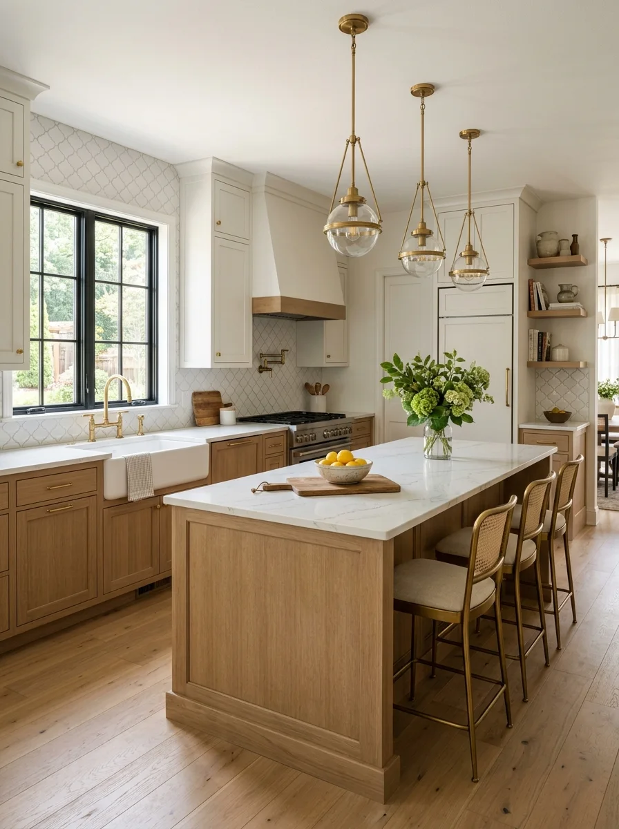
Linen white sits between crisp white and warm cream and that middle ground is exactly where kitchens look most effortlessly beautiful. It never feels stark under bright light, and it never turns yellow under warm bulbs. As part of a two tone cabinet scheme, linen uppers over wood toned lowers create one of the most balanced neutral kitchen palettes available.
The combination of airy upper cabinets and grounded lower ones gives the kitchen visual balance: lightness up top, warmth down below. Add an arabesque or subway backsplash tile in soft white, and the kitchen gains texture without gaining complexity. It’s a design formula that works in a 100 square foot galley and a 600 square foot open kitchen alike.
The Key: Two tone cabinets with linen uppers create natural visual separation upper lightness lifts the ceiling, lower warmth grounds the room.
08
Dusty Rose Accents on Neutral
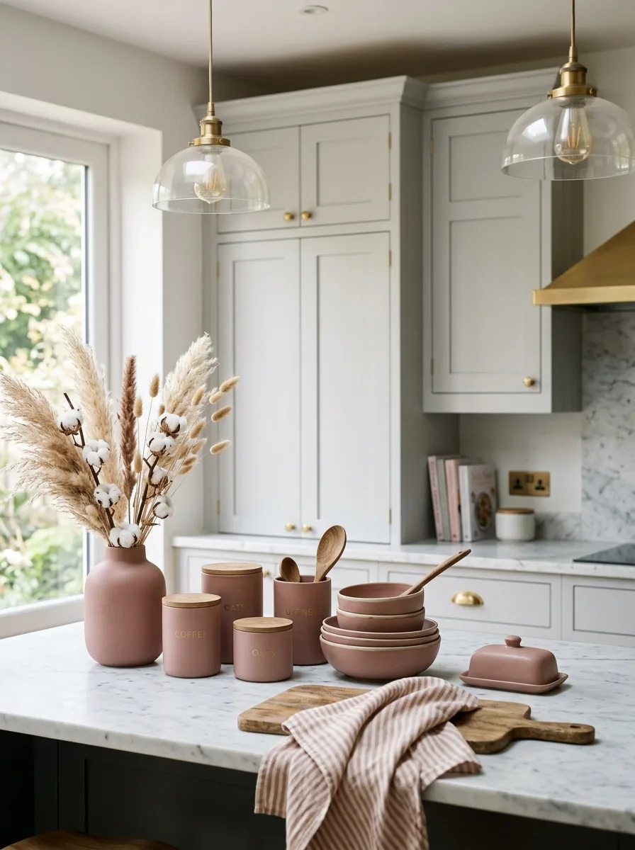
Dusty rose might seem like a bold move in the kitchen but used as an accent against pale grey or greige cabinetry, it becomes something quietly sophisticated. It’s not pink; it’s blush with maturity. A few dusty rose ceramics, a linen runner in the right shade, or even rose toned pendant shades can shift a neutral kitchen from pleasant to genuinely beautiful.
The key is restraint: let the cabinetry be the foundation and allow the dusty rose to be the conversation. A bowl here, a canister there, pampas grass in a blush vase. Layer it with gold or warm brass hardware and the result feels editorial rather than sweet. I have seen this work in contemporary kitchens as beautifully as in cottage style ones.
The Key: Dusty rose only works as an accent never as the dominant color against cool neutrals like grey or warm ones like greige.
09
Kitchen Color Ideas With Dark Floors
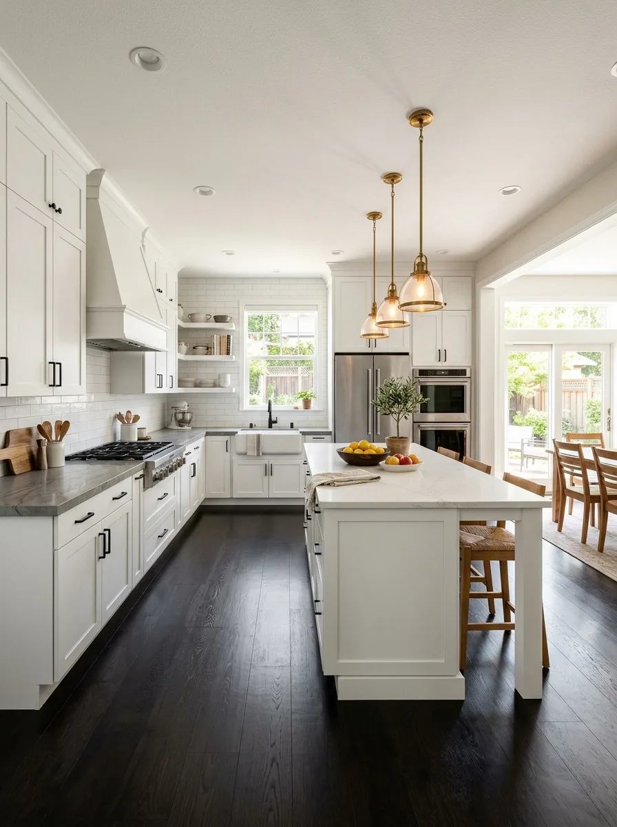
One of the most underrated kitchen color ideas is pairing light neutral cabinetry with dark floors. The contrast grounds the space without making it heavy because all that lightness overhead keeps things feeling open. White shaker cabinets over ebony or dark walnut floors create a kitchen that looks intentional, curated, and endlessly elegant.
Dark floors are also incredibly practical: they hide everyday dirt, scratches, and the inevitable spilled coffee far better than light toned wood. For the countertop, choose something in the middle warm grey quartz or pale marble to bridge the two extremes. This tonal bridge is what keeps the kitchen from feeling too stark or too divided.
The Key: Dark floors with light cabinets create drama through contrast the countertop is the mediator that ties both worlds together into one cohesive palette.
10
Aged Brass Hardware and Cream
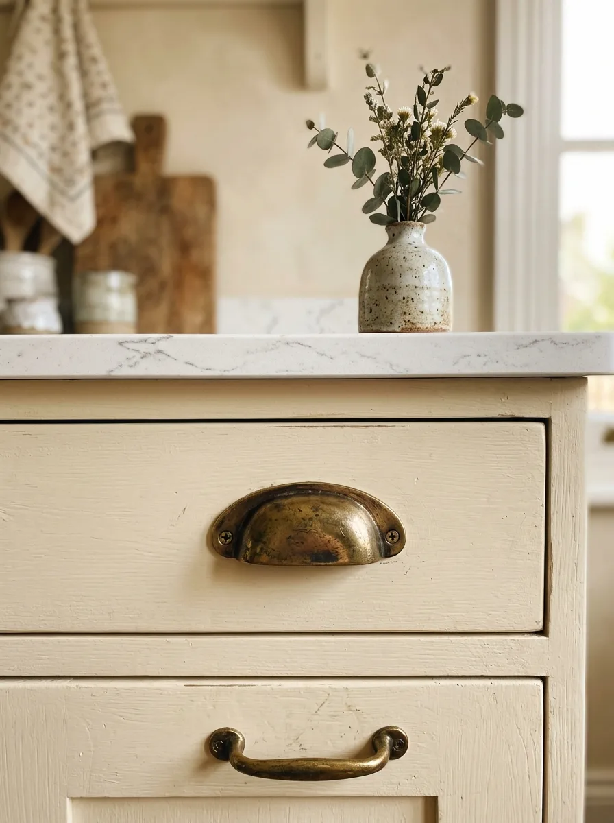
Hardware is the jewellery of the kitchen and aged brass is the heirloom piece that makes everything else look better. On cream cabinetry, unlacquered brass hardware creates an antique warmth that no other metal finish achieves. The natural patina that develops over time only makes it more beautiful, which is rare in a world of things that just wear out.
Cup pulls on drawers, small knobs on upper doors, a brushed brass faucet over the sink these small decisions accumulate into a kitchen that feels thoughtfully built. The cream provides the quiet backdrop, and the brass provides the story. Together they create one of the most timeless kitchen colors combinations in residential design.
The Key: Hardware finish sets the era and personality of the kitchen unlacquered brass says heirloom; brushed gold says modern luxury; matte black says contemporary.
11
Limewash Walls for Texture
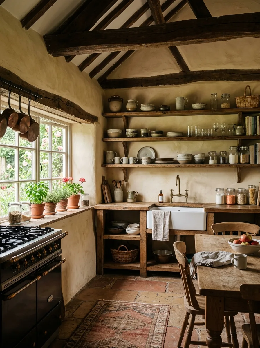
Limewash paint adds something that no standard paint can: depth. The naturally varying finish creates a soft, cloudy texture that shifts in different light warmer in the morning, cooler at dusk. Applied to kitchen walls in warm ochre or ivory tones, limewash transforms the entire room into something that looks centuries old in the best possible way.
It pairs beautifully with exposed wooden beams, reclaimed open shelves, and white ceramic sinks. The imperfection is the point it brings a handcrafted, artisan quality to the space that manufactured finishes can never replicate. If you’re looking for a best colors for kitchen walls that photograph magnificently, limewash in warm ivory or sand is your answer.
The Key: Limewash creates warmth through texture, not just color its tonal variation catches light in ways flat paint simply cannot.
12
Muted Olive as Island Color
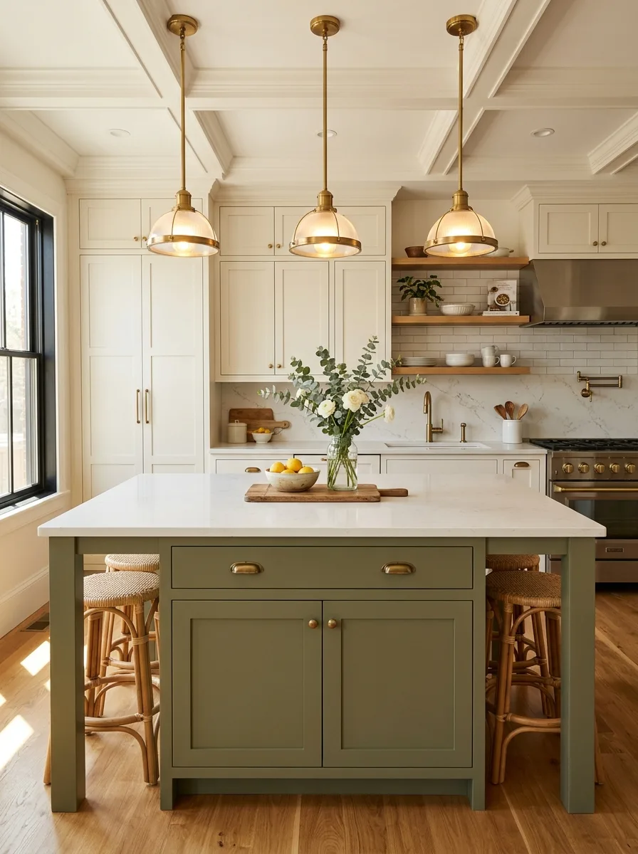
A muted olive island is one of the most compelling ways to add color to a neutral kitchen without overwhelming it. Against white perimeter cabinets, olive reads earthy and sophisticated a nature inspired neutral that grounds the entire room. It’s a color that photographs beautifully on Pinterest and feels even better in person.
The island’s warm olive tone connects to the hardwood floor, creating a natural vertical flow from ground to counter. Brass pendant lights amplify the warmth, while white upper cabinetry keeps the room feeling bright. I have seen this color combination create genuinely stunning kitchens in both compact apartments and large family homes.
The Key: A colored island works best when the rest of the kitchen stays neutral the island becomes the focal point, the hero, the room’s defining feature.
13
White Brick Backsplash Warmth
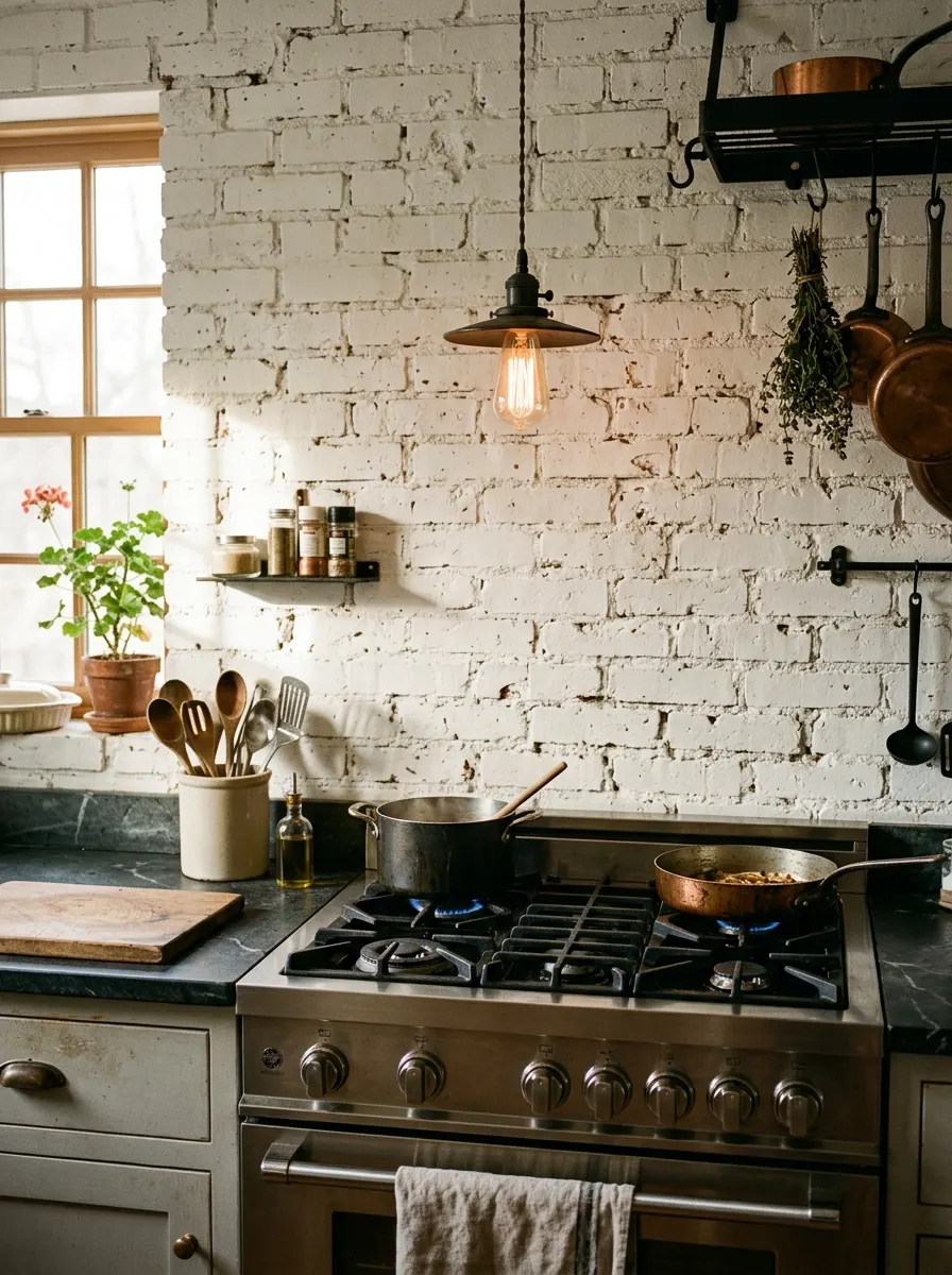
Exposed brick brings something irreplaceable to a kitchen: texture, history, and warmth baked into the actual structure of the room. Painted white, brick softens from industrial to farmhouse chic. The slight variation in the mortar lines and brick faces catches light beautifully, creating a backsplash that no tile can quite replicate.
Behind a gas range, white brick creates an architectural backdrop that turns cooking into a visual experience. Grey soapstone countertops alongside the brick add another layer of natural material organic and understated. This combination belongs among the most character rich warm kitchen tones palette approaches because it earns its warmth through material, not just color.
The Key: White painted brick adds depth through texture that flat tile simply cannot match perfect for kitchens that want warmth without heavy color.
14
Warm Grey Quartz Countertops
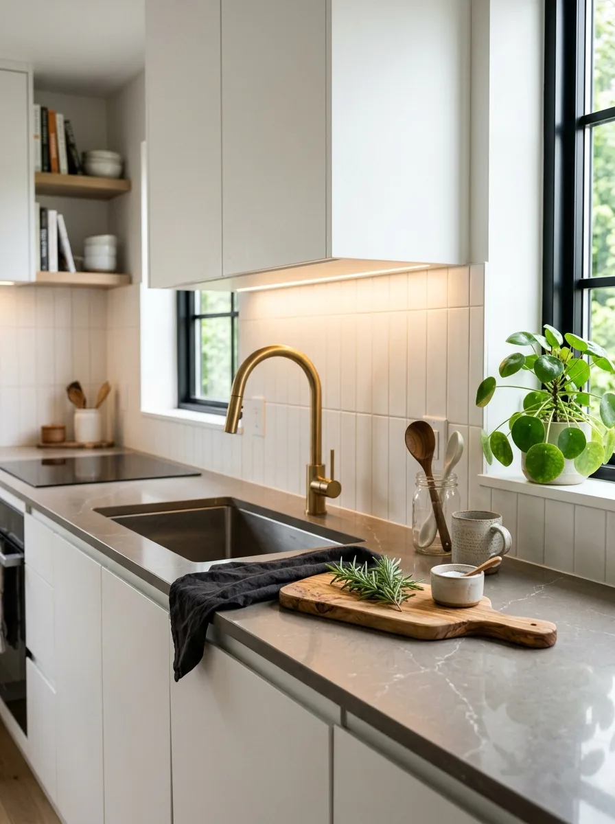
Grey quartz isn’t all cold and clinical the warm toned varieties with ivory, beige, or sand undertones bring quiet richness to a kitchen counter. They’re the workhorse surfaces of interior design: beautiful, durable, non porous, and endlessly flexible. I have noticed that warm grey quartz makes even basic white cabinetry look more expensive.
Pair warm grey quartz with a brushed gold faucet and white cabinets, and the kitchen immediately reads upscale. For even more timeless kitchen inspiration, explore these Italian Tuscan kitchen ideas. The quartz becomes the unifying neutral that connects hardware, cabinetry, and backsplash without ever drawing attention to itself, and that quiet confidence is exactly what great design looks like.
The Key: Warm grey quartz is the universal countertop it connects cool and warm elements in one surface, making mixed metal and two tone kitchens look intentional.
15
Wicker and Rattan Cabinet Inserts
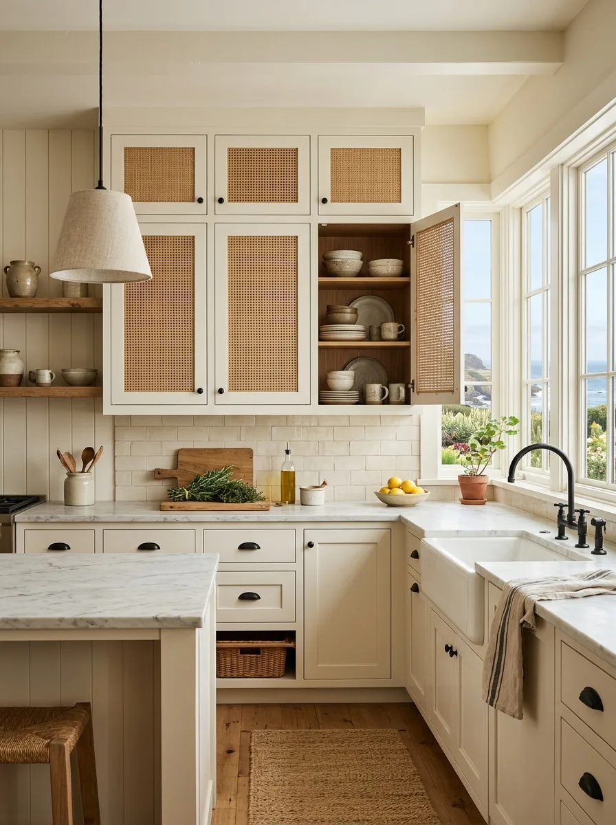
Wicker and rattan cabinet inserts are one of the most creative ways to add warmth and texture to kitchen cabinetry without repainting or replacing. Swapping out flat upper cabinet door panels for woven rattan inserts takes about a weekend and transforms the kitchen’s personality entirely from ordinary to coastal farmhouse effortless.
The open weave lets cabinet interiors peek through, which encourages curated, beautiful storage rather than hidden chaos. Stack white dishes, linen napkins, or simple glassware behind the rattan. The organic texture pairs naturally with all the warm neutrals cream, greige, taupe, sage making rattan inserts one of the most versatile styling moves in this guide.
The Key: Rattan inserts work best on upper cabinets only on lowers, the practical demands of regular handling make the woven panels wear out too quickly.
16
Sand Plaster Ceiling Finish
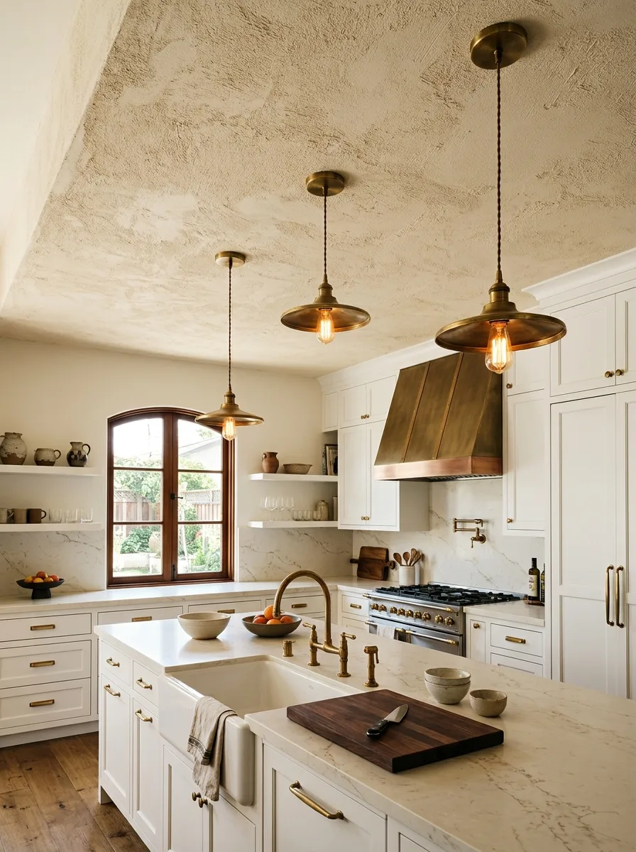
Most people forget the ceiling exists in kitchen design and that oversight leaves one of the best surfaces for adding warmth completely untouched. A sand plaster or Venetian plaster ceiling finish in warm ivory or soft white adds architectural texture that diffuses light beautifully, making the whole room feel warmer without a single change to the walls or cabinets.
Under warm pendant lights, a plaster ceiling glows rather than glares. It adds a finish quality that’s almost hotel like elevated without being fussy. Pair it with antique brass light fixtures and warm white cabinetry and the kitchen achieves a cohesion that comes from treating every surface ceiling included as part of the kitchen color ideas palette.
The Key: The ceiling is the fifth wall a textured warm plaster finish there elevates the entire kitchen without touching a single cabinet or countertop.
17
Honey Oak Floors, Light Cabinets
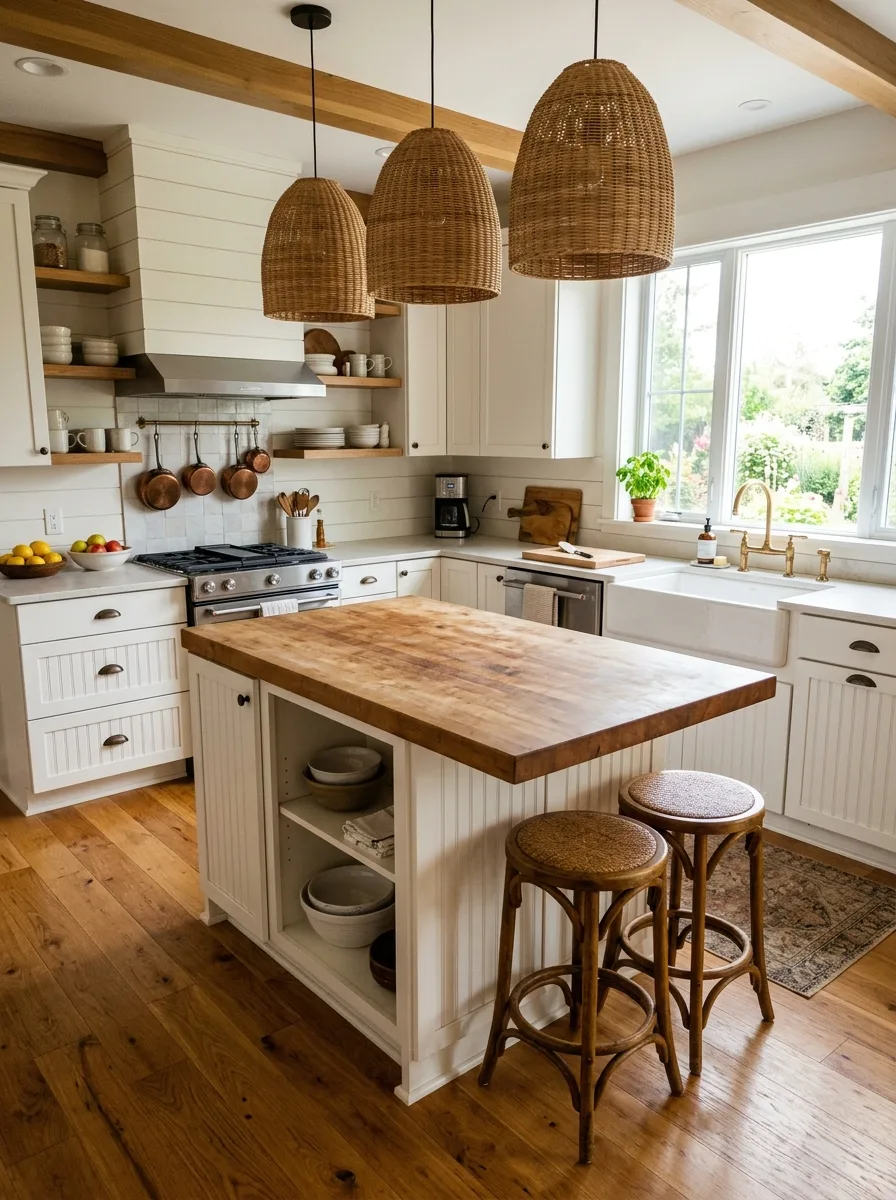
Honey oak floors fell out of fashion for a while, but they’re back and this time, paired with light cabinetry instead of matching oak everything, they look completely fresh. The warm amber of honey oak against white beadboard or cream shaker cabinetry creates a kitchen color ideas pairing that is timeless, practical, and deeply welcoming.
The wood floor brings warmth to the foundation, and the light cabinetry keeps everything bright above. Add a butcher block island for extra wood warmth and the kitchen ties together organically all natural, all honest, all beautiful. This is the kind of kitchen that feels like a Sunday morning, regardless of what day you’re actually standing in it.
The Key: Honey oak floors need light, not matching, cabinetry the old mistake was pairing honey oak with oak cabinets, which read as a single heavy wooden mass.
18
Soft Black on Lower Cabinets
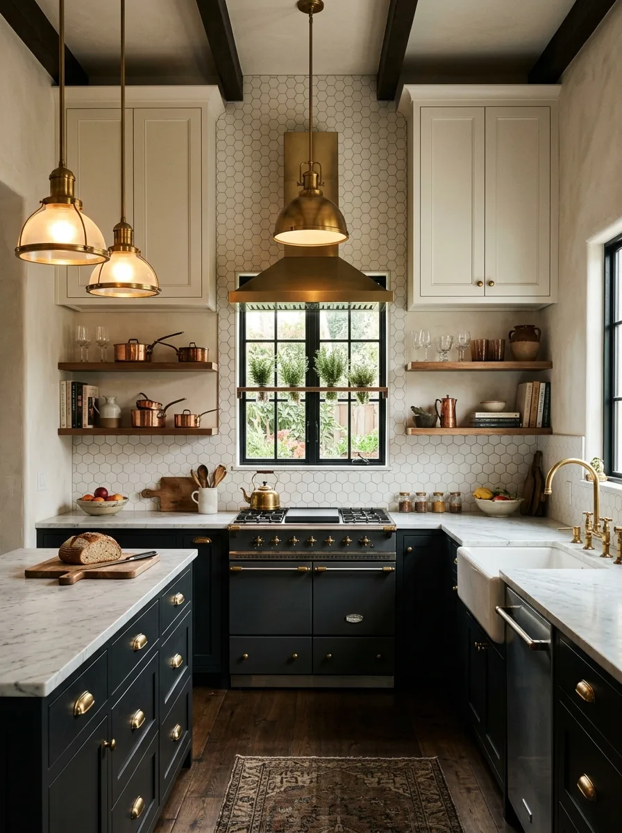
Soft black think charcoal, near black, or deep graphite on lower cabinets creates extraordinary visual drama when paired with white uppers. It’s the most sophisticated two tone kitchen combination available, and it works in everything from tiny city kitchens to grand open plan homes. The contrast is the design: controlled, intentional, and very high impact.
Warm brass or gold hardware on the black lower cabinets prevents the palette from reading cold or harsh. White marble countertops bridge the dark below and light above, making the transition feel luxurious. The warmth here comes from material choice and metal finish, not from color proving that even a near black kitchen can belong firmly in the neutral kitchen palette category.
The Key: Soft black works as a warm neutral when paired with the right metals brass and gold keep it from feeling cold; chrome and nickel make it stark.
19
Whitewashed Brick or Stone Walls
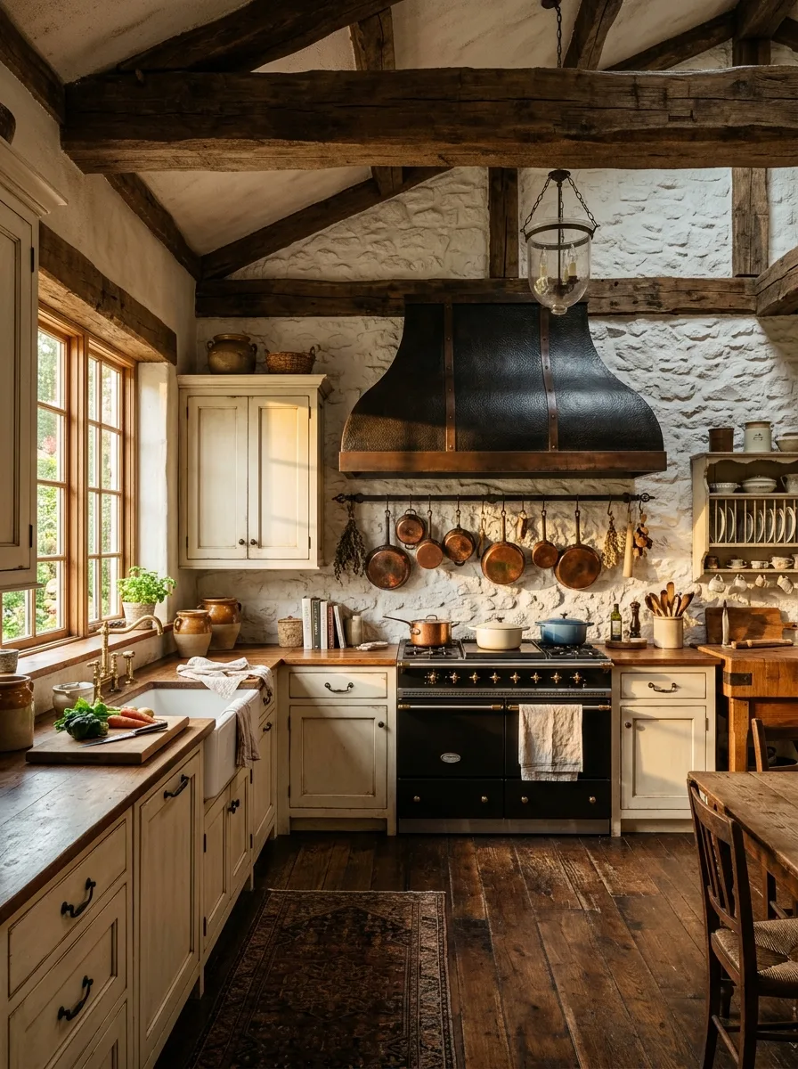
Whitewashed stone or brick walls bring an irreplaceable organic warmth to a kitchen the kind that’s literally built into the bones of the room. Unlike tile or paint, a whitewashed stone feature wall has depth, variation, and age. It makes even a modern kitchen feel rooted in something real, and it photographs with extraordinary character.
Used as a feature wall behind the cooking range, whitewashed stone becomes the kitchen’s visual anchor. Pair it with cream cabinetry and a cast iron range hood and the room feels like a French farmhouse kitchen that has been lovingly maintained for generations. Copper or iron cookware on display completes the picture functional beauty at its finest.
The Key: A whitewashed feature wall earns its warmth from physical depth and material history no paint color achieves that same quality of texture.
20
Natural Linen Curtains for Softness
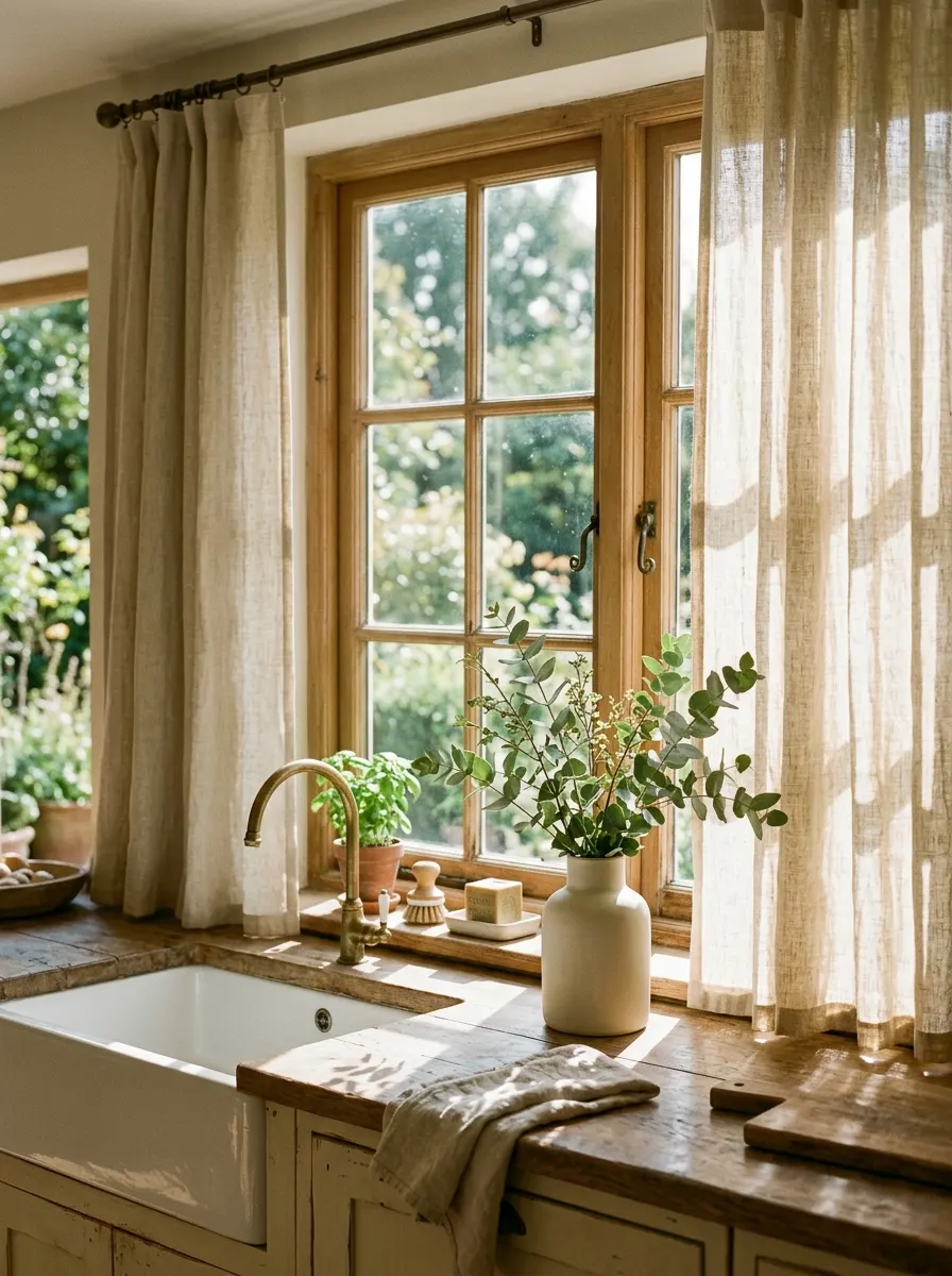
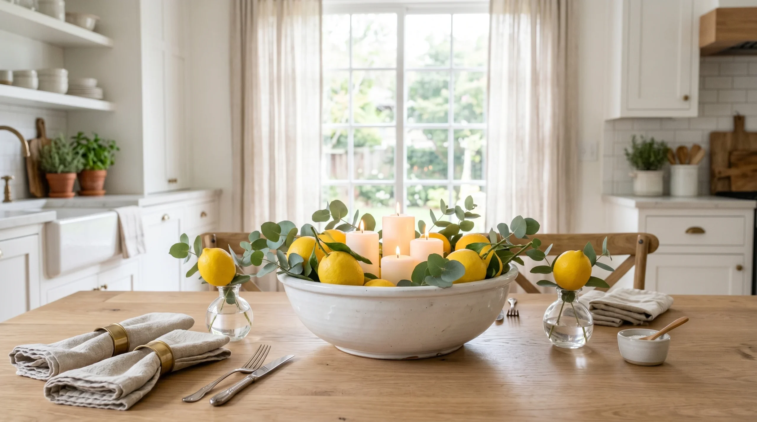
Linen curtains are one of the least expected and most transformative elements in a kitchen. The loose weave catches and diffuses sunlight into soft, dappled warmth across the room. Natural linen in sand, ivory, or oatmeal reads as another warm neutral in the palette not as a separate accent, but as a material that extends and softens the whole kitchen.
Above a farmhouse sink, floor length linen curtains create a quiet elegance that Roman blinds and roller shades simply can’t match. They move with light breezes, hold soft light beautifully, and improve with age like all natural materials. For anyone building a warm neutral kitchen, natural linen curtains are the easiest upgrade that nobody expects but everyone notices.
The Key: Linen curtains soften a kitchen’s hard surfaces stone, tile, stainless by adding the one element a kitchen often lacks: natural, moving textile warmth.
21
Earthy Pottery and Ceramic Displays
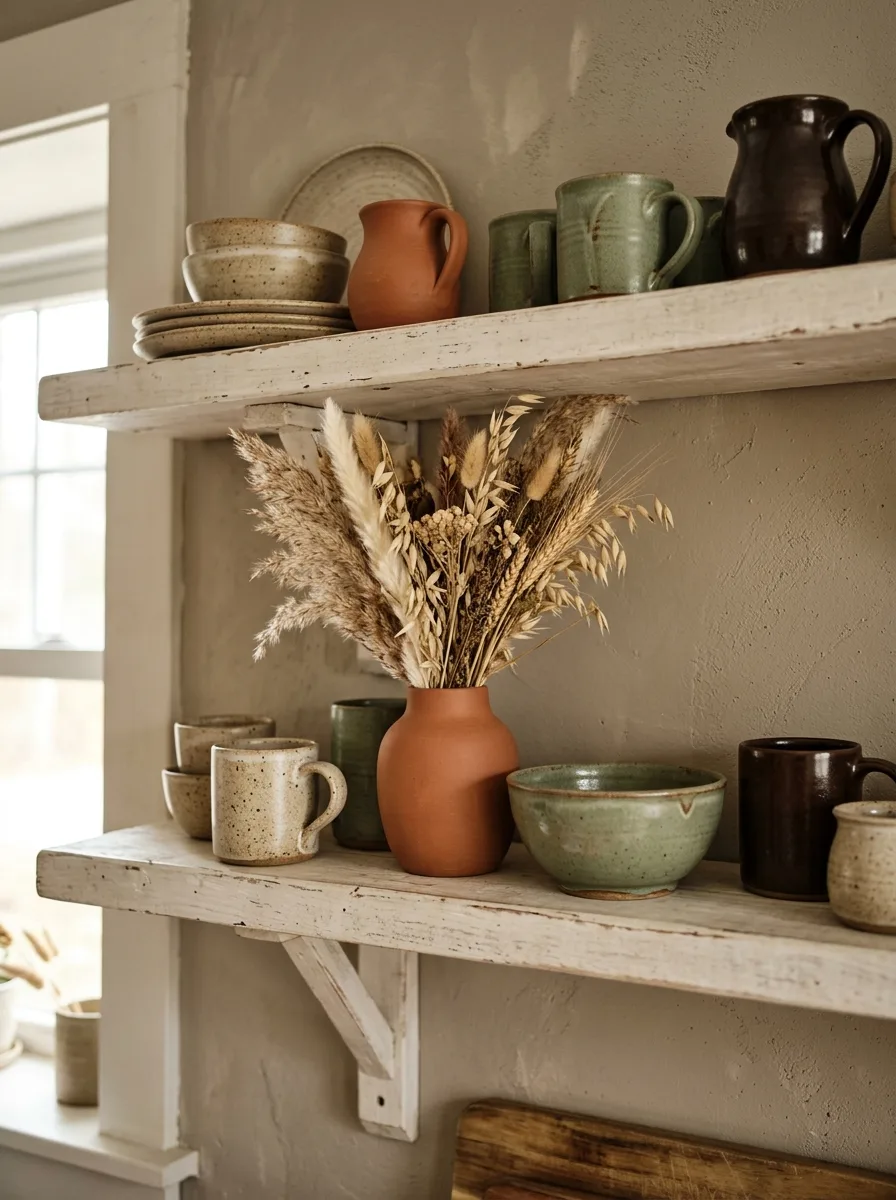
Open shelving is only as beautiful as what lives on it and earthy stoneware pottery is the ideal resident. Pieces in oatmeal, terracotta, sage, and deep chocolate glazes bring a full spectrum of warm neutrals to the kitchen without a single design decision beyond choosing what to display. It’s decorating through collection rather than through intention.
Arrange pottery in odd number groupings, mix heights, and let negative space breathe between pieces. Add dried grasses, a small olive branch, or linen wrapped bundle for organic contrast. The result reads as a beautifully curated kitchen display one that honours warm kitchen tones through object and material rather than wall color alone.
The Key: Earthy pottery transforms open shelving from storage into art choose pieces with handmade imperfections, not factory perfect finishes, for the best visual warmth.
Warm neutrals aren’t just a trend they’re a way of designing spaces that genuinely feel good to be inside. This collection of 21 kitchen color ideas proves that the warmth you want in your kitchen doesn’t require dramatic color or expensive renovation. It comes from choosing materials, finishes, and tones that work together quietly, building an atmosphere that makes every meal, every morning coffee, every shared conversation feel a little softer and more meaningful. That’s the real power of a considered neutral palette.
Now the fun part: pick the idea that spoke loudest to you and start there. Maybe it’s swapping hardware to aged brass, or trying a sage green wall, or finally tracking down that terracotta tile you’ve been saving on Pinterest for months. Whatever your starting point, these warm neutral ideas scale beautifully from one small change to a full kitchen transformation. Save this post so you have it when you’re ready, and share it with someone who’s been dreaming about their kitchen too.