COLORFUL LIVING ROOM
🏠 20 Real Ideas
⏱ Quick Read
🔥 Always Trending
20 Colorful Living Room Ideas
That Made Us Rethink Color Completely
Color has a way of changing everything. The moment you move beyond beige and white, a room stops feeling safe and starts feeling alive. These colorful living room ideas prove that bold choices don’t have to be risky — they just have to be intentional.
In my experience, people underestimate the power of one committed color decision. Whether it’s a jewel-toned sofa, a painted accent wall, or a gallery of vibrant artwork, color creates emotion that no neutral ever could. Checkout for more living room décor ideas. This list of 20 ideas will show you exactly how to make color work beautifully in your own space.
01
Teal Velvet Sofas
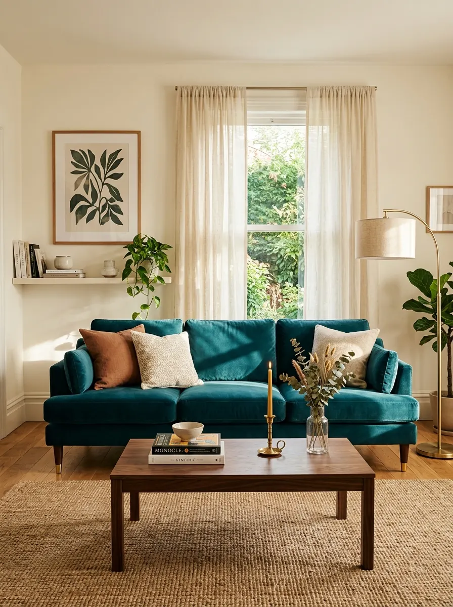
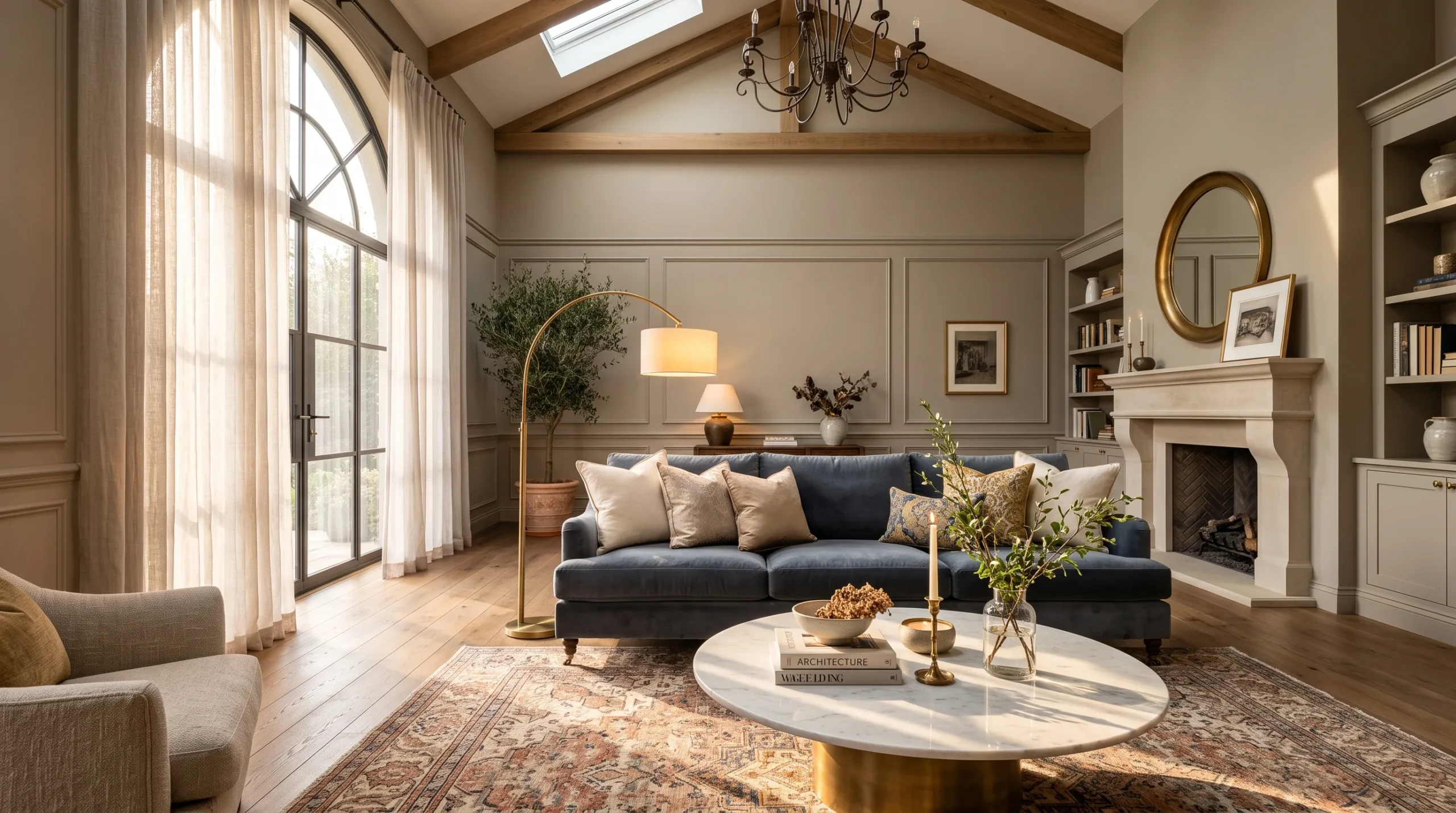
A teal velvet sofa is one of those pieces that does all the talking for you. It brings depth, richness, and a sense of drama that instantly transforms a plain room into something worth remembering. Paired with warm white walls and natural wood tones, it feels bold without being overwhelming. It is a genuinely stunning place to start.
The secret to making teal work is keeping everything around it grounded. Choose warm neutrals — cream, sand, or light oak — to let the sofa breathe. Add brass or copper accessories to pull out teal’s warm undertones. Layer in a textured cream throw and a simple jute rug, and the whole room feels effortlessly curated and complete.
The Key: Bold color works best when the rest of the room stays calm — let one statement piece own the space entirely.
02
Painted Accent Walls
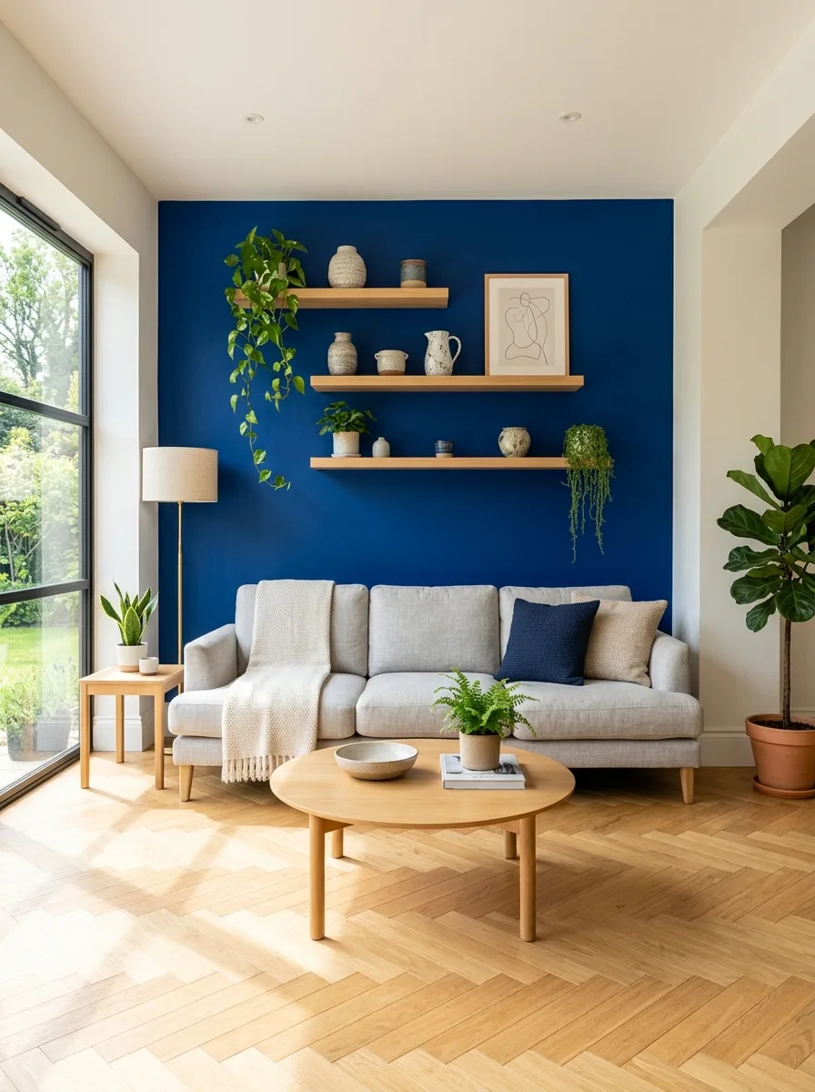
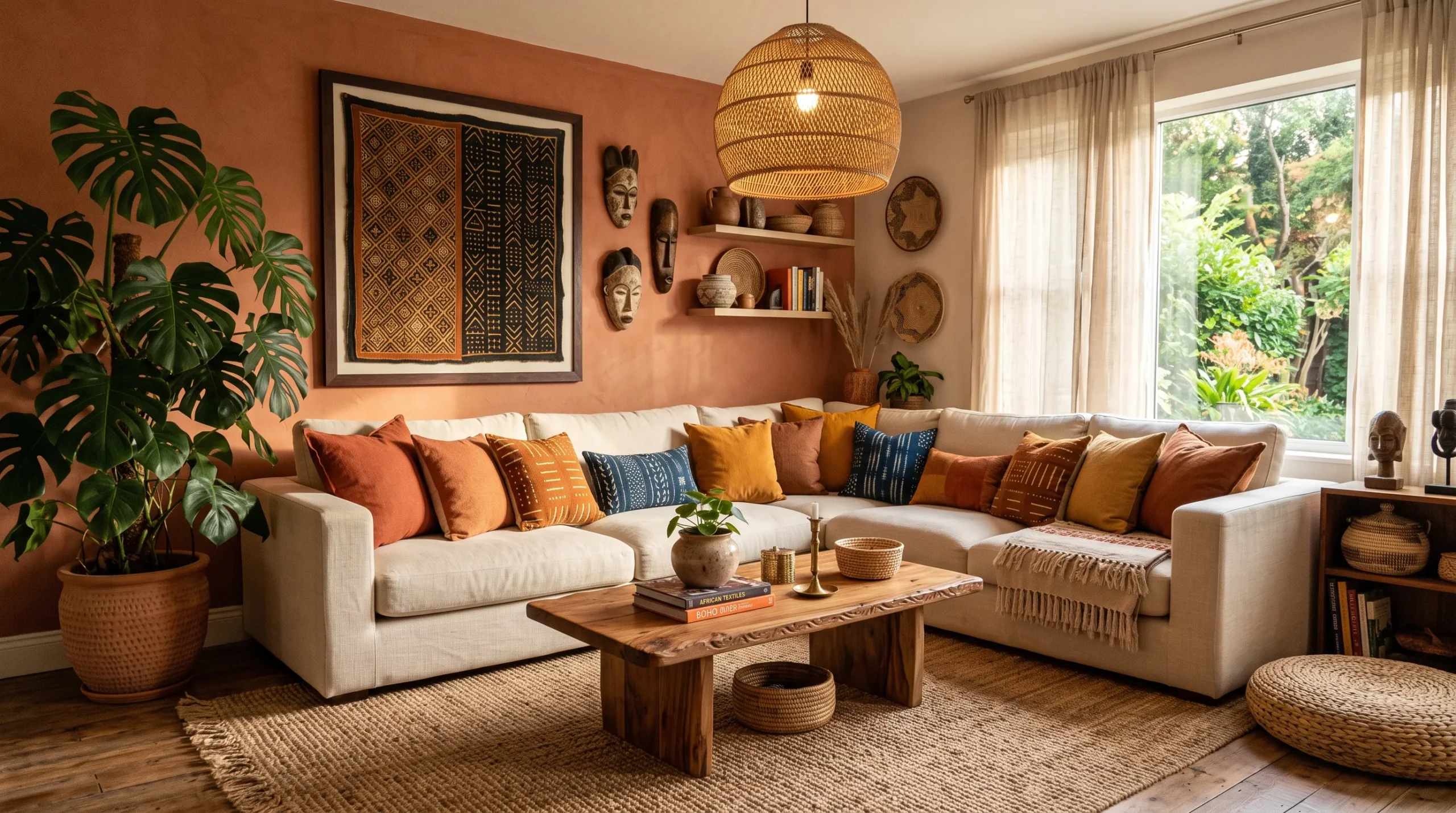
A single painted wall is the fastest way to introduce vibrant living room decor without committing to color on every surface. It creates an instant focal point, drawing the eye and giving the room a clear sense of direction. Choose a saturated shade — cobalt, forest green, or terracotta — and watch the whole space shift immediately.
The key is choosing the right wall. Behind a sofa, TV unit, or fireplace works best — these are natural anchor points the eye already travels to. Keep the remaining three walls light and neutral. Style your chosen wall with floating shelves, artwork, or sconces to make it feel intentional rather than unfinished. One wall, maximum impact.
The Key: One saturated accent wall is enough — choose your room’s natural focal point and commit to it fully.
03
Mustard Yellow Throws
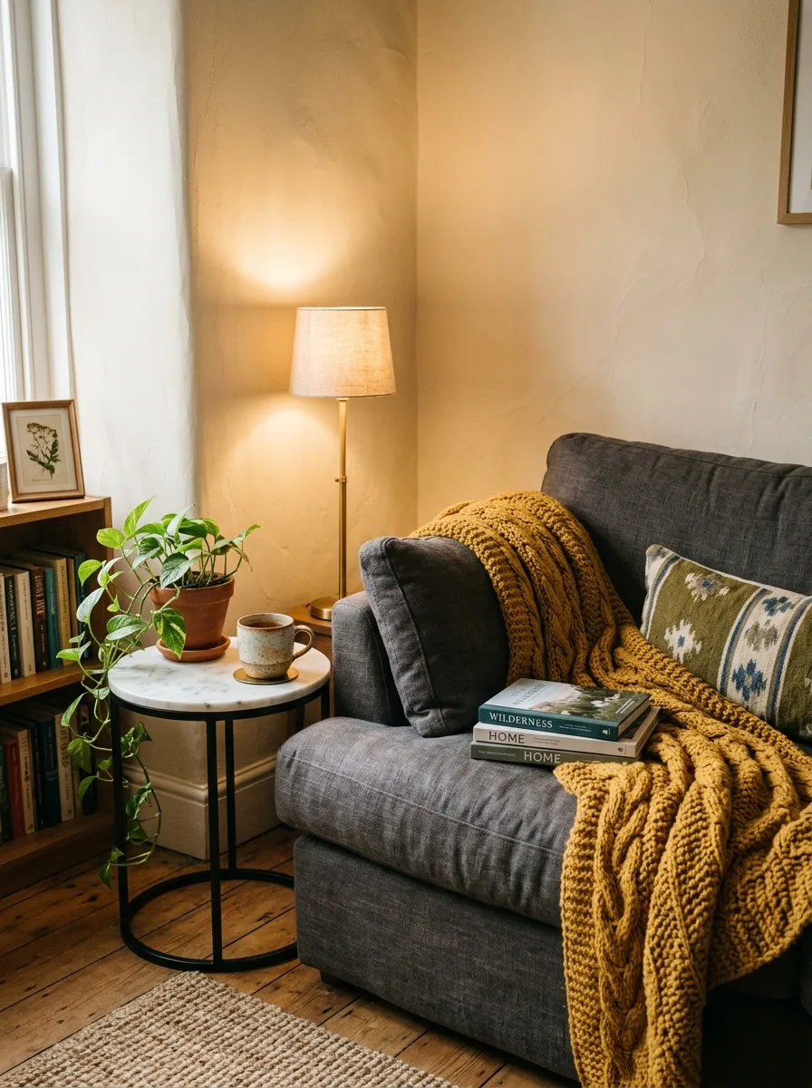
Mustard yellow is one of those colors that works in almost any living room without demanding too much attention. Draped casually over a charcoal or navy sofa, a mustard throw instantly warms the mood of the entire space. It is one of the simplest, most affordable ways to test bold color before committing to anything permanent.
This color pairs brilliantly with deep blues, warm greys, and earthy terracottas. Choose a chunky knit or woven texture to add visual warmth alongside the color. Style it folded over one sofa arm rather than spread flat — it looks more natural, more lived-in, and more intentional. Small detail, genuinely big impact on the overall atmosphere.
The Key: Mustard yellow is the easiest entry point into bold color — one throw can shift an entire room’s mood instantly.
04
Gallery Walls Done Bold
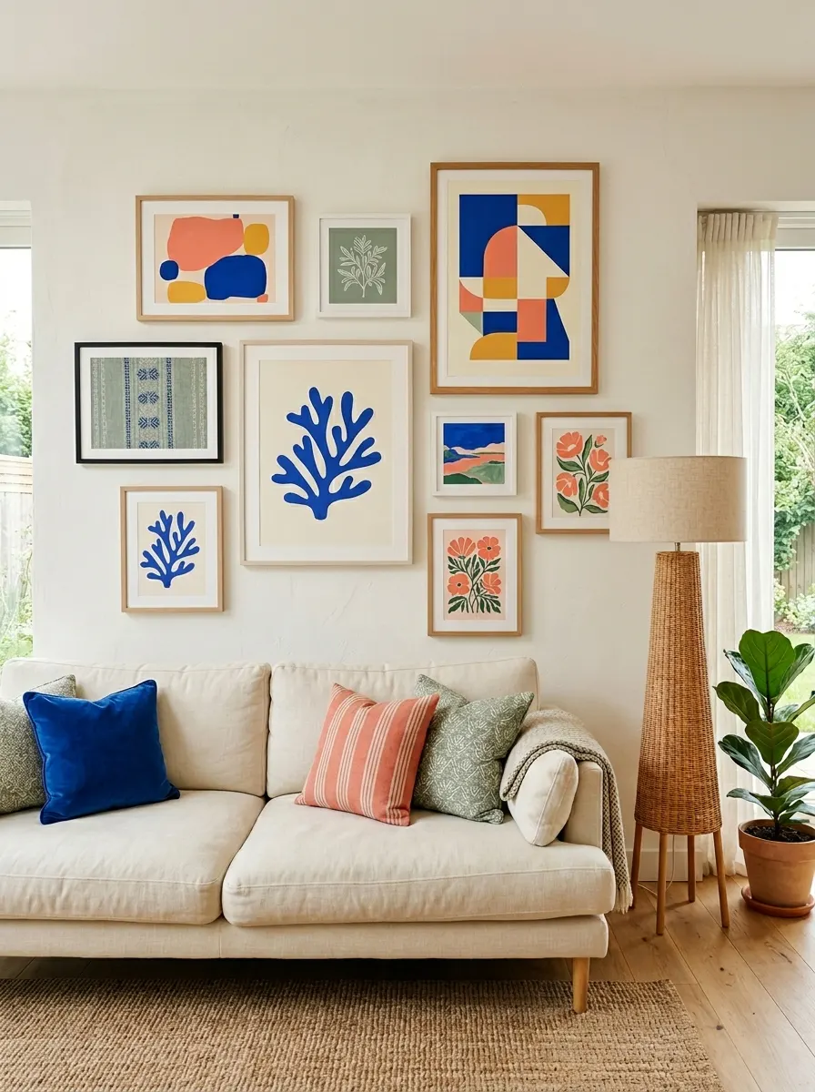
A gallery wall is where your personality gets to speak at full volume. When you choose artwork in bold, contrasting hues — cobalt blues, warm corals, sage greens — the wall becomes a living collection of color that shifts the entire energy of the room. That’s why many designers recommend starting color journeys with art, not paint.
You don’t need perfectly matched frames or a rigid grid layout. Mix frame sizes, styles, and colors intentionally — the variety creates dynamism. Choose a loose color palette across three to four tones and repeat them throughout your arrangement. Step back and assess the balance from across the room before committing. Trust the layered, collected look entirely.
The Key: A gallery wall works when you commit to a three-color palette and repeat it consistently across every piece you hang.
05
Terracotta Floor Tiles
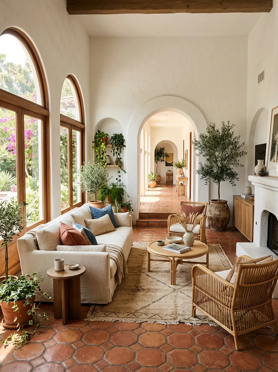
Terracotta floor tiles are one of the most underused tools in bold living room color design. The warm, burnished orange tone grounds an entire room and creates an instant sense of warmth that no rug alone can replicate. They work beautifully beneath cream, sage, and dusty pink furnishings — bringing a sun-soaked, relaxed sophistication to the space.
Hexagonal tiles in a classic terracotta offer more visual texture than square formats — they feel artisan and considered. Keep walls light and let the floor do the color work. Add low rattan or cane furniture to amplify the natural, earthy feel. Layer in trailing plants for freshness. The result feels warm, inviting, and beautifully timeless.
The Key: Let terracotta floors lead your color story — build the rest of the room around their warm, earthy tone upward.
06
Jewel-Toned Curtains
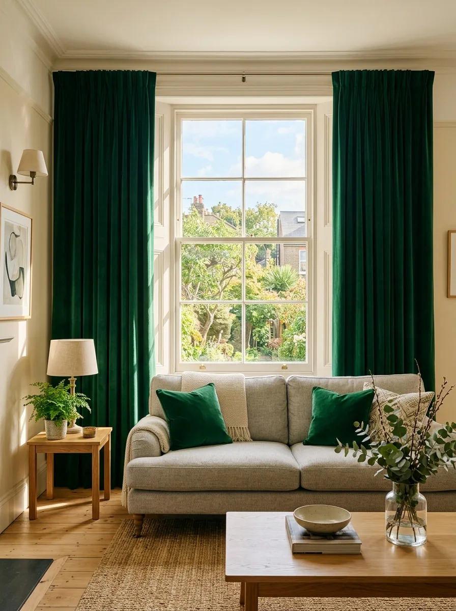
Jewel-toned curtains are one of the most dramatic and rewarding color decisions you can make in a living room. Deep emerald, sapphire blue, or amethyst purple draped from ceiling to floor makes the room feel taller, richer, and far more intentional. The effect is immediate — a room goes from ordinary to extraordinary before you’ve changed anything else.
Velvet is the fabric of choice for jewel tones — it absorbs and reflects light simultaneously, making the color shift beautifully throughout the day. Hang your curtains from ceiling height, even when windows are smaller, to maximize drama. Pair with pale, understated walls and simple furniture to keep the balance right. Let the curtains truly lead.
The Key: Hang jewel-toned velvet curtains from ceiling height — the scale and richness together create maximum impact with minimum effort.
07
Colorful Bookshelves
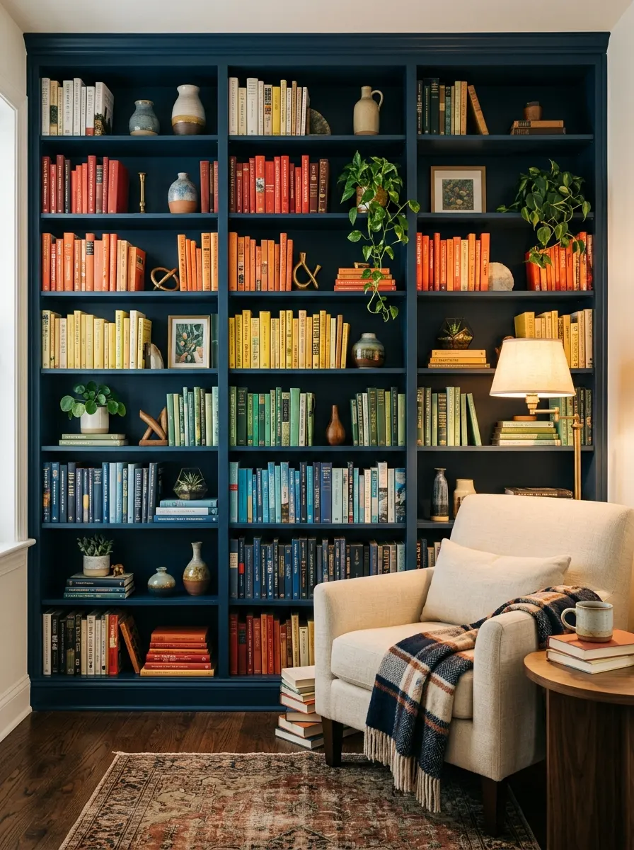
A bookshelf is essentially a wall of color waiting to be designed. When you arrange books by color rather than author or genre, the shelf transforms from storage into a genuine visual feature. This is one of those living room color inspiration ideas that costs nothing extra — you simply reorganize what you already own into something striking.
Paint the inside or back of your shelving unit in a deep, contrasting tone — navy, forest green, or matte black — to make each object displayed pop dramatically. Mix books with ceramic vessels, trailing plants, and a few sculptural pieces at varying heights. Step back and edit until the whole composition feels balanced, layered, and genuinely curated.
The Key: Paint your bookshelf’s back panel in a deep contrast color — it instantly turns storage into a design-forward statement feature.
08
Mixed Pattern Cushions
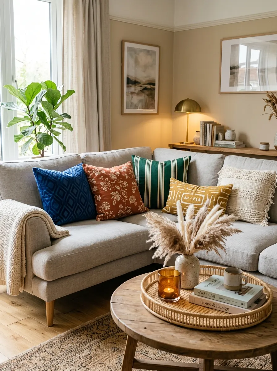
Mixed pattern cushions are the easiest, most reversible way to bring bold color into your living room. When chosen correctly, a layered mix of geometric, floral, and abstract patterns in complementary tones creates a sofa that looks professionally styled rather than chaotic. The key is working within a defined palette — usually three to four anchoring colors maximum
Vary your cushion sizes to create natural depth — two large square cushions at the back, two medium in front, and one rectangular lumbar for layering. Mix pattern scales deliberately: one large-scale print, one medium, one small or textured. Repeat your two dominant colors across all five cushions to tie everything together into a harmonious arrangement.
The Key: Mix pattern scales — large, medium, and small — within one defined color palette to create a sofa that looks intentionally styled.
09
Sage Green Walls
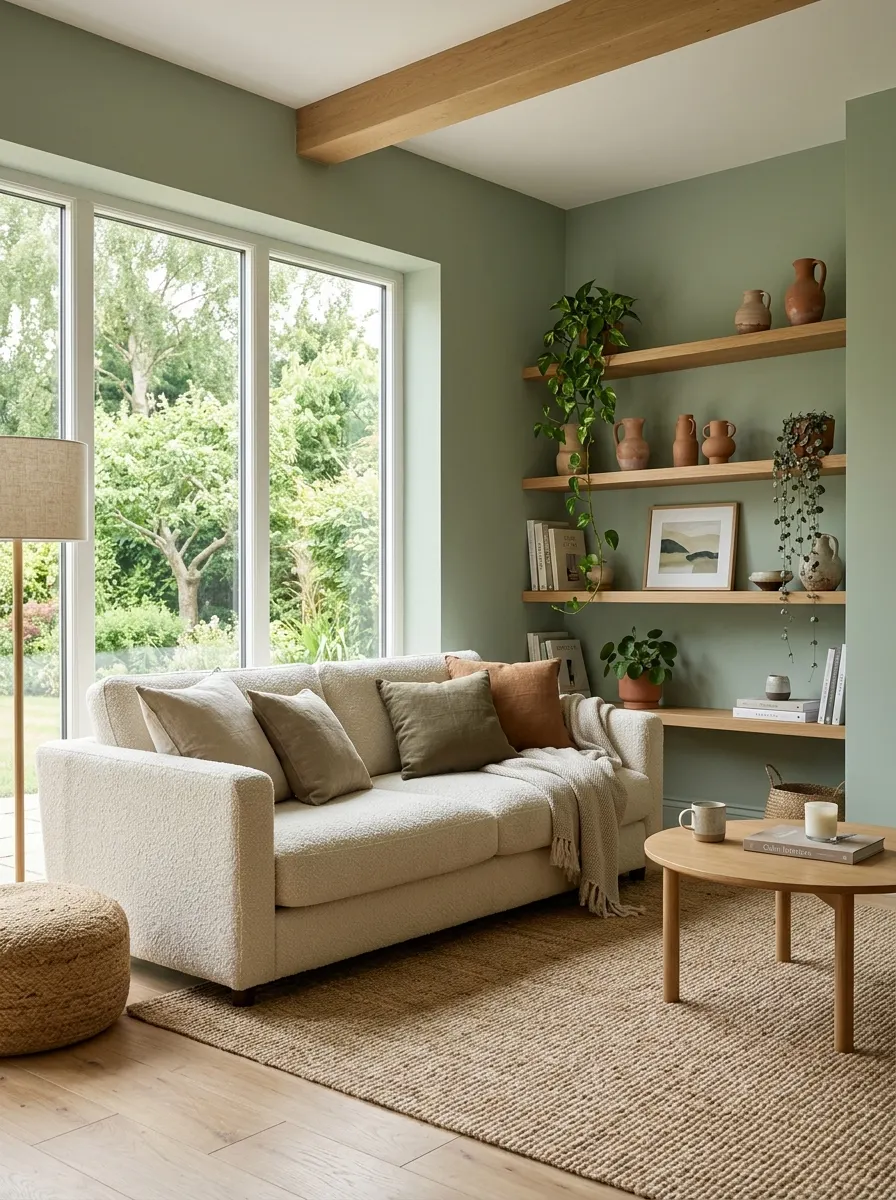
Sage green is the perfect gateway color for those stepping into bold wall choices for the first time. It reads as a neutral while still delivering genuine color impact — grounding a space without overpowering it. I’ve noticed it works in both small apartments and large open-plan rooms, adapting beautifully to whatever natural light the space offers.
The tone pairs flawlessly with cream, warm white, natural linen, raw wood, and terracotta accents. Avoid cold greys alongside sage — they push the color toward feeling clinical. Instead, lean into warm natural textures: sisal rugs, rattan baskets, aged brass fixtures, and trailing trailing plants. Together they amplify that effortlessly organic quality that makes sage green so irresistible.
The Key: Sage green needs warm, natural companions — linen, rattan, and terracotta unlock its full calming potential in any living room.
10
Bold Area Rugs
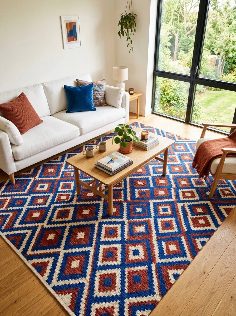
A bold area rug is one of the most powerful color tools in a living room because it defines the entire space from the ground up. Choose a rug in two to three strong, saturated tones and every other furniture choice becomes easier — the rug is already doing the color directing, guiding every decision made above it.
When selecting your rug, pull one dominant color and echo it in at least one other element — a cushion, a vase, or an artwork. This simple repetition ties the whole room together visually. Keep furniture simple and neutral so the rug remains the clear focal point. A white sofa over a vibrant rug always looks intentional.
The Key: Choose a rug with two dominant colors, then repeat just one of them elsewhere in the room — instant cohesion.
11
Coral and Blue Combos
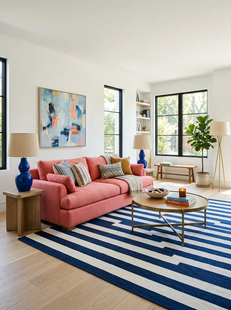
Coral and cobalt blue is one of those unexpected color pairings that immediately looks sophisticated when done with restraint. These two hues sit opposite each other on the color wheel, which means they naturally amplify each other’s intensity. The effect is vibrant but balanced — the kind of bright and colorful lounge idea that always photographs beautifully.
Keep one color dominant and the other as an accent. A coral sofa with cobalt accessories works better than equal amounts of each — too much of both at once tips into visual noise. Use white walls and pale floors as your buffer. Add brass fixtures to bridge the gap between the warm coral and cool blue seamlessly.
The Key: With contrasting color combos, let one color own sixty percent of the space — the other thirty, neutrals the remaining ten.
12
Painted Ceiling Drama
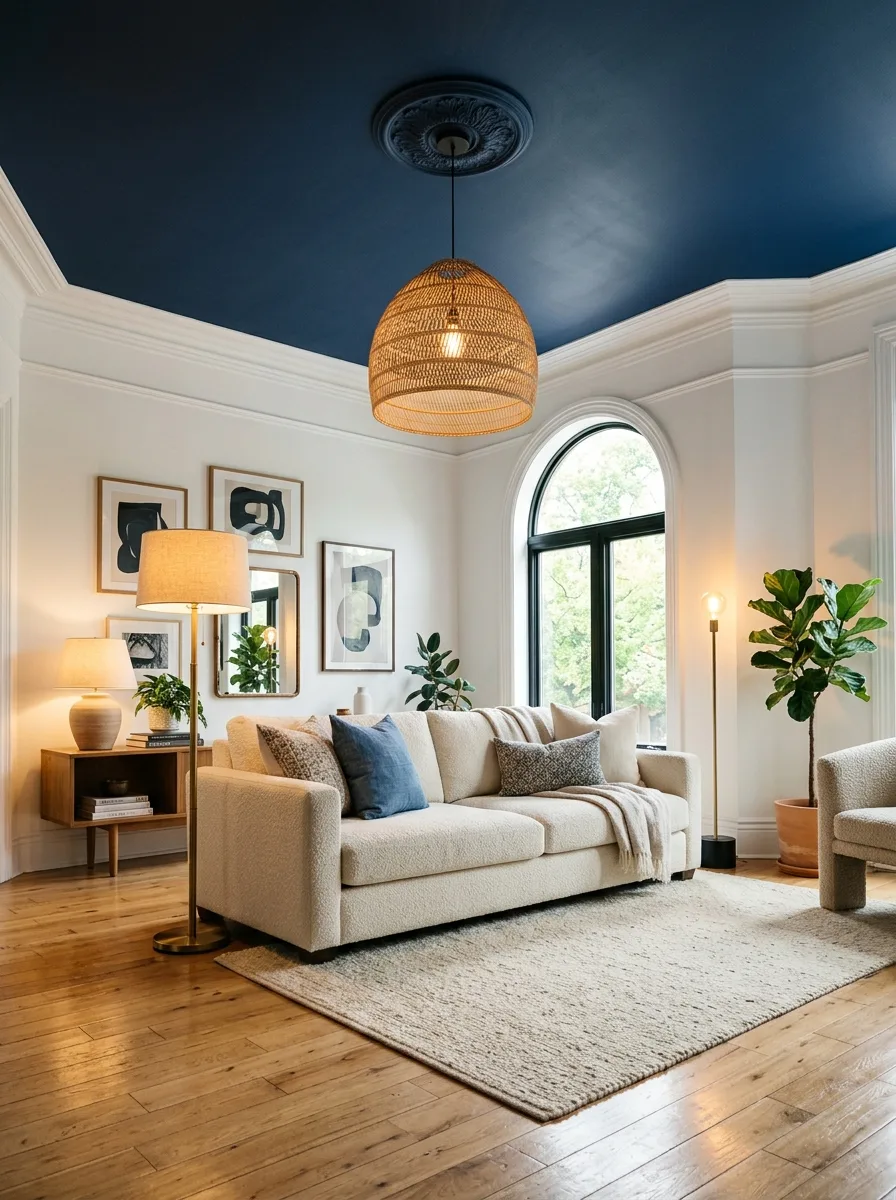
The ceiling is the one surface most people forget entirely — and that is exactly what makes painting it such a striking, unexpected move. A deep indigo, forest green, or rich burgundy ceiling adds architectural color in a way that feels theatrical without consuming floor space. It draws the eye upward and makes a room feel genuinely immersive.
Keep walls white or very pale to let the ceiling have its moment completely. Add a statement pendant light in a warm finish — rattan, aged brass, or matte black — to frame the color from above. The contrast between a bold ceiling and clean white walls looks purposeful, considered, and surprisingly elegant in even the most modest rooms.
The Key: A painted ceiling works best over white walls — the contrast is what makes it read as bold design rather than an accident.
13
Vintage Colored Glassware
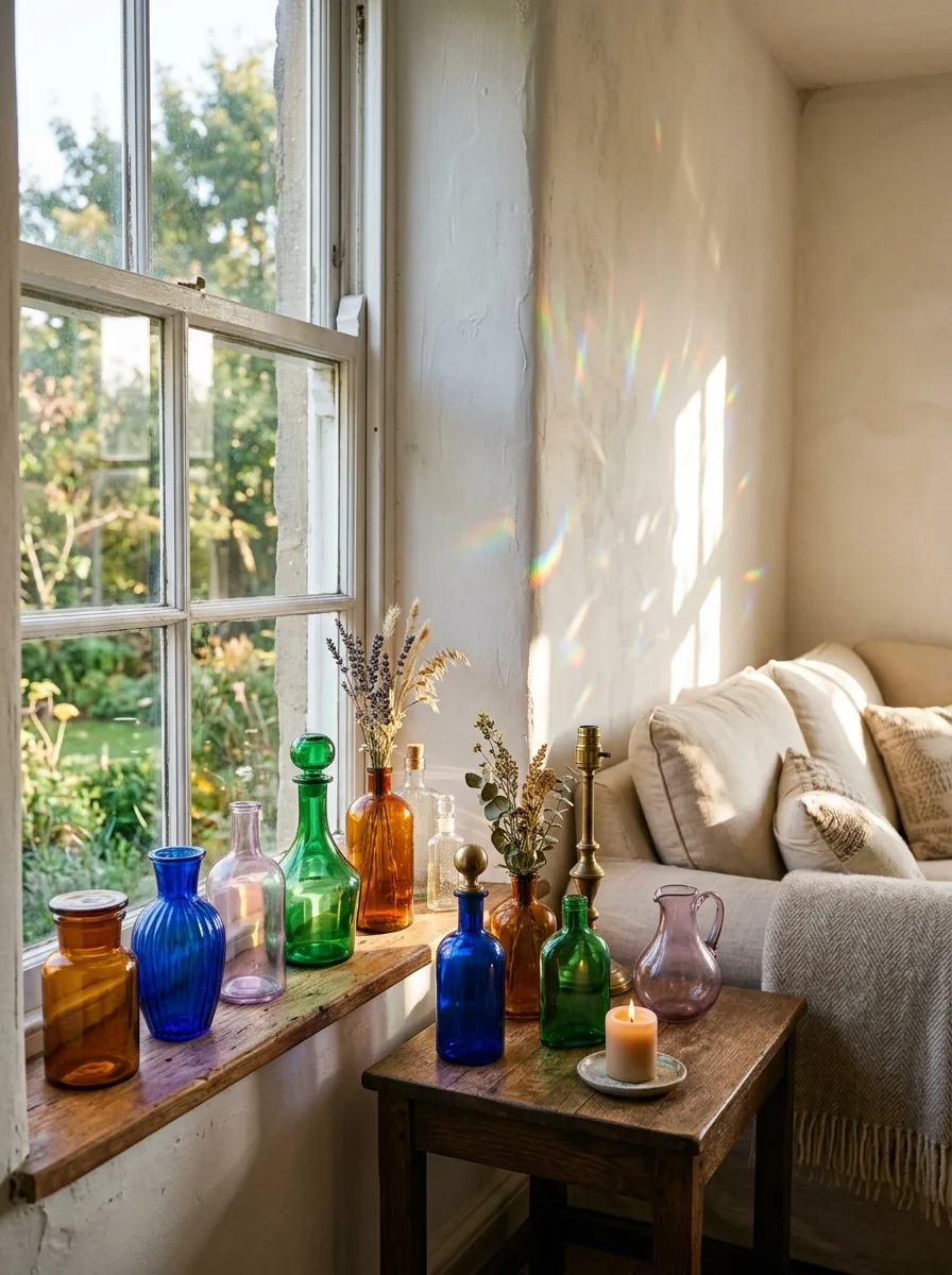
Colored glassware is one of the most overlooked accessories in bold living room color schemes — and one of the most magical. Antique and vintage glass bottles, vases, and decanters in amber, cobalt, and emerald green catch natural light and scatter color across walls in a way no paint or cushion can replicate. It is quiet, beautiful drama.
Style them on windowsills, side tables, or open shelving where direct sunlight reaches during the day. Group odd numbers together — three to five pieces — in a range of heights and tones. Mix rounded and angular shapes for variety. In my experience, a window ledge lined with colored vintage glass transforms an ordinary living room corner completely.
The Key: Place colored glassware on sun-facing windowsills — natural light turns them into living, ever-changing pieces of color art throughout the day.
14
Statement Armchairs
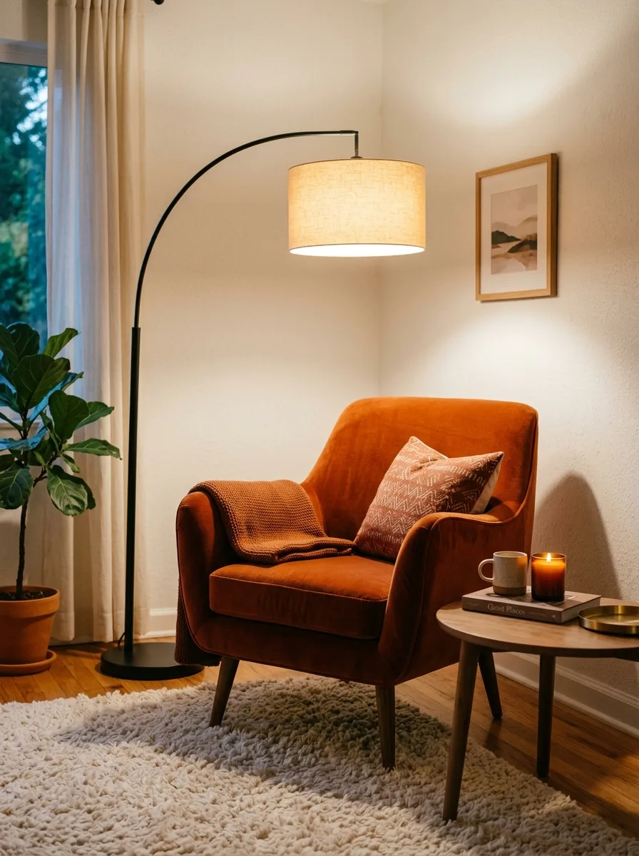
A single statement armchair in a bold color is one of the most effective ways to build living room color inspiration from scratch. One piece — a burnt orange velvet, a cobalt blue boucle, or an emerald curved tub chair — instantly anchors a room’s color palette and gives every other choice something to respond to harmoniously.
Place your statement chair at an angle in a corner — never flat against a wall. This creates a natural reading nook and gives the chair a sense of purpose beyond decoration. Add a floor lamp behind it and a small side table beside it. The vignette becomes the room’s most inviting and visually compelling corner effortlessly.
The Key: One bold armchair placed at an angle in a corner creates an instant lifestyle vignette that anchors the whole room’s color story.
15
Two-Tone Painted Walls
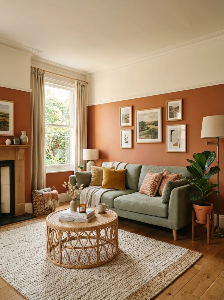
Two-tone painted walls deliver twice the color impact of a single shade while still feeling considered and controlled. Dividing the wall horizontally — with the deeper tone below and a lighter one above — elongates the room visually and creates a clear architectural feature without touching any of the existing structure. It reads as intentional, stylish, and timeless.
The division line traditionally sits at dado rail height — roughly a third of the way up the wall. Use the same depth of tone in two complementary hues: terracotta and cream, sage and off-white, or navy and pale blue. A simple painted or applied wooden rail at the dividing line gives the transition a clean, finished edge.
The Key: Place your darker tone on the lower third of the wall — it grounds the room visually while making the ceiling feel taller.
16
Maximalist Plant Styling
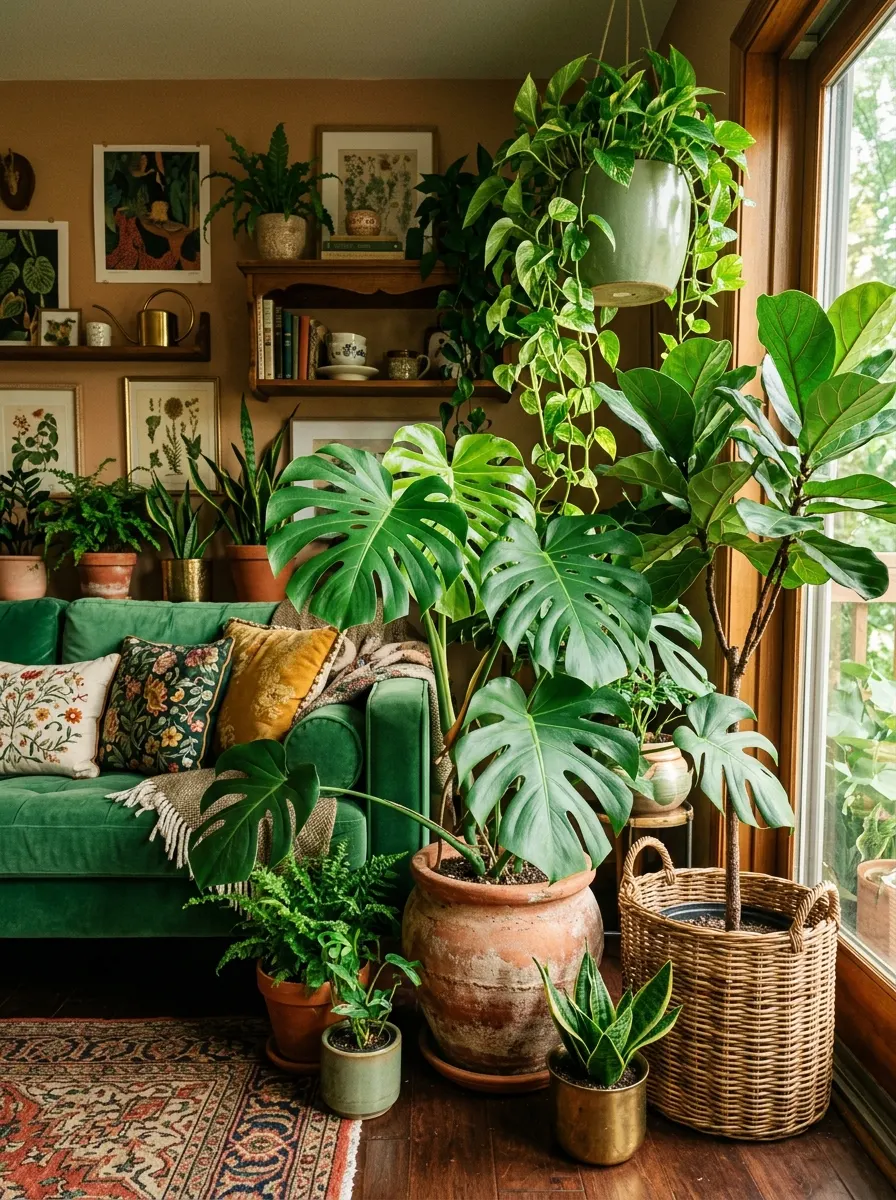
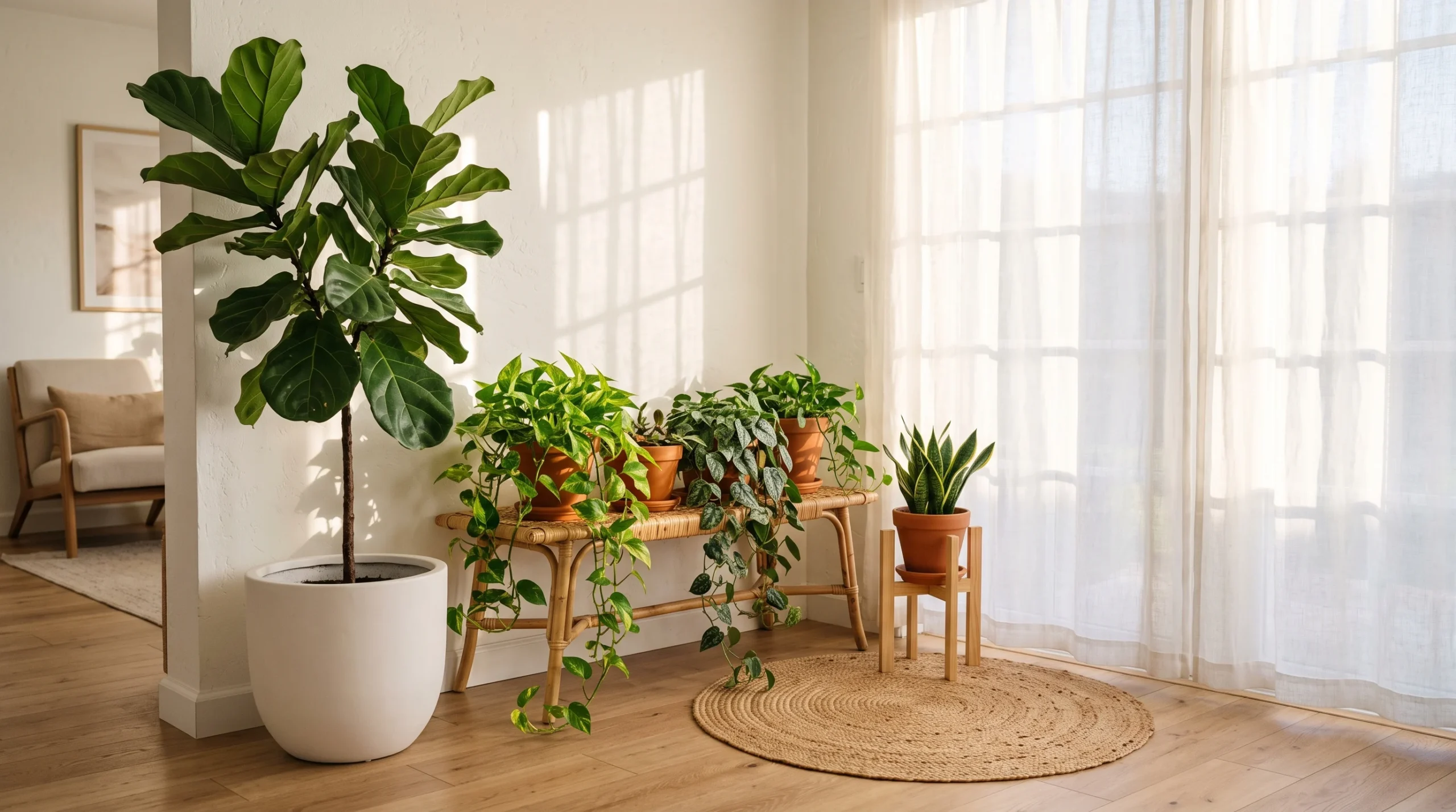
Plants are color, texture, and life all at once — and in a bold living room, they earn their place not as background filler but as front-row design elements. Grouping large statement plants like monsteras, fiddle leaf figs, and trailing pothos creates a layered, lush atmosphere that makes even a simple room feel abundantly full and beautifully alive.
The pots matter as much as the plants themselves. Choose terracotta, aged ceramic, or woven wicker in warm, earthy tones that complement your room’s color palette. Vary the heights dramatically — floor-standing plants beside low-set trailing ones beside tall shelf specimens. The layered vertical range fills dead space and transforms corners that no furniture would fit into naturally.
The Key: Treat plants as design elements first — vary height, pot color, and leaf scale as deliberately as you would any other decor object.
17
Rich Burgundy Accents
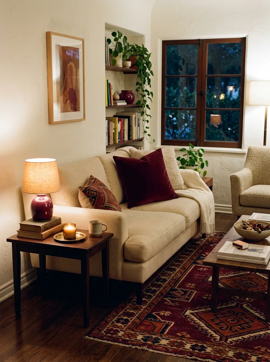
Burgundy is one of the richest, most overlooked accent colors in living room styling. It brings warmth, depth, and a feeling of quiet luxury without being loud or aggressive. A single burgundy cushion, lamp, or vintage rug introduces sophisticated color to even the most minimal room — grounding it with something that feels genuinely old-world and refined.
This tone pairs beautifully with cream, warm grey, mustard yellow, and forest green — all natural companions that amplify burgundy’s richness without competing with it. Use it in soft furnishings first: cushions, throws, and rugs are low-commitment, high-impact entry points. Once you see how the tone warms the room, adding a larger burgundy piece feels completely natural.
The Key: Burgundy works best in soft furnishings first — cushions and rugs let you test the depth of tone before committing to larger pieces.
18
Colorful Side Tables
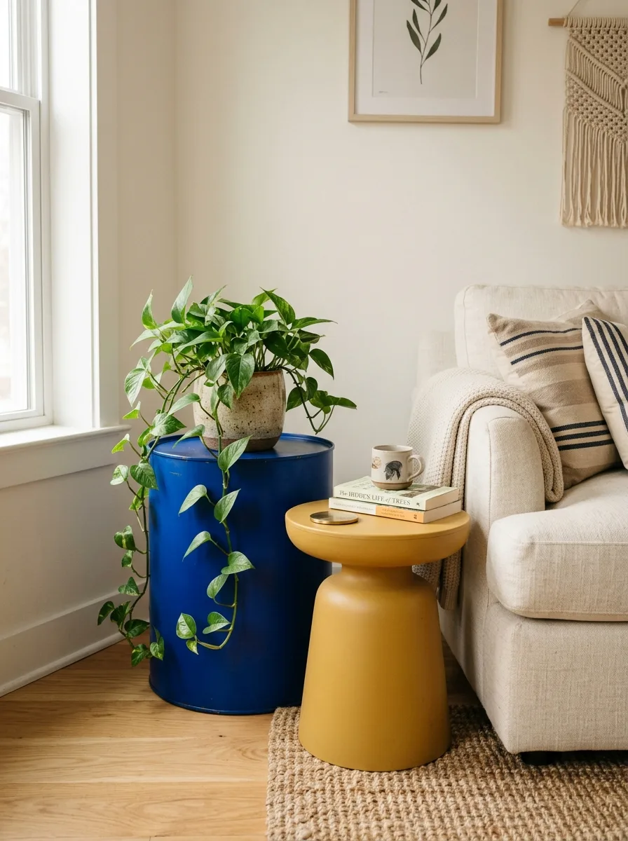
Colorful side tables are the most playful way to introduce bold color to a living room because they invite mix-and-match thinking. Two mismatched tables in contrasting tones — a cobalt blue drum beside a mustard yellow nesting table — beside a neutral sofa looks deliberately eclectic rather than accidental. It shows personality, confidence, and a real eye for design.
Choose tables in solid, saturated colors rather than patterned surfaces — the shape itself becomes the design statement. Lacquered finishes amplify color beautifully, while matte resin or painted wood offer a more relaxed aesthetic. Style each table simply — one object maximum — so the color of the table itself remains the clear and uninterrupted visual focus.
The Key: Mismatched colorful side tables work when they share one tone with something elsewhere in the room — connection creates cohesion effortlessly.
19
Wallpaper Feature Walls
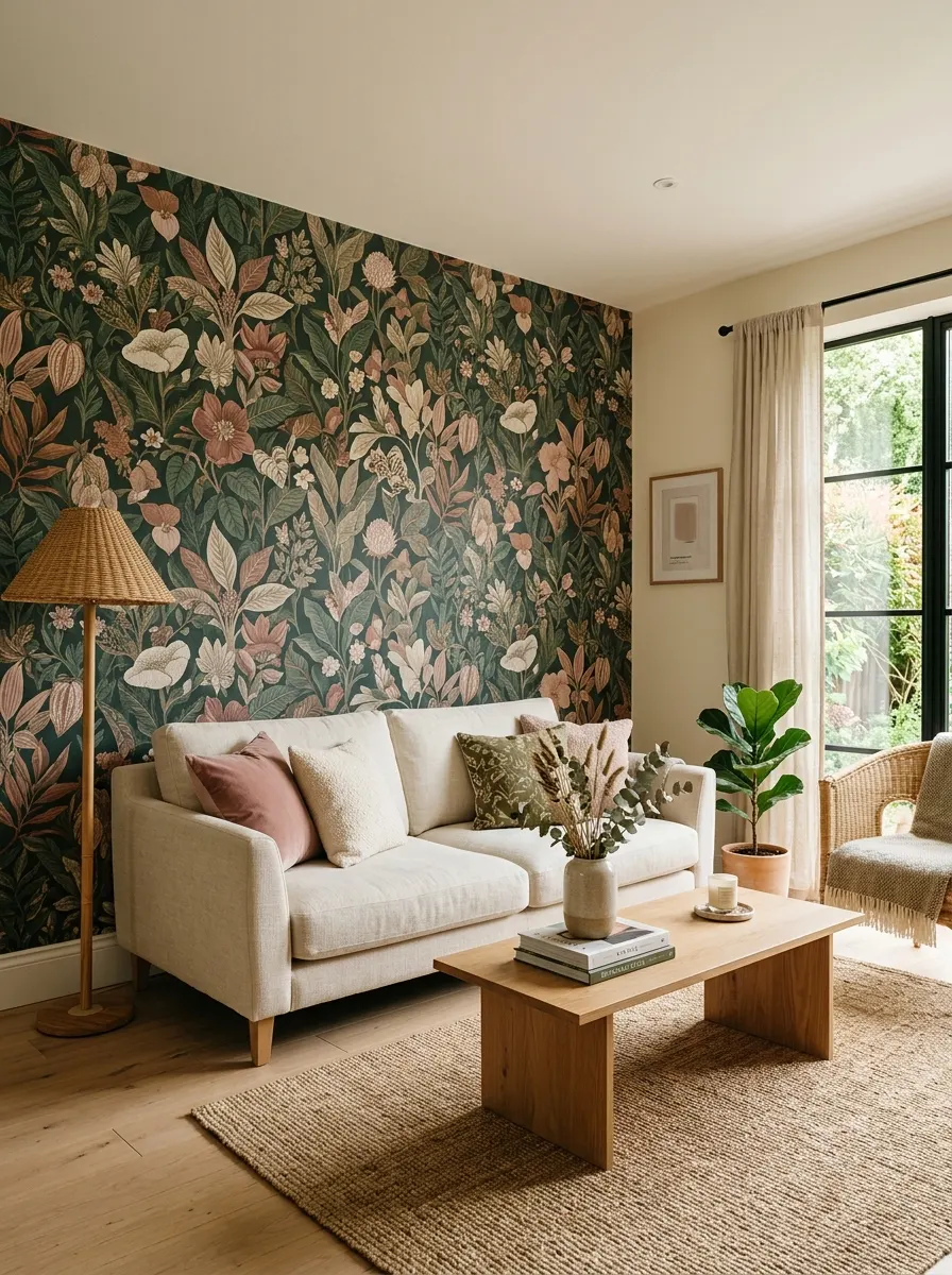
A wallpaper feature wall offers color, pattern, and personality in a single decision. Choose a large-scale botanical, geometric, or abstract print and even the simplest furniture arrangement instantly looks intentional and designer-quality. This is one of those bold living room color schemes that photographs beautifully and makes the most striking impression on anyone entering the room for the first time.
The rule is simple: pull two colors from your chosen wallpaper and use them as your room’s accent palette. If the wallpaper features forest green and dusty pink, echo those tones in cushions, throws, and accessories throughout the space. The repetition creates harmony rather than visual competition. The wallpaper leads — everything else simply follows its direction naturally.
The Key: Extract two colors from your wallpaper and repeat them in soft furnishings — this creates instant harmony without any additional design thinking.
20
Layered Earthy Tones
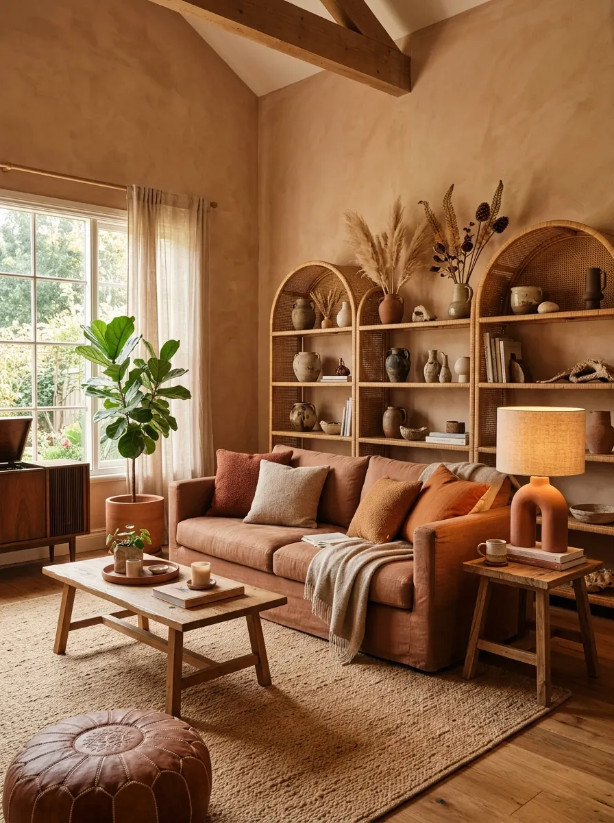
Layering earthy tones is one of the most sophisticated approaches to vibrant living room decor — because the richness comes from depth and texture rather than contrast. Building a palette from terracotta, sand, caramel, and burnt sienna creates a room that feels warm and fully considered from every angle. Nothing clashes, yet nothing is boring. It simply glows.
The key to making earthy layering work is varying texture as much as tone. Combine smooth ceramic with rough rattan, soft linen with chunky knit, and matte plaster with polished wood. When every material has a different surface quality, the tonal similarities create harmony while the textural variety creates interest. I’ve seen this approach transform even the most ordinary room completely.
The Key: In a tonal earthy palette, texture does the work that contrast does elsewhere — vary surfaces as deliberately as you vary color.
Color is not a risk — it is a decision. And every one of the colorful living room ideas in this list proves that living with bold, beautiful hues creates spaces that feel genuinely alive, personal, and worth coming home to every single day. You don’t need to change everything. You just need to start somewhere.
Pick one idea that sparked something in you — a teal sofa, a painted ceiling, a bold area rug — and commit to it. I’ve seen how small changes like these can completely transform a space, and yours is no different. If this post gave you the color confidence you needed, save it for when you’re ready to begin — and share it with a friend who’s been playing it too safe with beige.