Colorful Kitchen
🏠 24 Real Ideas
⏱ Quick Read
🔥 Always Trending
24 Colorful Kitchen Ideas That
Make Bold Spaces Look Elegant, Balanced, and Magazine Worthy
Your kitchen deserves more than white walls and safe choices. A colorful kitchen is not just a design trend it is a daily mood boost, a personal statement, and the most joyful room in your home. In my experience, the kitchens that stop people mid scroll on Pinterest are never the cautious ones. They are the ones that commit to color with confidence, pair bold hues with smart balance, and make every inch feel intentional.
These 24 ideas will show you exactly how to do that. Whether you love deep jewel tones, cheerful pastels, or earthy bohemian warmth, there is a colorful kitchen design here that will feel like yours. From cabinet color combos to backsplash pairings, statement islands to bold accessory layering, every idea in this list is built to inspire real results, not just pretty pictures.
01
Navy and Mustard Cabinet Colorful Kitchen
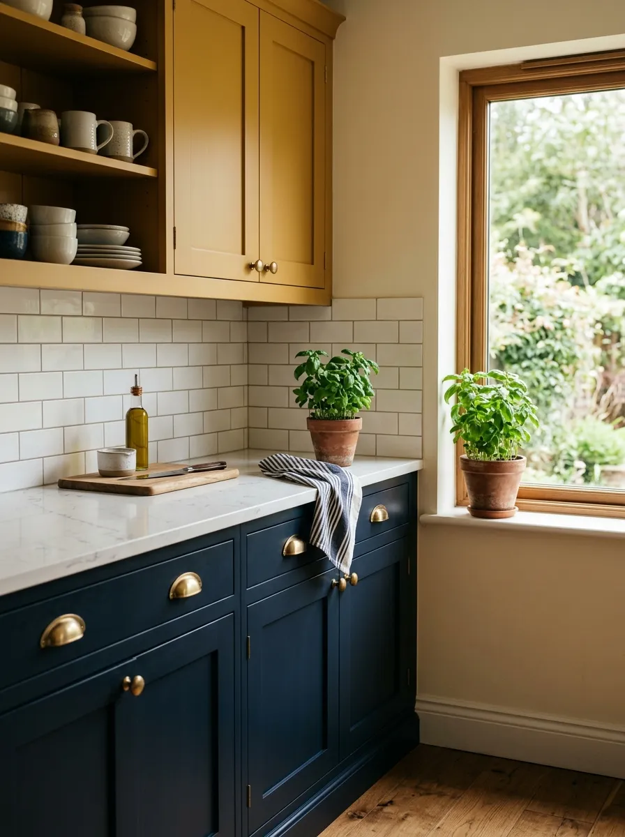
Navy and mustard together is one of the most underrated cabinet combinations in home design. The deep, grounding quality of navy keeps the space from feeling chaotic, while mustard injects warmth and energy that makes the room feel genuinely alive. This pairing works across both traditional and modern kitchens without feeling out of place.
What makes this bold kitchen colors combination so magazine worthy is the contrast. Navy absorbs light beautifully, creating depth in lower cabinets, while mustard bounces light upward, keeping the upper half of the kitchen bright and airy. Add brass hardware and white countertops to complete the look elegantly.
The Key: Pair navy lower cabinets with mustard uppers for a high contrast, balanced look that adds sophistication without sacrificing warmth or personality.
02
Sage Green Shaker Cabinet Style
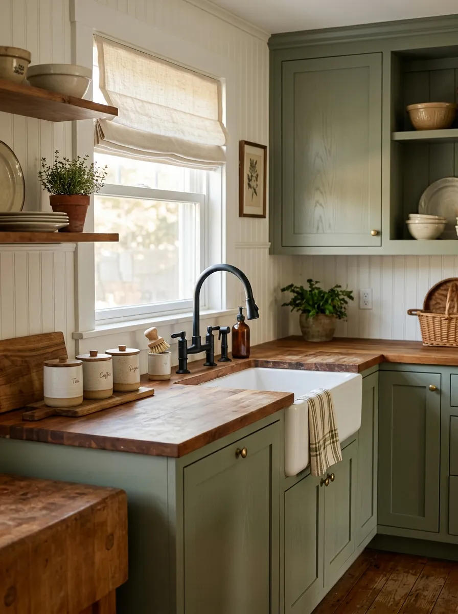
Sage green is the color that makes a kitchen feel like a deep breath. It sits beautifully between warm and cool on the color wheel, which means it pairs naturally with nearly every neutral. From crisp white to warm cream, from natural wood to matte black, sage green brings harmony wherever it lands. I have noticed that this shade photographs particularly well in natural light, which makes it a top choice for content creators and Pinterest lovers.
The shaker cabinet style amplifies the charm of sage green by adding texture through its simple recessed panel detail. This combination creates a kitchen that feels intentional and handcrafted, like something out of a countryside magazine spread. Keep countertops in butcher block or honed white marble for the warmest result. Anyone drawn to this organic, nature-forward kitchen palette will find the full range of cottage kitchen ideas worth exploring for even more ways to carry this aesthetic through every detail.
The Key: Sage green shaker cabinets with butcher block countertops create an organic, cottagecore aesthetic that feels timeless, warm, and consistently beautiful across seasons.
03
Terracotta and Cream Warm Palette
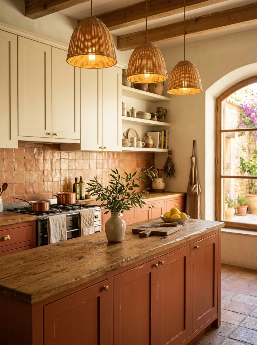
Terracotta brings something no other color can: the warmth of sunbaked earth, the soul of a Mediterranean courtyard, and the kind of richness that makes a kitchen feel genuinely nourishing. When paired with cream cabinets above, the contrast is soft rather than stark, making the overall palette feel balanced and deeply cozy. This is a vibrant kitchen decor choice that photographs golden and lush in afternoon light.
From what I have seen, terracotta works best when you carry the warm tones through your accessories as well. Handmade tiles, wooden countertops with visible grain, woven pendant shades, and terracotta colored ceramics all reinforce the palette naturally. The result is a kitchen that feels cohesive, not curated, and warmly personal.
The Key: Use terracotta on lower cabinets only, keeping uppers in cream so the warm clay hue grounds the space without making the ceiling feel low or heavy.
04
Cobalt Blue Island Statement Piece
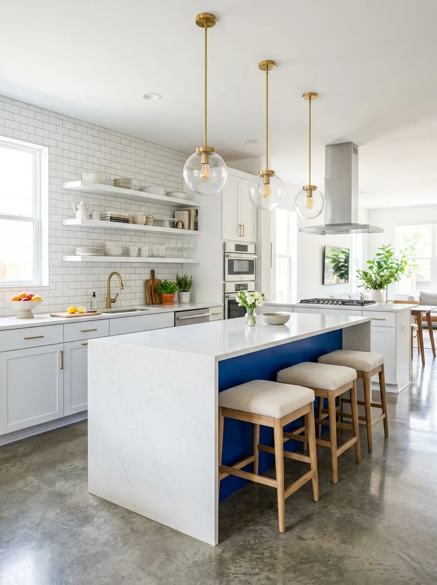
A bold cobalt blue island in an otherwise white kitchen is one of the most effective ways to add drama without overwhelming your entire space. The island becomes an anchor, a focal point that pulls the room together and gives it genuine personality. One thing I have learned from studying hundreds of kitchen designs is that a single statement color, used confidently in one key piece, reads as sophisticated rather than loud.
Cobalt blue works because it is deeply saturated without being aggressive. It pairs naturally with gold or brass hardware, white marble or quartz countertops, and warm wood stools. In a bright kitchen with good natural light, cobalt practically vibrates with richness. This is kitchen color ideas at their most impactful, turning the island into the conversation piece of the whole room.
The Key: A cobalt blue island in a white kitchen delivers maximum visual impact with minimal commitment, since only one surface carries the bold hue while everything else remains neutral.
05
Dusty Rose Cabinet Elegance
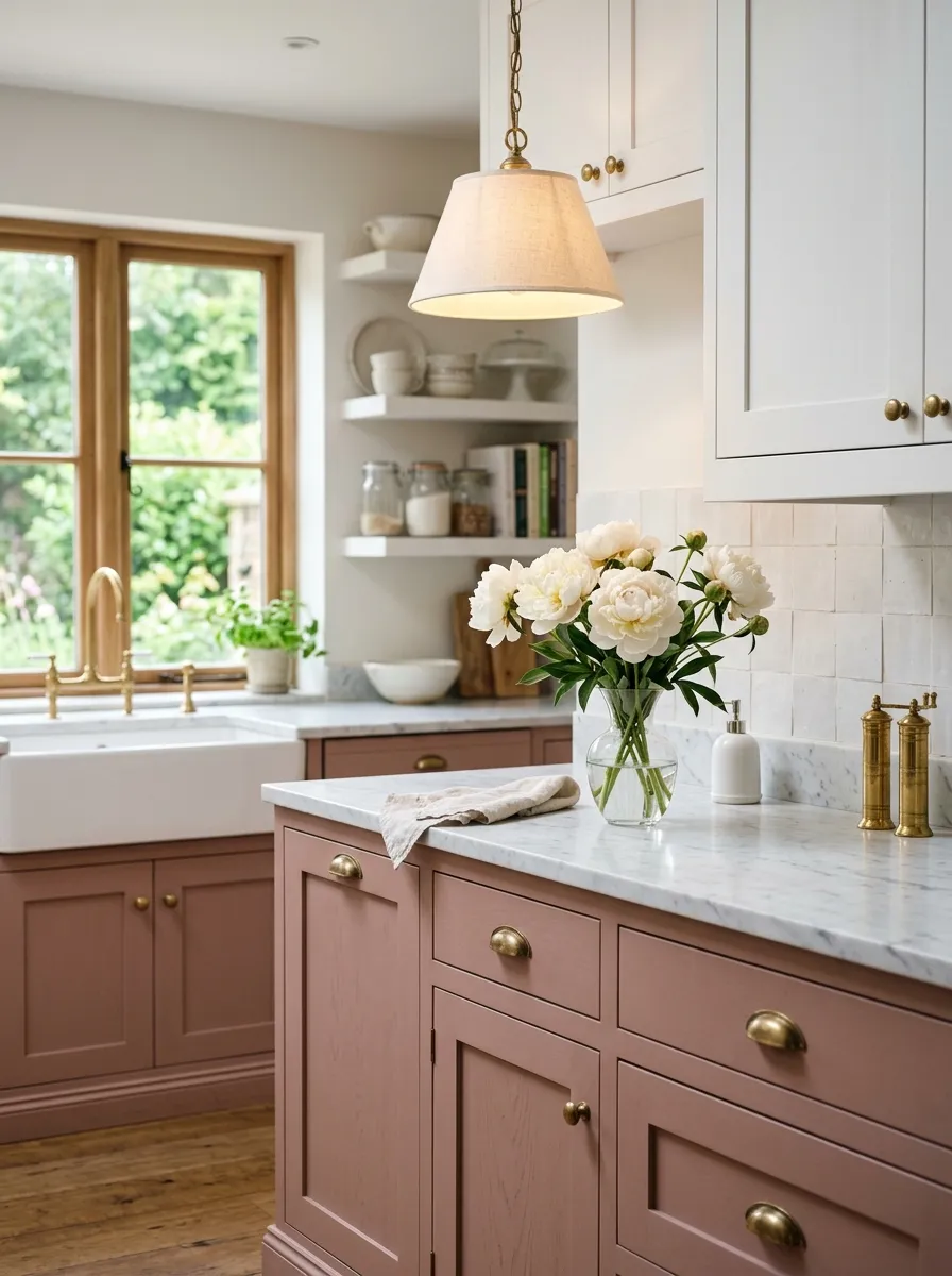
Dusty rose is the most underestimated pink in home design. Unlike hot pink or bubblegum, dusty rose carries a muted, vintage sophistication that reads as elegant rather than playful. In a kitchen setting, matte dusty rose cabinets create a soft warmth that glows beautifully under brass pendant lighting. The result feels less like a trendy choice and more like a timeless one.
Pairing dusty rose with white upper cabinets keeps the space light and balanced. White marble veined with warm grey reinforces the softness of the palette, while unlacquered brass hardware adds an organic, aged character that makes the whole kitchen feel intentional and refined. A colorful kitchen design built around dusty rose will feel fresh and personal for years without dating itself.
The Key: Use matte finish paint on dusty rose cabinets to soften the color further and give the kitchen a refined, velvety quality that satin or gloss finishes cannot replicate.
06
Olive Green and Walnut Warmth
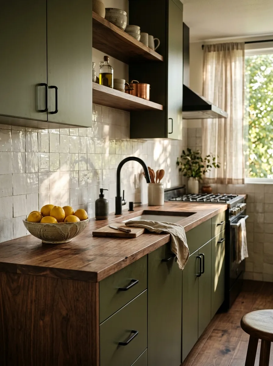
Olive green and walnut wood create a pairing that is rooted in nature and grounded in sophistication. The deep, muted quality of olive green sits comfortably in both modern and traditional kitchens, adding richness without aggression. Walnut countertops bring warmth and organic texture that softens the depth of the green, creating a balance that feels genuinely livable. This combination shares the same earthy, grounded DNA as the best warm neutral kitchen palettes that feel timeless across any season.
After trying this myself in a design project, the biggest surprise was how well this combination photographs. The earthy tones create a rich backdrop that makes every styled element stand out, from white ceramics to bright fruit bowls. A white zellige tile backsplash adds gentle light reflection and artisanal texture, breaking up the dark palette with small bursts of luminosity. This is bold kitchen colors with soul and substance.
The Key: Zellige tiles are the perfect backsplash for olive green kitchens because their handmade irregularity adds light variation that keeps the dark palette feeling lively, not heavy.
07
Teal Cabinets with Gold Accents
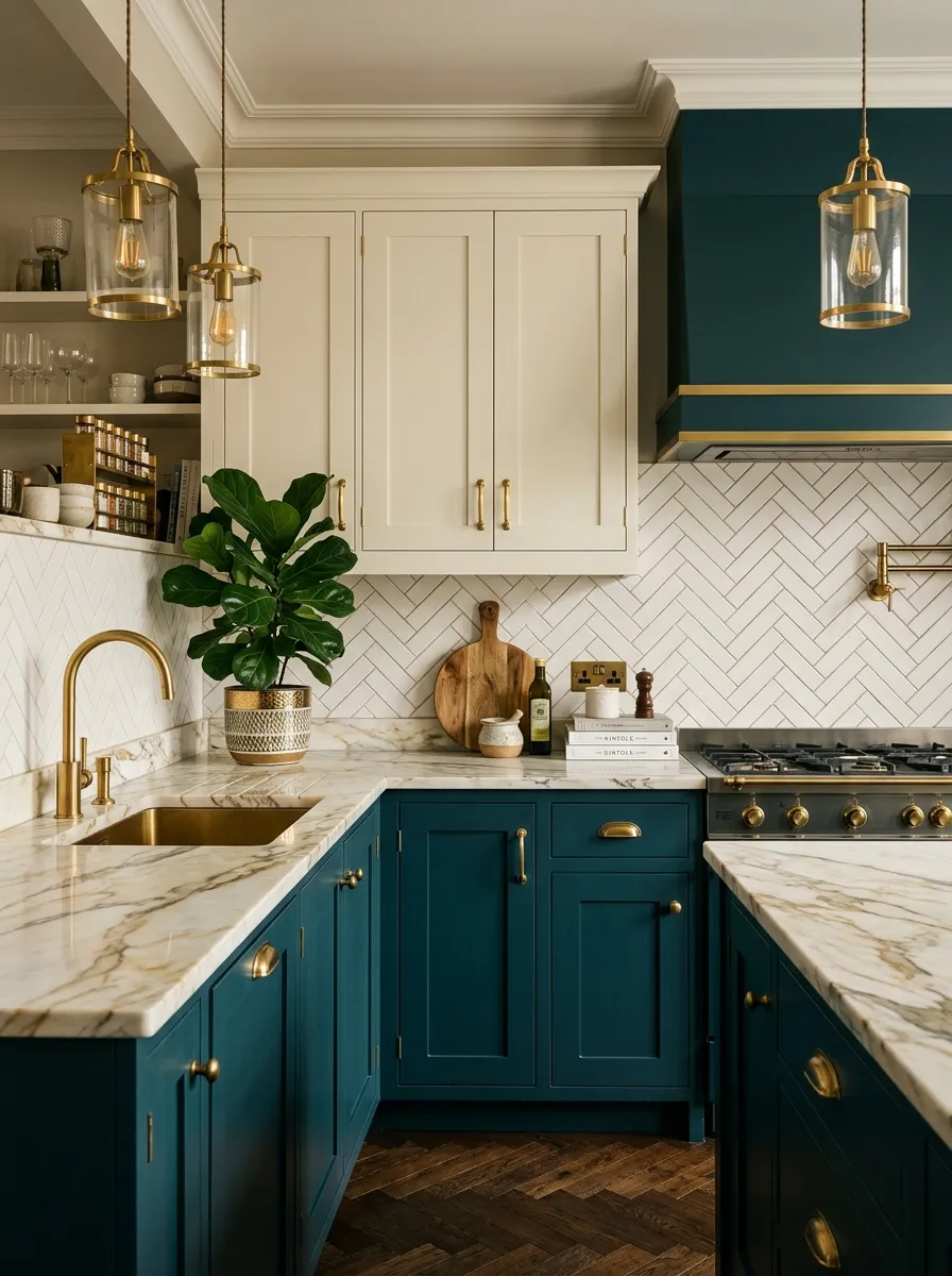
Teal is the jewel tone that makes kitchens look genuinely expensive. Its blue green depth reads as sophisticated and layered, and it pairs brilliantly with gold hardware to create a richness that feels more like a five star hotel lobby than a home kitchen in the very best way. I personally love how teal responds to warm lighting, shifting from bold in daylight to dramatically moody in evening light.
The key to making teal work in a colorful kitchen without it feeling cold is pairing it with warm neutrals above and warm metal accents throughout. Cream upper cabinets keep the space feeling open, while gold hardware ties the lower teal cabinets to the warmth above. Marble countertops with gold veining complete the luxury look naturally and cohesively.
The Key: Teal lower cabinets combined with cream uppers and gold hardware create a two tone kitchen that feels luxurious and designer without needing a renovation budget to match.
08
Mustard Yellow Accent Wall Kitchen
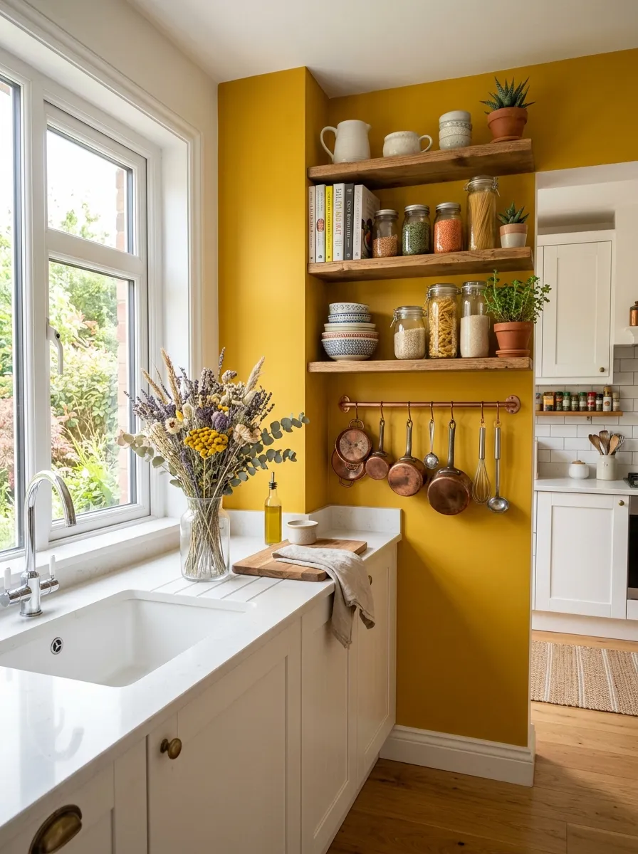
A single mustard yellow accent wall is one of the most budget friendly ways to bring color into a white kitchen without touching the cabinets. This approach is perfect for renters, beginners, or anyone who wants the warmth of a vibrant kitchen decor without full commitment. The yellow wall becomes an instant focal point that energizes the whole room.
What I have found is that open wooden shelving placed against a mustard yellow wall creates a warm, layered look that photographs beautifully. The natural wood tones are harmonized by the yellow behind them, and decorative items styled on the shelves pop against the bright backdrop. Copper or brass kitchen tools hung nearby reinforce the warm palette cohesively.
The Key: Painting a single accent wall in mustard yellow costs less than two hundred dollars in materials and transforms the entire energy of a white kitchen instantly and reversibly.
09
Emerald Green Tile Backsplash Drama
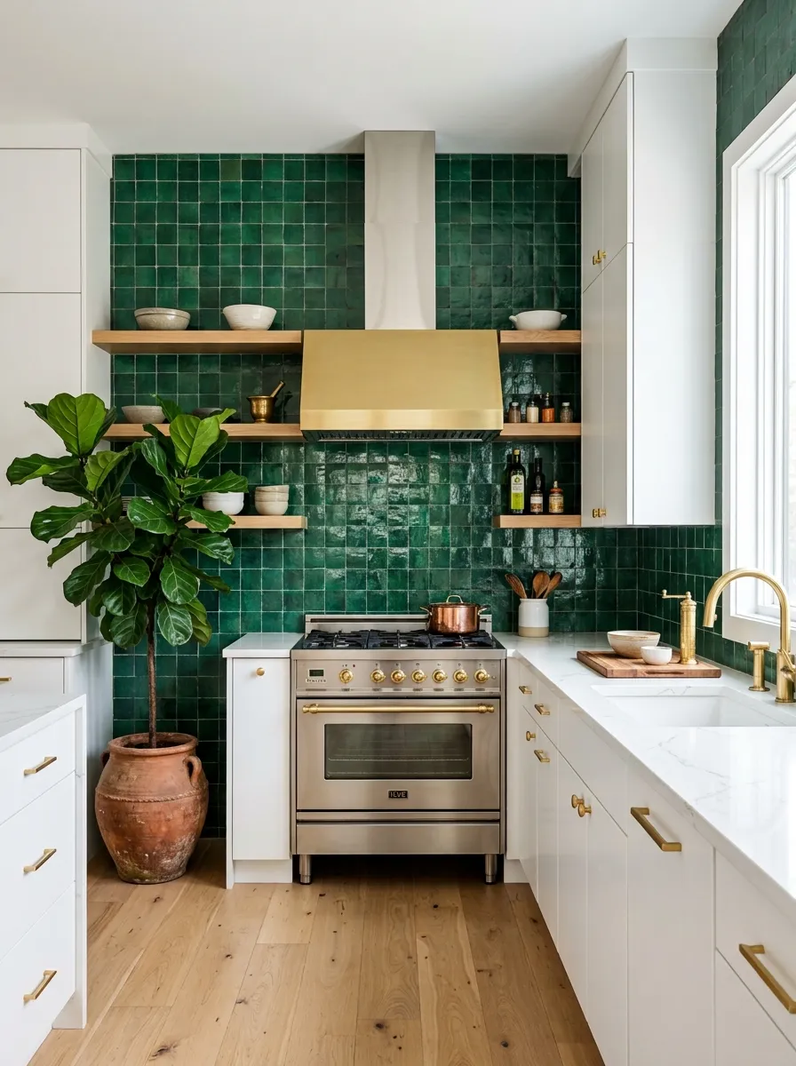
An emerald green tile backsplash is the most impactful single upgrade you can make to a white kitchen. Floor to ceiling zellige tiles in deep emerald transform a neutral backdrop into something that feels like a jewel box. The handmade quality of zellige tiles means each tile catches light slightly differently, creating a shimmering, alive quality that no flat painted surface can replicate.
White flat front cabinets keep the focus entirely on the green tiles, ensuring the backsplash remains the hero of the space. Brushed gold fixtures and hardware tie the warmth back into the jewel toned backdrop beautifully. This kitchen color ideas approach proves that color does not need to come from cabinets to dominate a room with confidence and style.
The Key: Zellige tiles work best in emerald green when installed floor to ceiling behind the range, creating a dramatic focal wall that elevates the entire kitchen instantly.
10
Coral and White Cheerful Combination
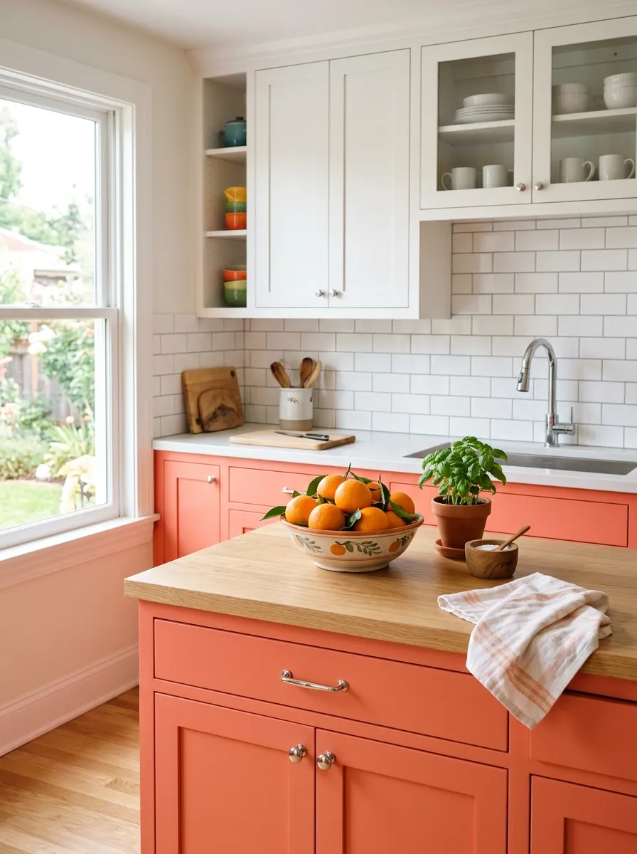
Coral is the friendliest color in the warm spectrum. It carries the energy of orange without its aggression, and the softness of pink without its delicacy, landing in a happy middle ground that makes kitchens feel immediately welcoming. Paired with crisp white upper cabinets and a white subway tile backsplash, coral becomes the warmth in an otherwise bright, clean space.
This combination works beautifully in smaller kitchens because the white keeps the space feeling open while the coral adds character and life. Chrome hardware keeps costs accessible and adds a clean, modern edge. A bowl of fresh oranges or clementines on the counter reinforces the warm palette naturally and brings a pop of real world color that ties the whole colorful kitchen design together.
The Key: Coral cabinets paired with white uppers and chrome hardware is a budget friendly combination that brings genuine warmth and personality to small and medium kitchens alike.
11
Lavender and White Soft Contrast
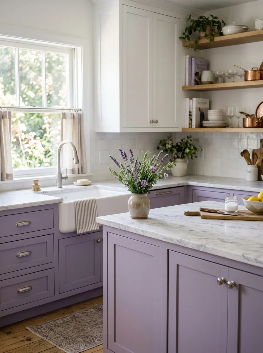
Lavender in a kitchen is rare enough to feel genuinely special, and that rarity is precisely what makes it so appealing on platforms like Pinterest. It reads as unexpected but somehow immediately right, especially in kitchens with good natural light where the muted purple softens into something almost ethereal. What I have tested in design layouts is that lavender works best when paired with cool whites rather than warm creams, because cool white amplifies the clarity of the purple without muddying it.
White marble countertops with subtle purple veining create a cohesive connection between the cabinets and the surface, making the palette feel like it was planned at an architect level. Brushed silver hardware keeps the color temperature cool and consistent throughout. This combination creates a vibrant kitchen decor that is gentle, original, and deeply beautiful.
The Key: Choose matte lavender over glossy to keep the look soft and sophisticated rather than bright, which preserves the serene, editorial quality of this delicate color palette.
12
Burnt Orange Bohemian Kitchen Feel
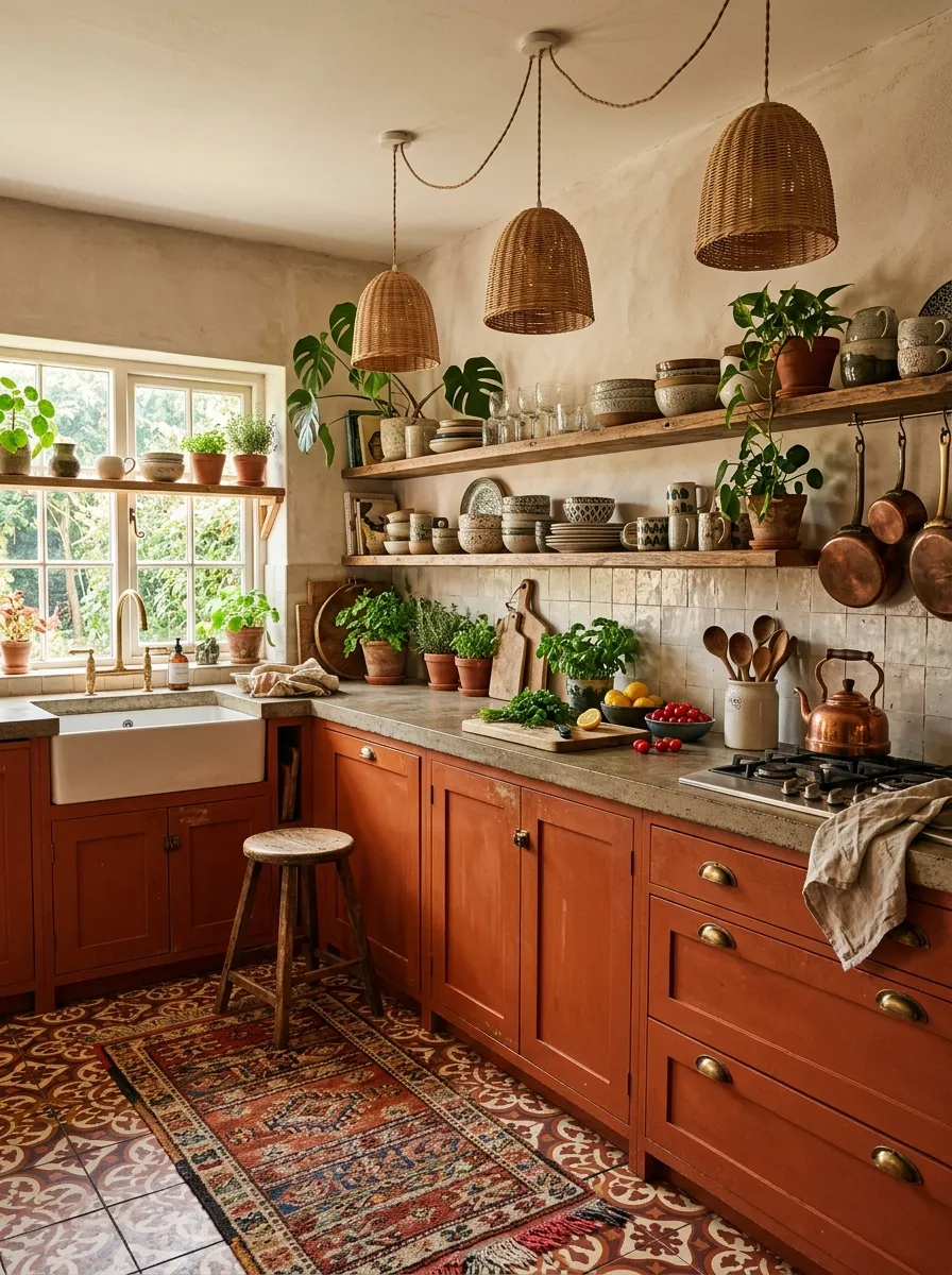
Burnt orange is the bohemian kitchen color that anchors a space in warmth and earthiness without trying too hard. It belongs to the same color family as terracotta but carries more depth and intensity, making it ideal for kitchens where you want bold character without the saturation of something like red or hot pink. This same warm, earthy energy is what makes a fully considered retro kitchen design feel so rich and personally expressive from every angle.
The key to keeping a burnt orange kitchen from feeling heavy is layering it with organic textures that breathe life into the space. Rattan pendant lights, open wooden shelves, Moroccan patterned floor tiles, and living plants all work in harmony with the orange backdrop to create a boho rich kitchen that feels collected and personal. This is bold kitchen colors expressed with warmth and culture.
The Key: Burnt orange cabinets with Moroccan floor tiles and rattan lighting create a layered bohemian kitchen that feels deeply personal, culturally inspired, and visually rich throughout.
13
Midnight Blue Moody Sophistication
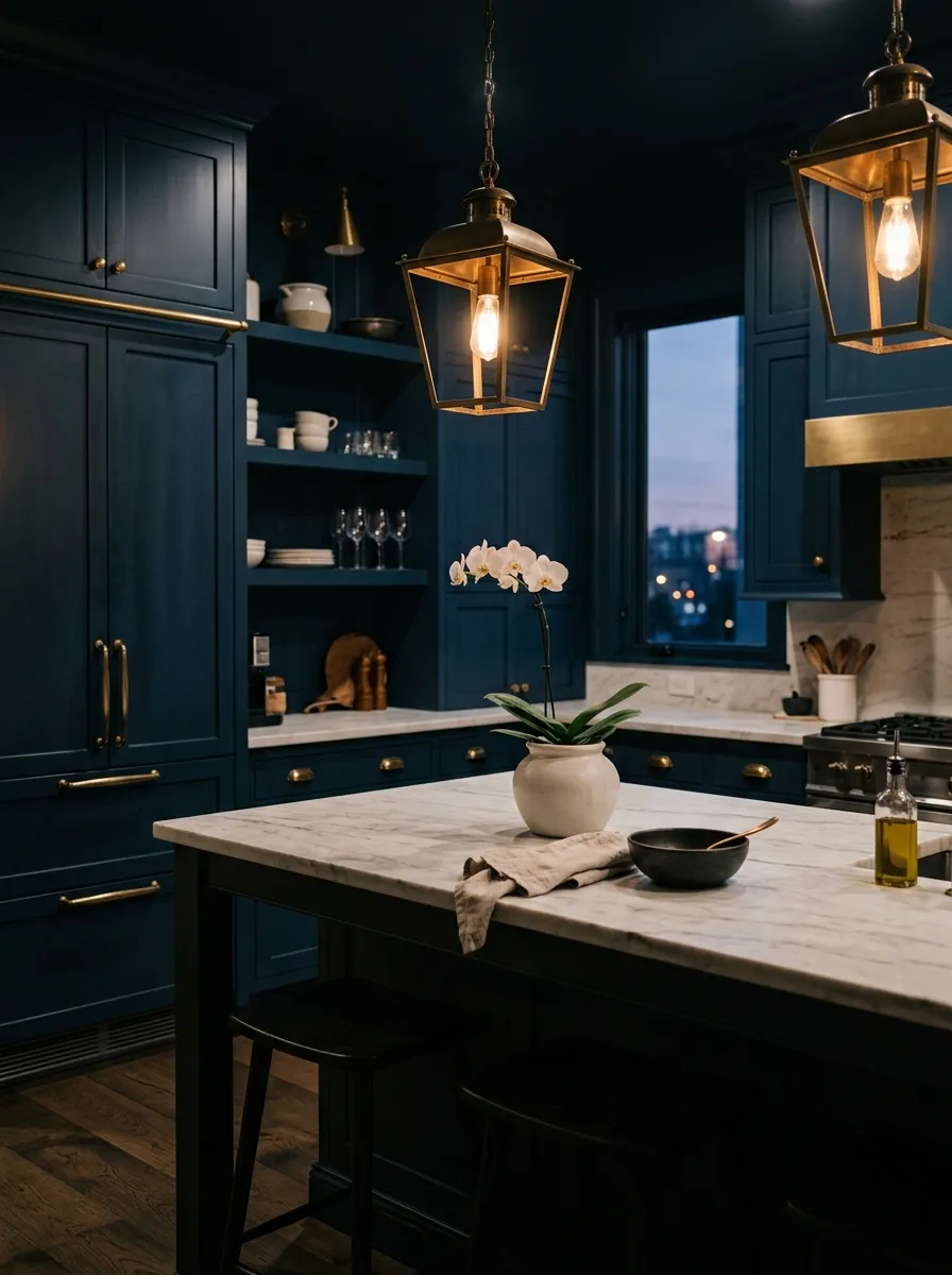
Midnight blue is one of those kitchen colors that announces itself immediately. The moment you see it, you feel the shift in atmosphere: the room becomes more serious, more considered, and somehow more luxurious. Unlike navy, which can read as casual, midnight blue has a depth and formality that elevates every other element around it. I always recommend this shade to clients who want their kitchen to feel like an experience, not just a room.
Aged brass hardware is the perfect companion to midnight blue because its warm, slightly tarnished quality softens the cool depth of the paint, creating a balance that feels expensive and intentional. A honed white marble countertop adds lightness and contrast, preventing the dark cabinets from closing in the space visually. This colorful kitchen approach is for those who are not afraid of commitment.
The Key: Midnight blue works best when used on all cabinets, floor to ceiling, because partial application creates confusion. Full commitment creates atmosphere and sophistication.
14
Sunshine Yellow Full Cabinet Kitchen
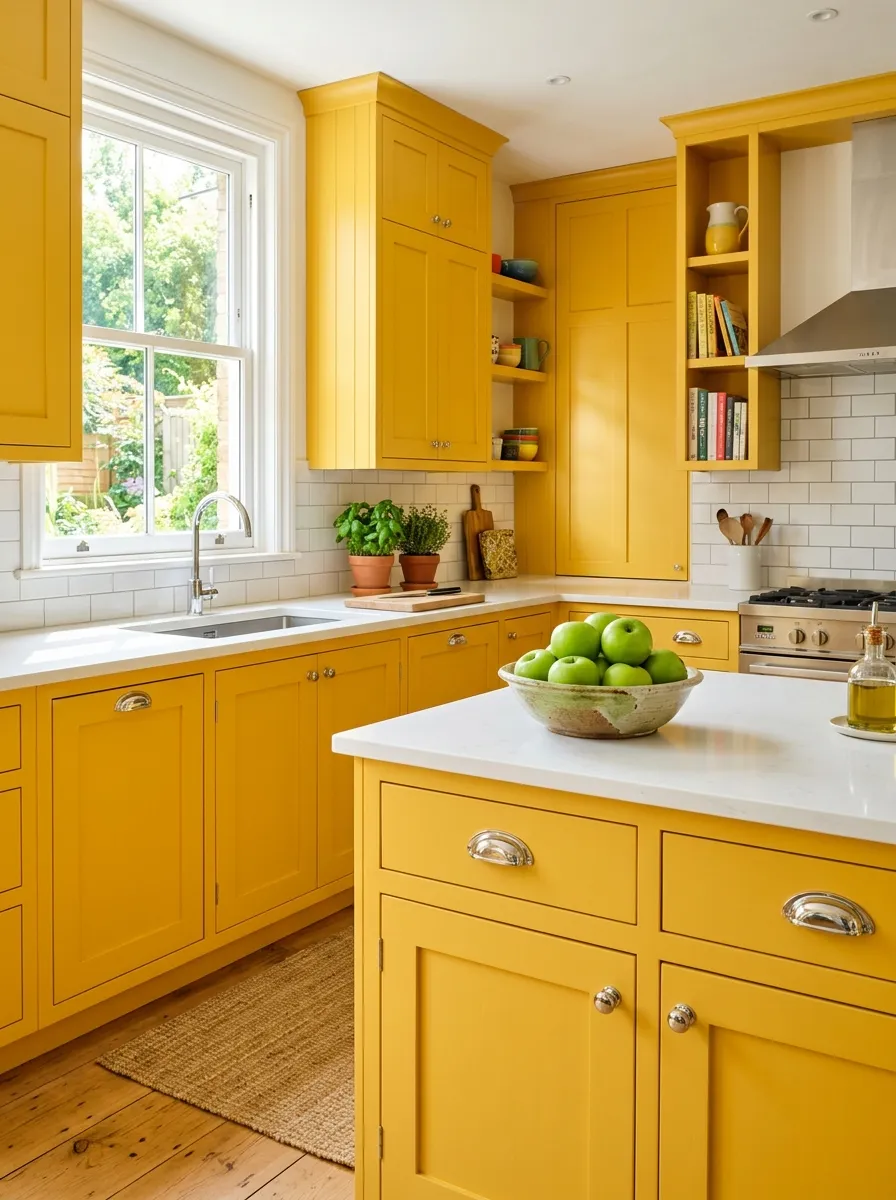
A kitchen dressed entirely in sunshine yellow is the most optimistic design choice you can make for your home. It is the color of morning energy, of warm light, of the feeling you get when you open the blinds and the sun comes flooding in. Used floor to ceiling on all cabinetry, sunshine yellow transforms the kitchen into something that feels genuinely celebratory. Trust me on this one: you cannot enter a yellow kitchen without smiling.
The challenge with full yellow cabinetry is keeping it from feeling overwhelming, and the solution is surprisingly simple. White countertops, white subway tile, and chrome hardware all reflect yellow tinged light without adding more warmth, which keeps the space bright rather than golden. Green apples or leafy herbs on the counter add a natural contrast that grounds the exuberant palette of this vibrant kitchen decor beautifully.
The Key: Full yellow cabinetry with white surfaces and chrome hardware creates a joyful kitchen that reads as intentional and editorial rather than childlike or overwhelming.
15
Forest Green and Brass Luxury Kitchen
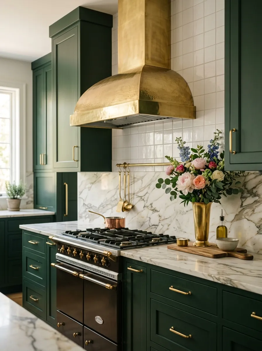
Forest green and polished brass is one of the most consistently stunning combinations in residential kitchen design. The depth of forest green darker than sage, richer than olive creates a backdrop that makes every brass detail catch the light like jewelry. This is kitchen color ideas at their most refined, where the kitchen stops being a functional room and starts being a design statement.
Personally, I think this combination photographs better than almost any other kitchen palette because the contrast between the dark matte green and the warm reflective brass creates visual texture without needing pattern or additional color. A brass range hood above the stove becomes the crown jewel of the kitchen, tying the hardware and the cabinetry into a cohesive luxury narrative that reads as effortlessly designer. That same commitment to a rich, deep-toned palette carries through naturally into a beautifully executed two tone cabinet approach that uses contrast in an equally sophisticated way.
The Key: Forest green paired with polished brass hardware and a marble countertop creates a kitchen that photographs with five star hotel luxury on a residential renovation budget.
16
Pastel Blue Cottage Kitchen Charm
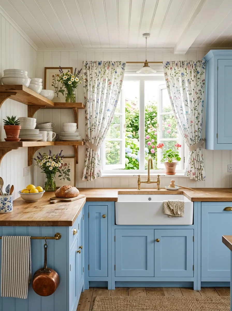
Pastel blue is the kitchen color that belongs to warm summers, slow Sunday mornings, and the kind of cottage life that makes you want to move to the countryside. It is soft enough to feel gentle and restful, yet distinct enough to read as a true design choice rather than a near neutral. In a kitchen with a farmhouse sink, beadboard ceiling, and floral curtains, pastel blue feels as though it has always been there, perfectly at home.
What I have noticed about pastel blue kitchens is that they photograph best in natural morning light, when the color takes on a fresh, luminous quality that makes the whole room glow. White open shelves styled with simple dishes and a small green plant add just enough contrast to keep the palette from feeling flat. This gentle approach to colorful kitchen design creates a space that is quietly beautiful and endlessly restful.
The Key: Pastel blue cabinets work best in cottage style kitchens because the soft color harmonizes with natural wood, white, and floral textiles that are already central to that aesthetic.
17
Red Accent Cabinet Kitchen Drama
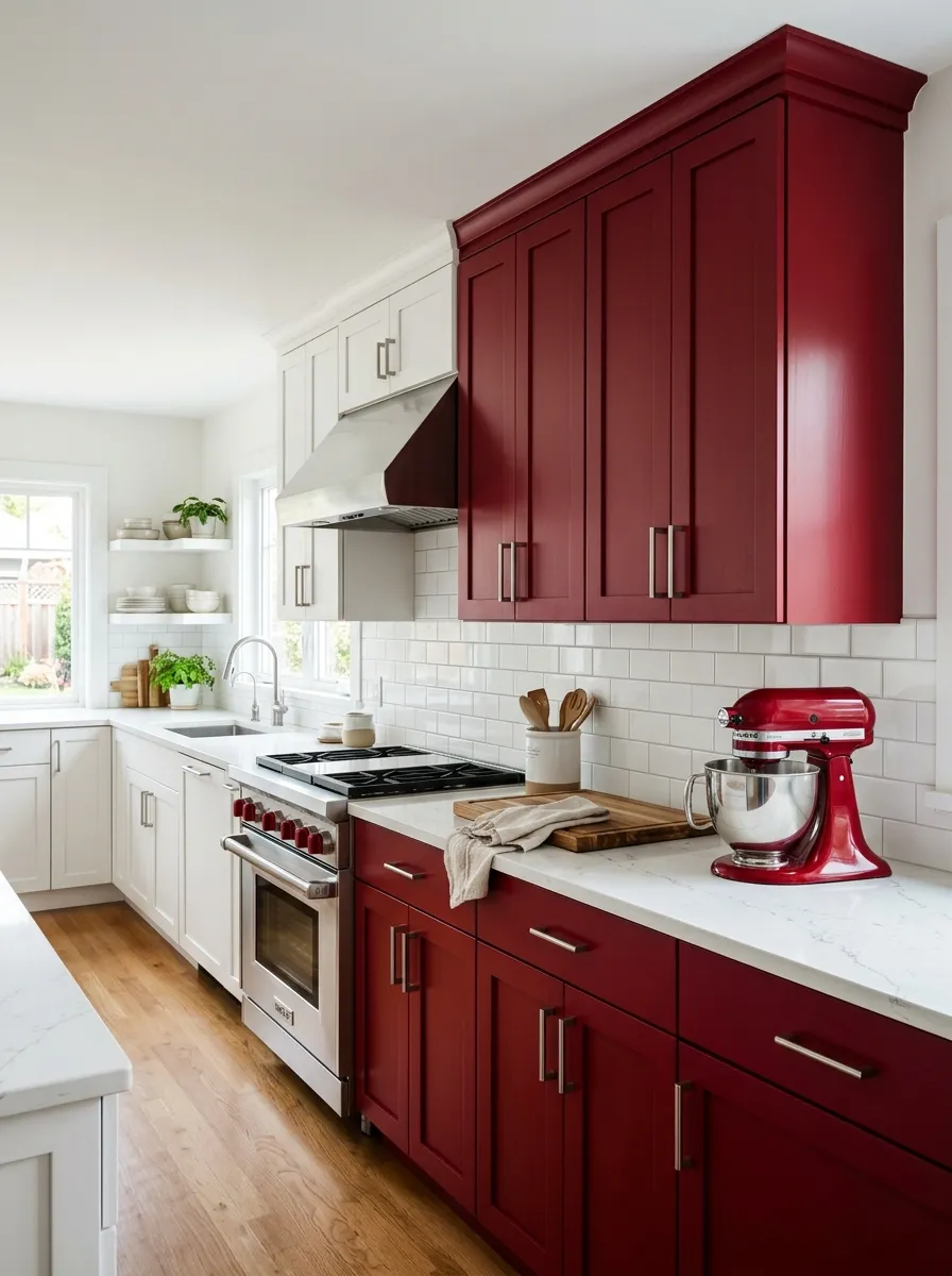
Red accent cabinets are the kitchen equivalent of a red lip bold, confident, and impossible to ignore. Concentrating the red on a single wall of cabinets keeps the energy contained and intentional, letting the color make its full impact without overwhelming the rest of the room. White cabinets on all other walls ensure the kitchen feels balanced rather than visually aggressive.
Stainless steel hardware keeps the red feeling modern rather than retro, and a matching red appliance on the counter reinforces the accent color as a deliberate palette choice rather than an accident. This bold kitchen colors strategy is the smartest way to introduce a high risk hue into your home because it gives you the drama without requiring you to repaint the whole kitchen if your preferences change over time.
The Key: Limiting red to one cabinet wall with white everywhere else is the professional approach that turns a high risk color into a high reward focal point in any kitchen layout.
18
Colorful Kitchen with Patterned Tile Floor
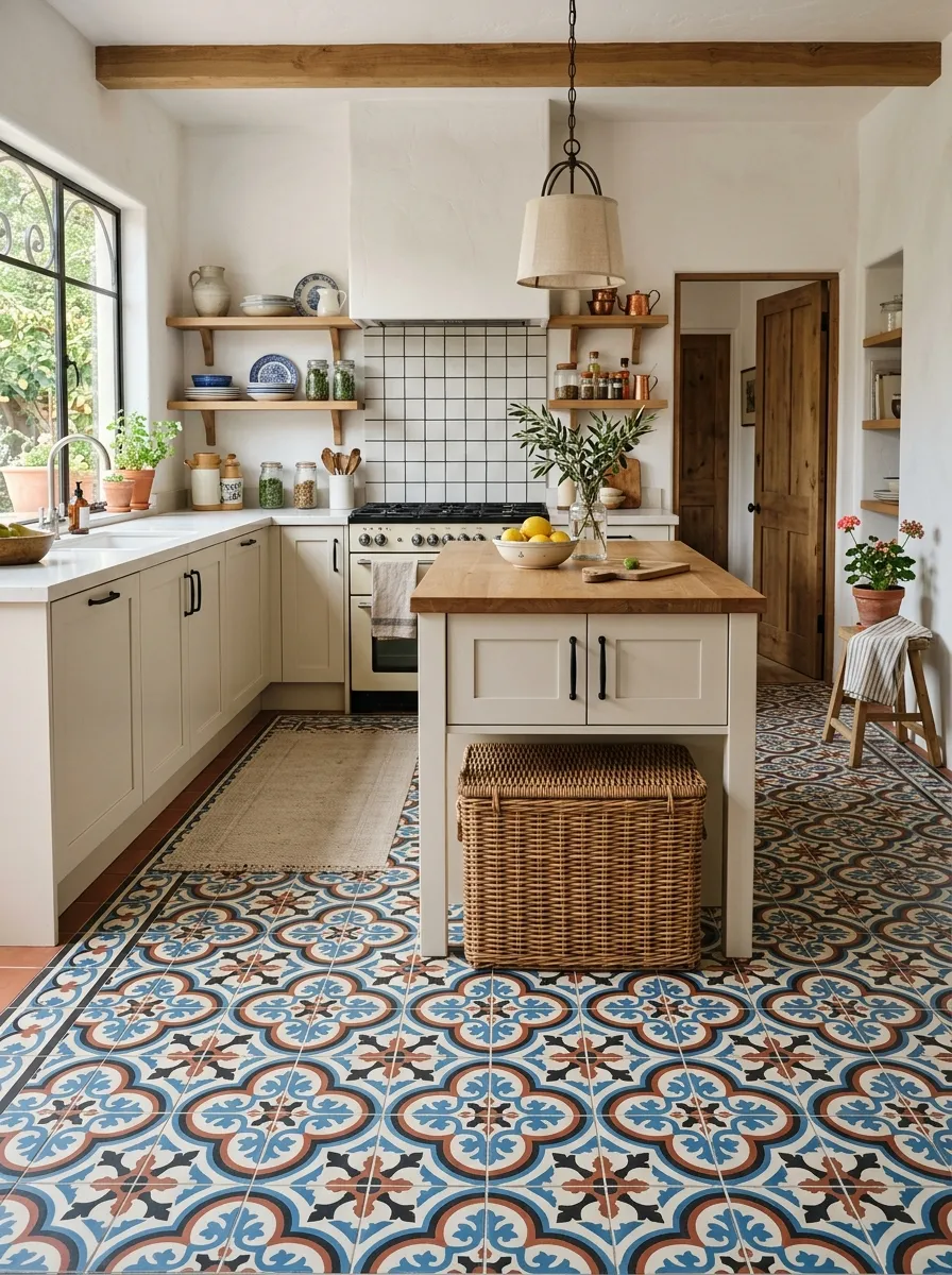
A patterned tile floor is one of the most underused tools in creating a colorful kitchen without touching a single cabinet. By keeping cabinets, countertops, and walls completely neutral, you allow a bold encaustic or cement tile floor in Mediterranean or Moroccan patterns to carry the full weight of the color story. The result is a kitchen that looks curated, layered, and deeply intentional.
Encaustic tile floors in blue, terracotta, white, and black are especially powerful because they reference global design traditions that feel both timeless and richly personal. The patterned floor creates a visual anchor that makes simple open shelving and matte black hardware feel like sophisticated design choices rather than afterthoughts. A wicker basket under the island adds one more layer of organic texture to the mix.
The Key: A patterned encaustic tile floor in a neutral kitchen removes all the risk from bold color choices because it is one contained, flat surface that color defines the entire room.
19
Two Tone Colorful Kitchen Cabinet Approach
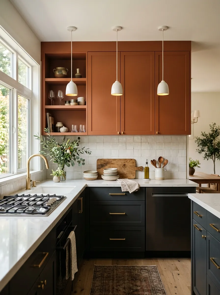
Two tone cabinetry is the single most effective way to add complexity and personality to a kitchen without making a single bold single-color decision. By choosing two colors that share a common quality, in this case the earthy richness of both charcoal and terracotta, you create a layered palette that feels considered and designer from every angle. If you want to explore every possible direction this technique can go, there are dedicated cabinet combinations worth studying before choosing your final palette.
Deep charcoal lower cabinets ground the kitchen with visual weight and stability, while terracotta uppers inject warmth and energy that keeps the space from feeling cold or institutional. White quartz countertops act as the neutral bridge between the two tones, and matte gold hardware ties both colors together through its warm metallic quality. This is colorful kitchen design expressed with restraint and elegance.
The Key: Two tone kitchens succeed when both colors share a common temperature or undertone. Charcoal and terracotta both carry warmth, which makes them feel cohesive despite their contrast.
20
Mint Green Retro Kitchen Vibe
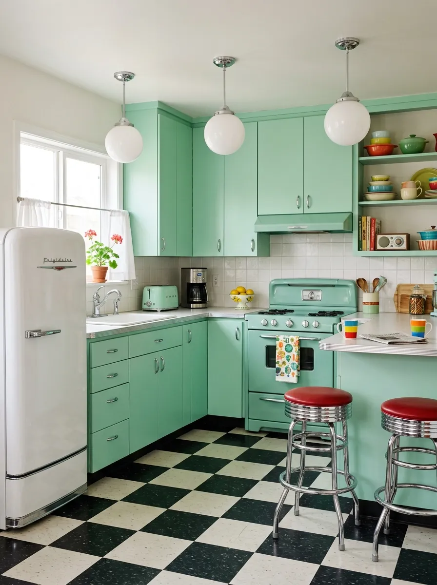
Mint green is the color of diners, soda fountains, and the kind of cheerful mid century optimism that makes any kitchen feel like a celebration. In a retro inspired space, mint green flat front cabinets pair naturally with chrome vintage hardware, a checkerboard floor, and rounded appliance edges to create a nostalgic kitchen that feels both playful and intentional. That retro energy is the same spirit driving the most beloved retro kitchen designs that balance vintage personality with everyday livability.
The checkerboard floor is essential to the retro mint kitchen because it provides the graphic contrast that keeps the mint from floating without a visual anchor. Chrome bar stools and globe pendant lights reinforce the mid century moment throughout the space. From what I have seen, this style photographs with extraordinary energy and is consistently one of the most saved kitchen aesthetics on Pinterest.
The Key: Mint green retro kitchens need a checkerboard floor to complete the aesthetic. Without the floor contrast, the mint reads as just another pastel rather than a committed design era.
21
Multicolor Maximalist Tile Kitchen
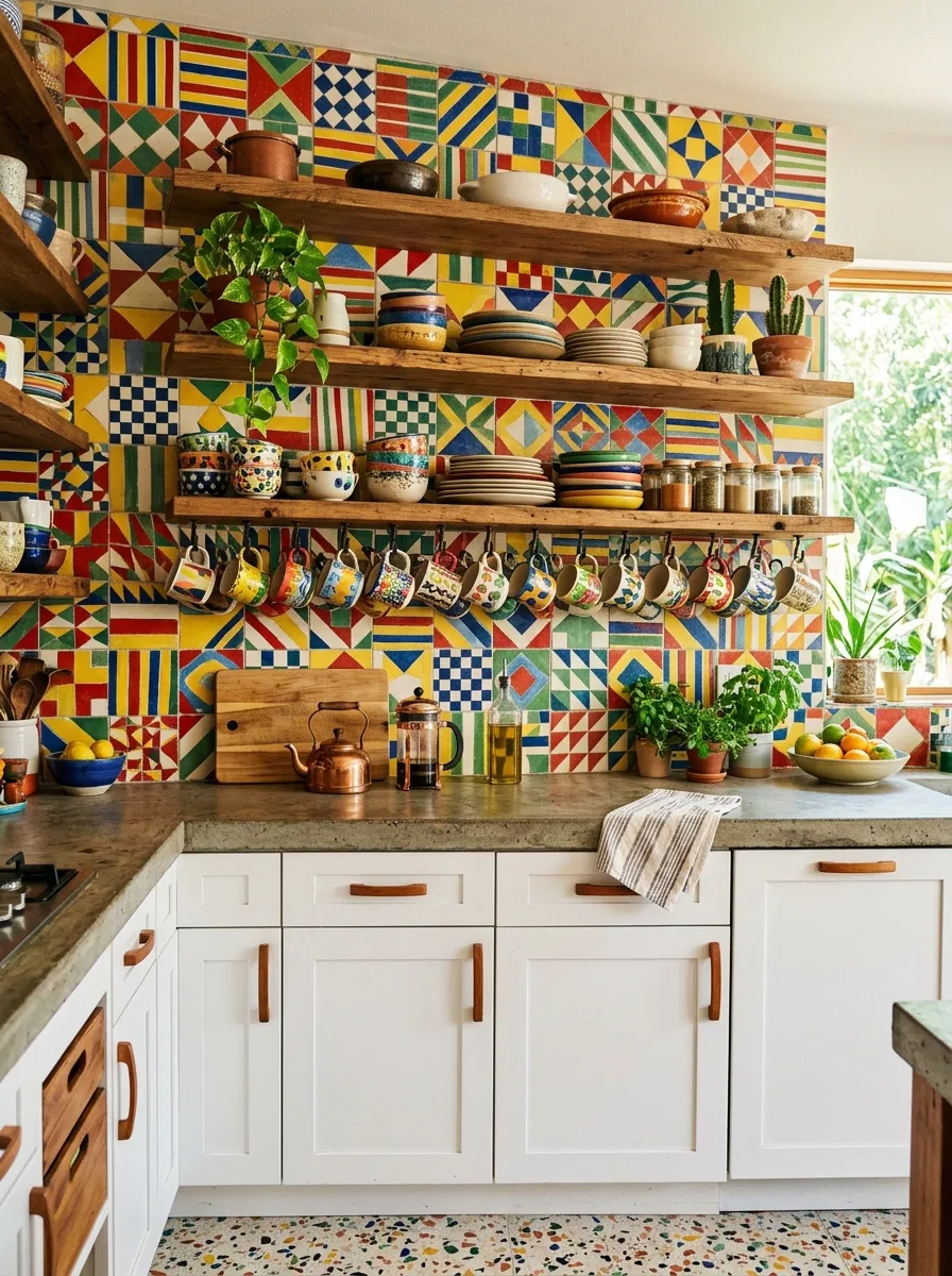
Maximalist tile kitchens are not for the timid, and that is exactly what makes them so exciting. A floor to ceiling handmade tile backsplash in a full spectrum of colors turns the cooking space into something closer to an art installation than a functional room. Yet when the tiles are handmade and the pattern is geometric, there is a structure to the chaos that keeps the whole design from dissolving into noise.
White lower cabinets are the anchor that makes a maximalist tile backsplash readable. By keeping the largest surfaces neutral, all the visual storytelling is concentrated on the tile, which is exactly where it should be. This is the most fearless expression of kitchen color ideas possible, and it rewards those who embrace it with a kitchen that never stops being interesting. A collection of colorful ceramic mugs hung from hooks extends the multicolor palette joyfully into the foreground.
The Key: White lower cabinets beneath a multicolor tile backsplash give the eye a resting place so the bold tiles read as art rather than visual overload in the kitchen space.
22
Warm Peach and Cream Kitchen Softness
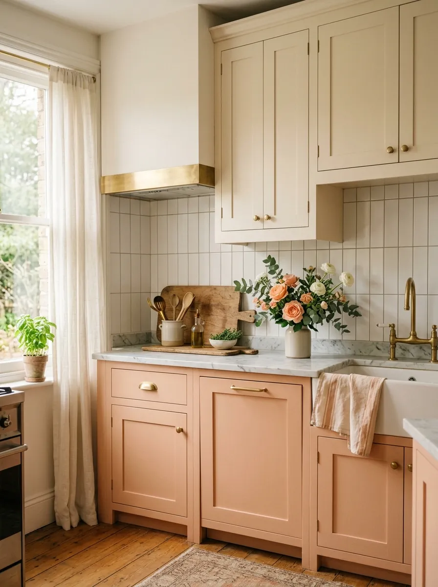
Peach is one of those kitchen colors that feels immediately warm and nourishing without being loud or demanding. It sits just between pink and orange on the color wheel, carrying the warmth of both without the intensity of either. In a colorful kitchen, peach painted shaker cabinets paired with cream uppers create a palette that feels like late summer sunshine filtered through sheer curtains soft, glowing, and genuinely welcoming.
Brushed gold hardware ties together the peach and cream tones through its warm metallic quality, and a white ceramic tile backsplash keeps the space bright without adding visual complexity. Fresh flowers on a marble countertop bring the organic world into the kitchen gently, completing a design that feels lived in rather than staged. This palette is one of the most serene and personally, I think, most underrated approaches to warm kitchen color.
The Key: Peach and cream cabinets create the warmest, most welcoming kitchen palette when paired with brushed gold hardware, which amplifies the soft orange undertones of both colors naturally.
23
Bold Black and Color Pop Kitchen
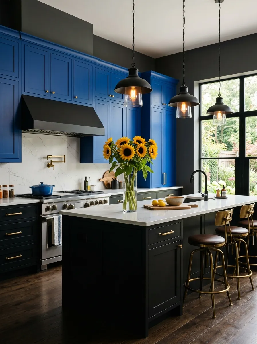
Matte black cabinets on their own read as sleek and minimal, but when you add cobalt blue upper cabinets above them, the kitchen transforms into something far more expressive and bold. The contrast between the absorbing darkness of matte black below and the saturated vibrancy of cobalt above creates a visual tension that makes the kitchen impossible to forget. This is the colorful kitchen approach for those who want both drama and design intelligence.
Brass hardware bridges the two cabinet colors through warmth, preventing the combination from reading as cold or industrial. Yellow sunflowers in a clear glass vase on the white countertop introduce the final complement color yellow opposite blue on the color wheel creating a complete, energized palette that feels thoughtfully composed. This is bold design with genuine logic behind every choice.
The Key: Matte black lower cabinets ground a cobalt blue upper cabinet kitchen in deep shadow, allowing the blue above to feel vivid and celebratory rather than chaotic or overwhelming.
24
Colorful Open Shelf Kitchen Display
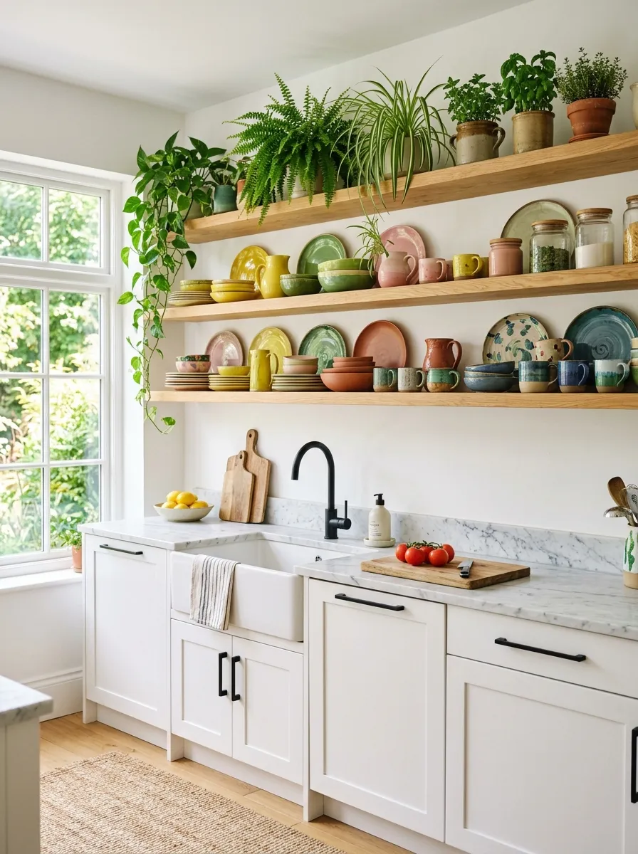
Open shelving is the most expressive version of the colorful kitchen because the color lives entirely in your collection of ceramics, plants, and treasured objects rather than in any painted surface. This makes it the most personal and flexible approach to kitchen color of all 24 ideas in this list: your palette can evolve as your collection grows, and no paint job is required when your taste changes.
A white kitchen with white lower cabinets and marble countertops gives the open shelves the cleanest possible backdrop, ensuring that the colorful ceramics read with full clarity and impact. Grouping items by loose color families on each shelf creates a sense of organization within the maximalist display. This same instinct for using colorful objects and bold accessories to inject personality into a neutral space is exactly what drives the best colorful apartment decorating ideas that work beautifully even when you cannot touch the walls or cabinets.
The Key: Open shelf kitchens succeed when ceramics are grouped loosely by color family so each shelf has its own palette moment that contributes to a cohesive whole rather than visual chaos.
Your kitchen is the room where your day begins and ends, and it deserves a palette that makes both moments feel a little more alive. Whether you are drawn to the moody luxury of midnight blue, the joyful optimism of sunshine yellow, or the quiet elegance of sage green, every colorful kitchen idea in this list proves that bold color and beautiful balance are not opposing forces. I have seen so many kitchens transformed simply by committing to one color choice with confidence, and the results are always worth it.
Save this post to your Pinterest board so you can come back to these ideas whenever you need inspiration, and share it with a friend who has been dreaming of a kitchen upgrade but has not yet found the courage to go for it. Color is one of the most accessible tools in home design, one that costs little, changes everything, and speaks directly to how you feel in your own home every single day. You now have 24 reasons to begin.