Two Tone Kitchen Cabinet
🏠 20 Real Ideas
⏱ Quick Read
🔥 Always Trending
20 Two Tone Kitchen Cabinet Ideas That Create a Balanced, Stylish, and Designer Inspired Look
There is something about a kitchen designed with two different cabinet colors that stops you mid scroll and makes you want to save it immediately. The contrast feels intentional, the balance feels artful, and the whole room looks like it came straight out of a design magazine. A two tone kitchen cabinet look is one of the most powerful and approachable upgrades you can give your kitchen without tearing everything out and starting over. I have noticed that this one design decision transforms an ordinary space into something that genuinely reflects personality and style.
This article brings you 20 real, beautifully specific ideas for two toned kitchen cabinets that work across every home style, budget, and taste. Whether you are drawn to moody contrasts or soft, romantic pairings, each idea here comes with the practical detail you need to actually pull it off. You will learn which colors to pair, how to balance them, what hardware to choose, and how to make the whole look feel cohesive rather than chaotic. By the end, your kitchen will feel entirely possible to reimagine, and your Pinterest board will be very, very full.
01
Navy Blue and Crisp White
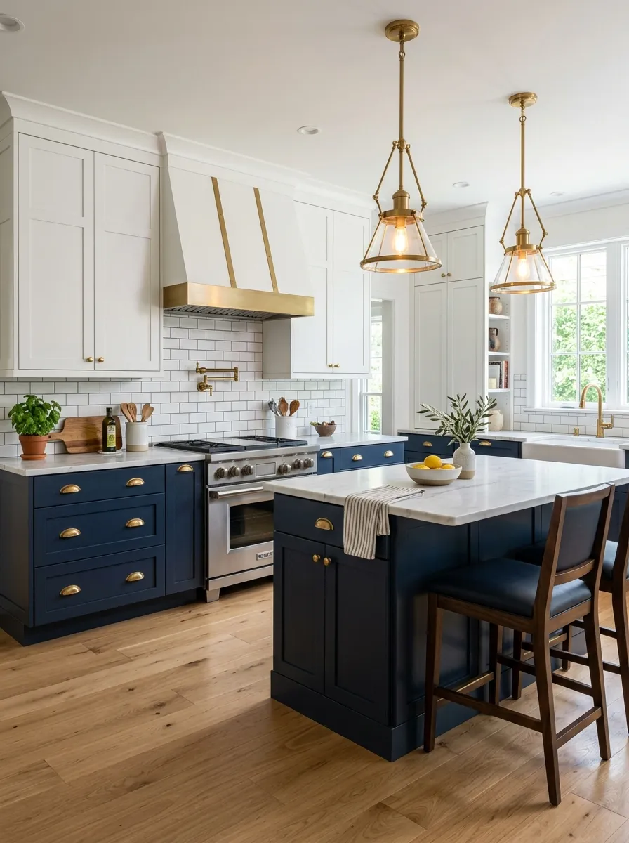
Navy and white is the combination that never goes out of style, and for good reason. The deep richness of navy blue brings a feeling of depth and grounded sophistication to the lower cabinets, while bright white uppers open the room up visually and keep the whole space from feeling heavy. What I have found is that this pairing works beautifully in both small galley kitchens and large open concept spaces because the contrast creates definition without division.
The secret to making this two color kitchen cabinet look feel elevated rather than ordinary is in the hardware. Brushed brass or antique gold pulls add warmth that softens the sharp contrast between the two tones. Pair it with a white marble or quartz countertop to keep the upper portion of the kitchen light and airy. A dark grout subway tile backsplash bridges both colors naturally and adds a layer of texture that pulls the whole design together with intention.
The Key: Navy lower cabinets must stay below eye level to anchor the space visually without closing it in. White uppers reflect light upward and make ceilings feel higher.
02
Warm White and Sage Green
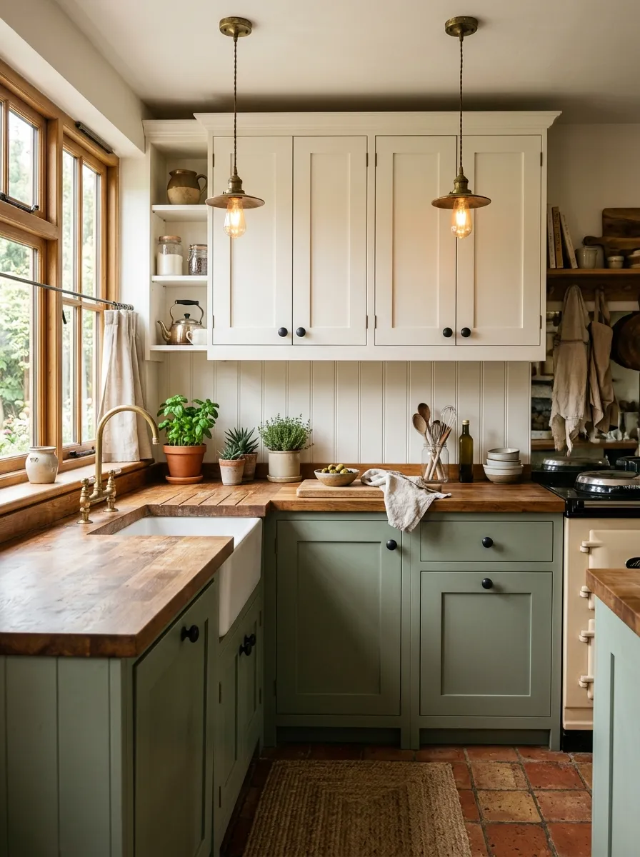
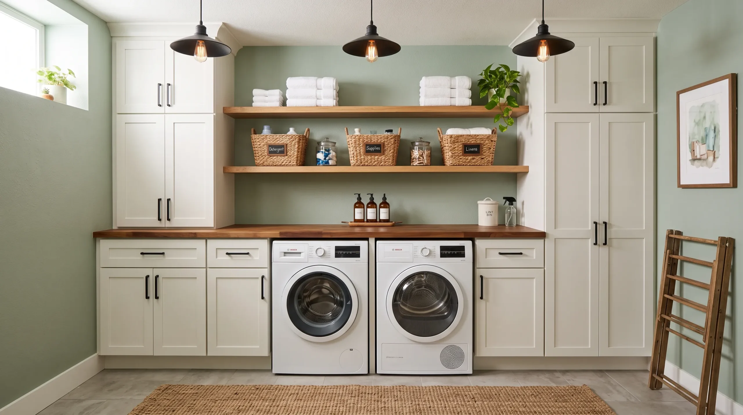
Sage green and warm white together create the kind of kitchen atmosphere that makes you want to stay in and cook all weekend. The muted green tone carries an earthy, organic quality that feels both calming and fresh, while warm white uppers keep the mood bright and welcoming. This is one of those kitchen cabinet color combinations that photographs beautifully and feels just as good to live in every single day. The same sage green magic is what makes the best cottage kitchen designs so quietly beautiful and enduring.
To give this pairing real depth and character, lean into natural materials throughout the rest of the kitchen. A butcher block countertop adds warmth and texture that complements the sage tone beautifully. Woven barstools, linen curtains, and ceramic canisters in cream or terracotta tones complete the picture. Matte black hardware on the lower cabinets creates a subtle contrast that defines the green without competing with it, keeping the whole look soft and layered rather than loud and heavy.
The Key: Keep both tones in the same warm undertone family so they feel connected. Mixing a cool sage with a warm white creates an undertone clash that makes the design feel unresolved.
03
Charcoal Gray and Soft Linen
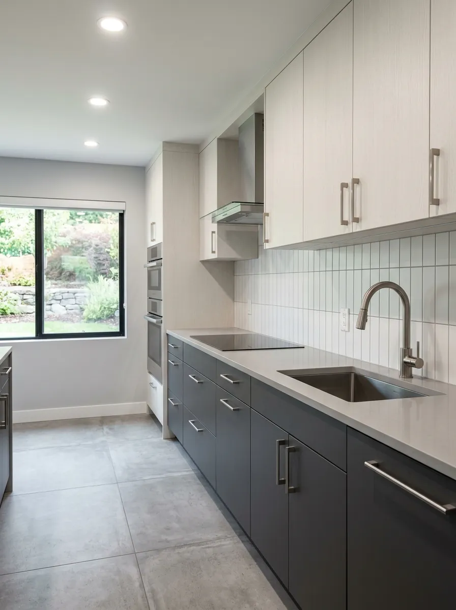
Charcoal gray and soft linen is the adult version of a two toned kitchen that feels quietly luxurious rather than aggressively dramatic. The charcoal lowers bring structure, weight, and a sense of permanence, while the soft linen uppers introduce warmth and lightness that prevents the space from feeling cold or industrial. From what I have seen in real kitchens, this combination works best in homes where the design language is calm, deliberate, and rooted in quality over decoration.
The key to this two tone kitchen cabinet pairing is choosing the right finish. Matte finishes on both cabinet colors keep the look sophisticated and cohesive, while any gloss finish on the charcoal can make the lower cabinets feel overpowering. Light gray quartz or limestone countertops sit naturally in the middle of both tones, acting as a visual bridge. Brushed nickel or chrome hardware keeps the look cool and modern, and vertical tile on the backsplash adds height without adding noise.
The Key: Avoid warm toned hardware like brass in this palette. It pulls the linen toward yellow, which disrupts the cool calm of the charcoal and makes the combination feel mismatched.
04
Forest Green and Natural Wood
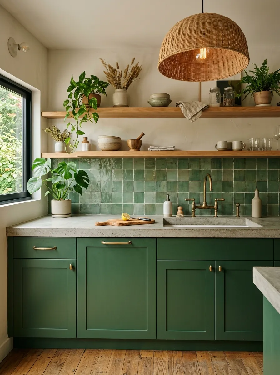
Forest green paired with natural wood is one of those kitchen cabinet color combinations that feels deeply rooted in nature without looking like a garden shed. The rich, saturated green grounds the lower cabinets with confidence and sophistication, while open wood shelves above replace traditional upper cabinets and bring in organic warmth that softens the whole space. This approach feels intentional, artistic, and incredibly livable, especially in kitchens where the homeowner wants depth without heaviness.
What makes this combination so visually satisfying is the way green and wood mirror each other tonally. Both carry warm undertones that link them without requiring any additional color to mediate. Aged brass hardware on the green cabinets ties directly to the golden tones in the wood grain, creating a palette that feels curated but effortless. A zellige tile backsplash in a complementary earthy green adds texture and handcrafted character. This same forest green and brass pairing is a cornerstone of the most elevated colorful kitchen designs that feel genuinely luxurious.
The Key: Choose a wood tone that reads warm, not orange. Blonde oak or oiled walnut both harmonize with forest green in a way that orange tinted pine never will.
05
Dusty Blue and Creamy White
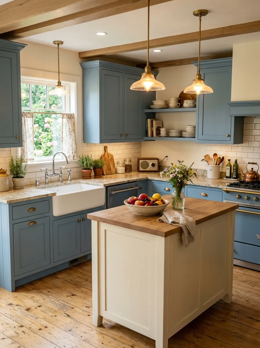
Dusty blue and creamy white together create a kitchen that feels like a breath of calm, cool coastal air paired with the softness of old linen. The blue carries just enough pigment to feel intentional without being bold, and the cream island breaks the space visually while adding a warmth that keeps the entire room from reading too cold. I personally love this combination because it works across so many home styles, from modern farmhouse to quiet coastal to relaxed traditional.
The success of this two toned kitchen cabinets look depends heavily on getting the cream tone exactly right. A cream that pulls too yellow will clash with the cool blue undertones, while a warm off white or antique white sits beautifully alongside dusty blue because it carries a slight gray in it. Chrome or brushed silver hardware on the blue cabinets reinforces the cool palette, while a light speckled granite countertop brings in just enough movement and natural texture to keep the space feeling alive.
The Key: Use the cream exclusively on the island so both tones get visual breathing room. Cream throughout all lowers makes the dusty blue feel isolated and disconnected from the overall design.
06
Black and Light Wood Grain
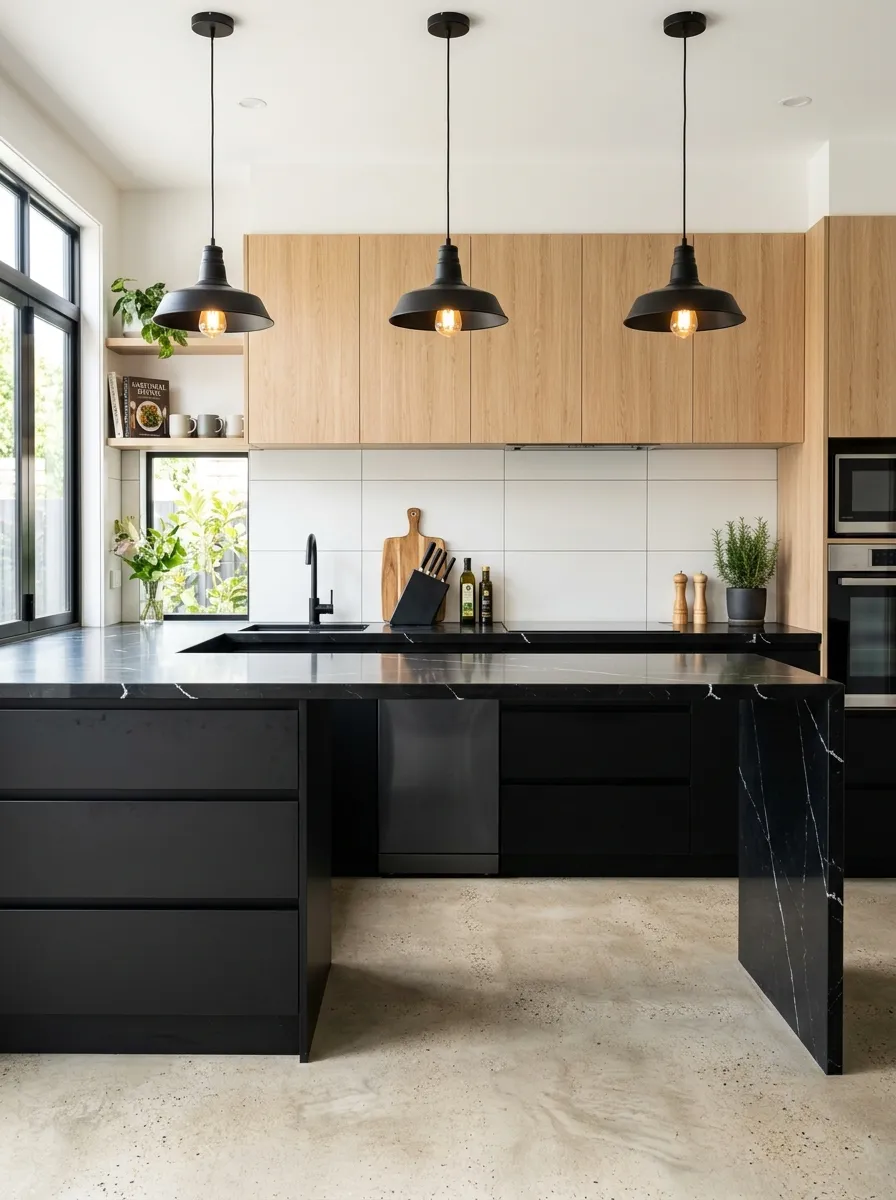
Matte black paired with light oak wood grain is the combination that looks like it belongs in an architectural magazine, and the best part is that it is entirely achievable in a real home kitchen. The black lower cabinets deliver maximum drama and visual weight at the base of the room, while the light wood grain uppers bring warmth and natural texture that prevent the space from feeling cold or showroom sterile. This is a pairing for homeowners who want bold design choices that still feel warm and genuinely livable.
The contrast between matte black and light oak works because they occupy opposite ends of the visual spectrum while sharing a common organic quality. Black sits quietly without reflecting light, while pale wood grain catches it and scatters it gently across the room. Integrated pulls or touch latch hardware on the black lower cabinets keep the profile clean and uninterrupted. A black quartz countertop with white veining connects the upper and lower tones and adds a layer of luxury that ties the entire design together beautifully.
The Key: Commit fully to matte finishes on the black cabinets. Even a slight sheen makes the black look inexpensive and draws attention to every fingerprint and smudge.
07
Terracotta and Off White
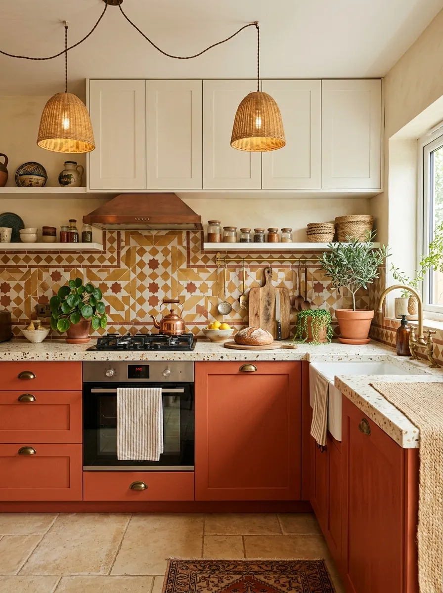
Terracotta and off white bring a warmth to the kitchen that feels completely irreplaceable by any trend driven palette. The terracotta lower cabinets introduce the rich, clay-like tones of sun baked earth that immediately make a kitchen feel inviting, grounded, and full of personality. Paired with off-white uppers, the look gains a softness that keeps the terracotta from overwhelming the eye. The same earthy terracotta warmth that works so beautifully in a kitchen also anchors the most beloved retro kitchen designs that lean into warm, vintage-inspired color combinations.
Terracotta belongs in the warm undertone family, so every other element in the kitchen should agree. Cream or ivory countertops in terrazzo or honed limestone feel perfectly at home alongside the earthy lower cabinets. Antique brass hardware reinforces the warm palette without introducing any cool contrast that would disrupt the cohesion. A handmade Moroccan or encaustic tile backsplash adds an artisanal quality to this upper and lower cabinet colors pairing that elevates it from colorful to genuinely layered and collected.
The Key: Use off white specifically, not bright white. Bright white next to terracotta reads as a jarring contrast rather than a warm complement, and it flattens the richness of the clay tone.
08
Warm Taupe and Deep Plum
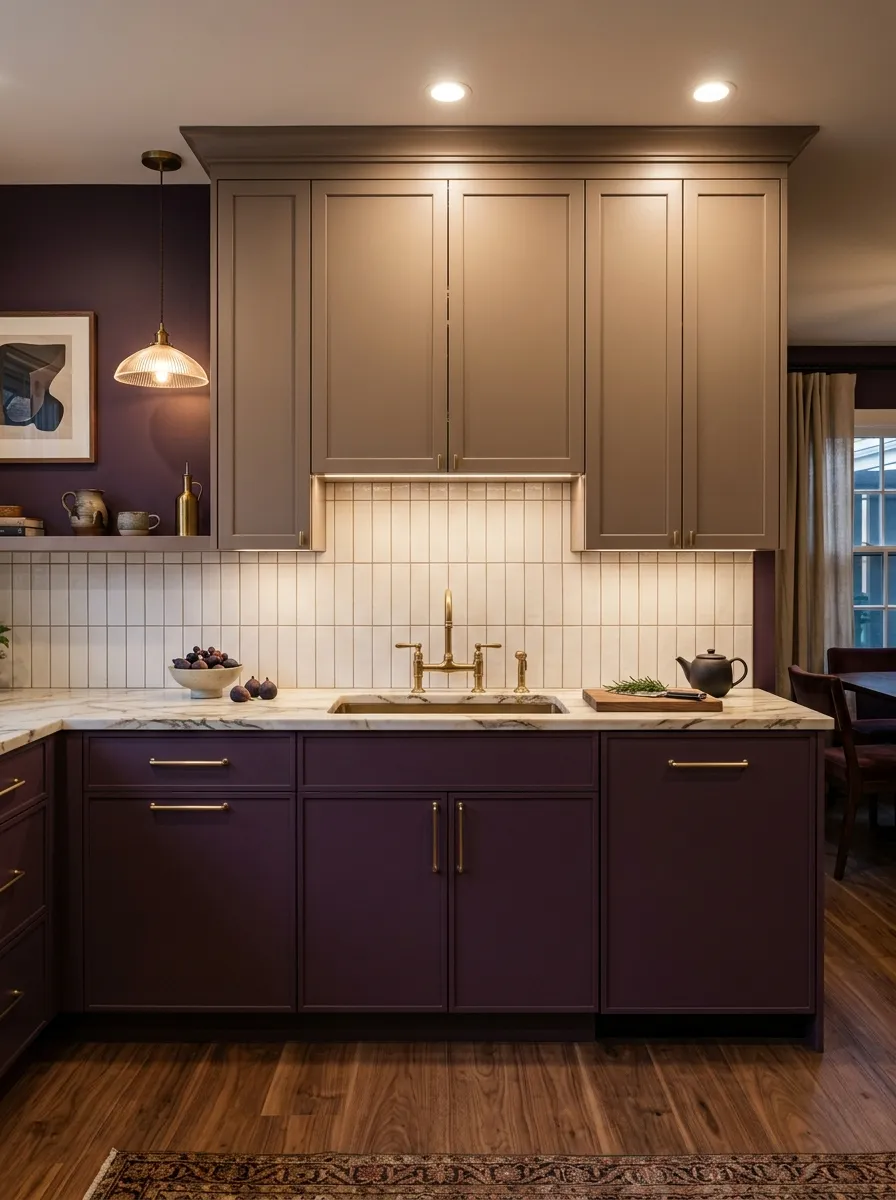
Deep plum and warm taupe is the combination that proves jewel tones belong in the kitchen just as much as they belong in a velvet sofa or a gallery wall. The plum lower cabinets introduce a richness and depth that feels luxurious and genuinely surprising, while the warm taupe uppers ground the palette with a calm, sandy neutral that prevents the purple from reading as theatrical. One thing I have learned from working with bolder palettes is that the neutral always has to be warm enough to embrace the jewel tone rather than simply sitting alongside it.
The beauty of this two color kitchen cabinet combination is how naturally sophisticated it feels despite the boldness of the plum. Matte gold hardware on the lower cabinets ties the jewel tone directly to the warm uppers, creating a bridge that makes the whole palette feel deliberate. Warm white marble countertops with soft gray veining provide a luxurious surface that complements both tones equally without competing with either. Warm recessed lighting above and pendant lighting over the island brings out the depth of the plum beautifully at every hour of the day.
The Key: Plum reads differently under warm versus cool lighting. Always test paint samples under the actual lighting conditions of your kitchen before committing to a full cabinet repaint.
09
Pale Yellow and Bright White
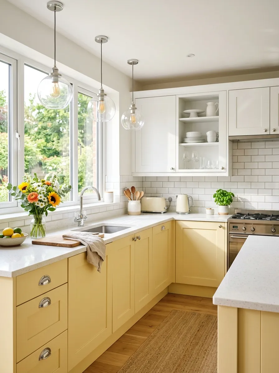
Pale yellow and bright white is the combination that instantly makes a kitchen feel like the happiest room in the house. The soft butter yellow lower cabinets introduce a gentle warmth and playful optimism that lifts the mood without demanding attention, while the bright white uppers keep the overall aesthetic light, airy, and fresh. From what I have seen, this two tone kitchen cabinet pairing resonates most with homeowners who want a cheerful kitchen that still feels clean and modern rather than overly country or retro.
The key to making yellow work in a kitchen is choosing the right shade. A soft butter yellow with cream undertones rather than green undertones will always read warmer and more sophisticated in daylight. Bright white quartz countertops keep the upper half of the kitchen clean and reflective, which is important because yellow absorbs less light than white and can darken a room if not balanced properly. Chrome hardware on the yellow lower cabinets adds a contemporary crispness that prevents the palette from sliding into a dated or overly sweet direction.
The Key: Avoid saturated or neon yellow, even if you want a bold look. Soft butter yellow ages well, photographs beautifully, and appeals to far more buyers if you ever sell the home.
10
Two Tone Kitchen Cabinet in Black and White
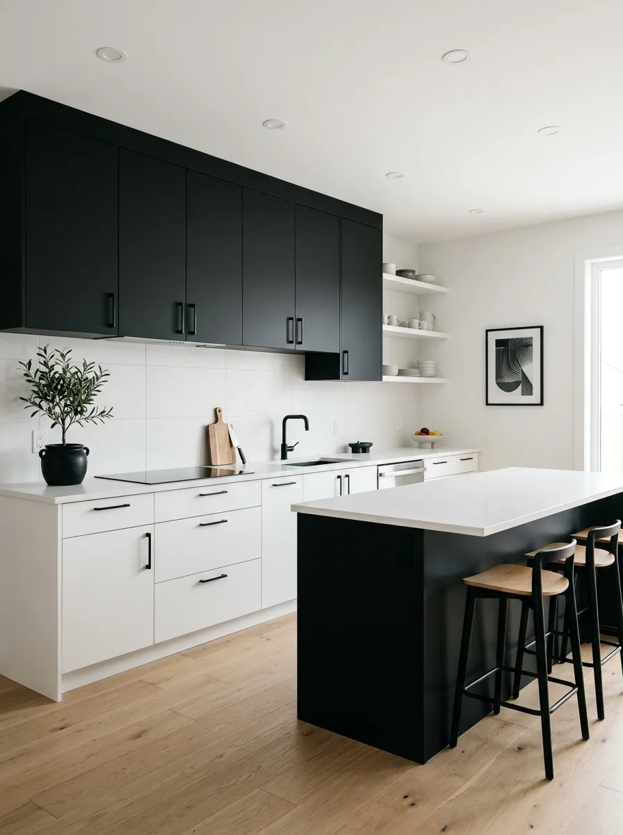
Black and white is the most graphic, high contrast two-tone kitchen cabinet combination you can create, and when executed with intention, it produces a kitchen that looks like a design editorial shoot in real life. What makes this version particularly interesting is the intentional reversal: matte black on the upper cabinets and white on the lowers. This unexpected choice separates a designer level kitchen from a predictable one. That same bold, high contrast approach to a kitchen palette is what makes a colorful kitchen design so powerful when one strong color is chosen and committed to fully.
Keeping the palette limited to true black and white demands that every other element in the kitchen carry its weight. White oak flooring brings in warmth without adding color, and the natural grain provides the texture that a purely monochrome palette needs to stay interesting. Matte black hardware throughout creates continuity and reinforces the graphic quality of the design. A large format white porcelain tile backsplash keeps the background clean and lets the dramatic two tone cabinet combination remain the clear focal point of the entire kitchen.
The Key: Matte finishes on both black and white are non negotiable in this palette. Any gloss surface will multiply reflections, soften edges, and undermine the graphic boldness that makes the design work.
11
Olive Green and Warm Cream
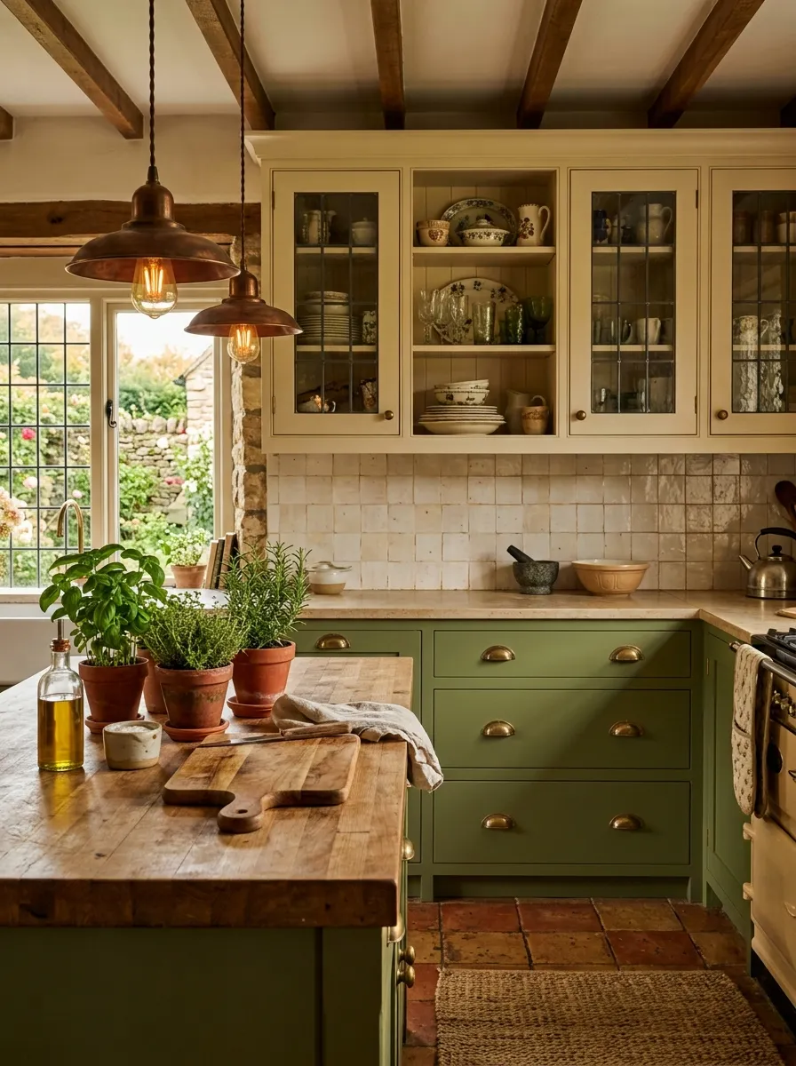
Olive green and warm cream is the combination that makes a kitchen feel like it has always been there, settled and comfortable in the best possible way. The olive lower cabinets carry an earthy depth that connects the kitchen to the natural world, while warm cream uppers hold the space in a soft, sun touched brightness that never feels sterile or modern cold. I always recommend this pairing to homeowners who want a kitchen with genuine character that will still feel relevant and beautiful ten years from now.
The warmth of aged brass hardware on the olive cabinets is essential to this kitchen cabinet color combinations palette. It ties the earthiness of the green to the warmth of the cream and prevents any visual separation between the two tones. Glass insert doors on the upper cream cabinets add lightness and depth while allowing a glimpse of the styled shelves inside, which reinforces the collected, lived in quality that makes this style so appealing. Cream zellige tile on the backsplash introduces handcrafted texture that elevates the whole pairing into something that feels genuinely irreplaceable.
The Key: Choose an olive with a gray green undertone rather than a yellow green. The gray pulls in the cream’s cooler edge and creates a more harmonious and sophisticated bridge between both tones.
12
Slate Blue and Warm Wood
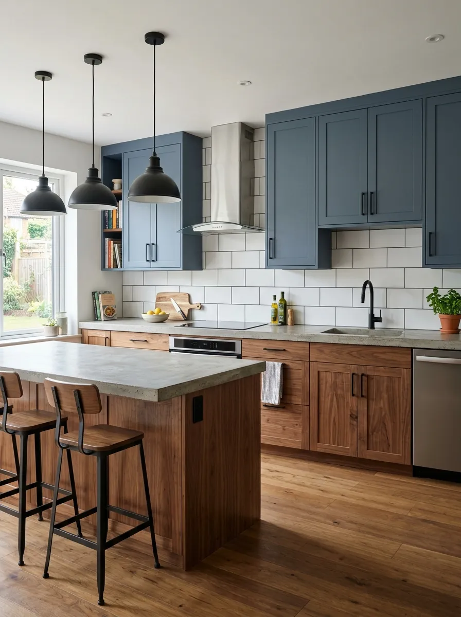
Slate blue upper cabinets paired with warm walnut wood lower cabinets is one of the most sophisticated and underused upper and lower cabinet colors combinations in modern kitchen design. The slate blue brings a quiet, considered depth to the upper half of the room, while the walnut lowers introduce a natural richness and warmth that prevents the cool blue from dominating. Together, they create a kitchen that feels contemporary without being cold, and warm without being rustic, landing in that desirable transitional zone where nearly every design style feels at home.
The cool warm contrast in this palette requires careful balancing at the hardware and countertop level. Matte black hardware works beautifully on both cabinet finishes because it reads as neutral rather than either warm or cool, making it the ideal bridge element. A light gray concrete countertop continues the cool tone from the uppers but at a lighter value, which prevents the upper half of the kitchen from reading as too heavy. Large format white tile with dark grout on the backsplash creates a graphic background that lets both cabinet tones speak clearly without any visual competition.
The Key: Walnut lower cabinets require a consistent wood grain direction. Horizontal grain reads more modern and calm, while vertical grain adds energy and visual height that changes the room’s character significantly.
13
Dusty Pink and Warm White
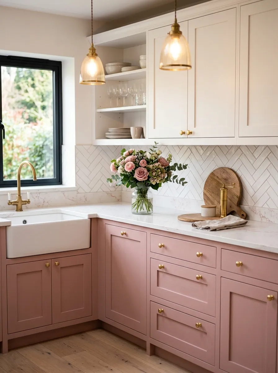
Dusty pink and warm white is not a trend, it is a mood. The soft rose tone on the lower cabinets introduces a romance and warmth that feels completely unique in a kitchen space, while warm white uppers keep the overall palette light, airy, and deeply livable. After trying this myself in a styled kitchen shoot, I can say with confidence that dusty pink cabinets photograph better than almost any other color in the morning light, which makes them an absolute dream for Pinterest content and real life enjoyment alike.
The version of pink that works in a kitchen is always the dusty, muted one rather than the bright, candy version. Dusty rose carries enough gray in it to feel intentional rather than playful, and it pairs effortlessly with warm white without creating a palette that reads as juvenile or overly sweet. Polished gold hardware reinforces the romantic quality and ties into the warm white uppers through their shared undertone. This same soft, sophisticated approach to cabinet color is beautifully expanded in colorful kitchen ideas that show just how elegant a muted, personality driven palette can truly become.
The Key: Dusty pink lowers require warm white uppers, not bright white. Bright white next to dusty pink creates a contrast that makes the pink look faded and tired rather than intentionally muted.
14
Deep Teal and Natural Linen
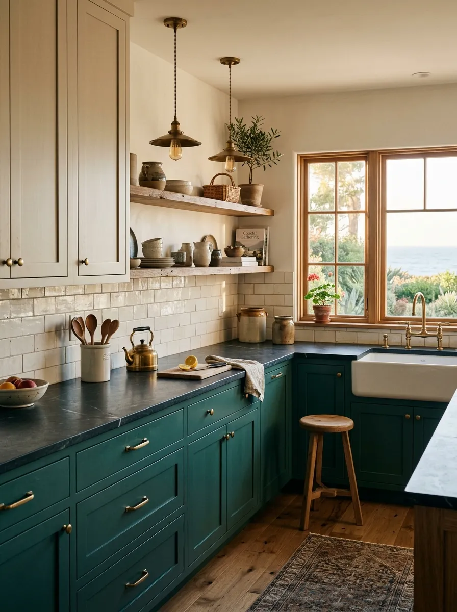
Deep teal and natural linen is the coastal meets organic palette that feels like the best version of a seaside kitchen without a single nautical cliche in sight. The teal lower cabinets carry the depth and complexity of deep ocean water, while the linen uppers introduce a sun bleached warmth that grounds the space in something natural and genuinely beautiful. What I have found is that this combination creates rooms that feel both collected over time and completely intentional, the combination every designer aims for but rarely achieves with only two cabinet colors.
The unlacquered brass hardware on the teal lower cabinets is where this design really reveals its depth. Unlacquered brass develops a living patina over time, growing warmer and more golden with age, which means the kitchen gets more beautiful the longer you live in it. Honed soapstone countertops in dark charcoal provide a rich, matte surface that connects to the depth of the teal without overpowering the lighter linen uppers. Handmade cream subway tile adds a tactile, artisan quality to the backsplash that keeps this two toned kitchen cabinets look from ever feeling mass produced or generic.
The Key: Linen tones come in dozens of variations. Hold physical paint chips against your specific teal choice in your kitchen light before committing, because the wrong undertone in the linen will flatten the entire palette.
15
Warm Greige and Chocolate Brown
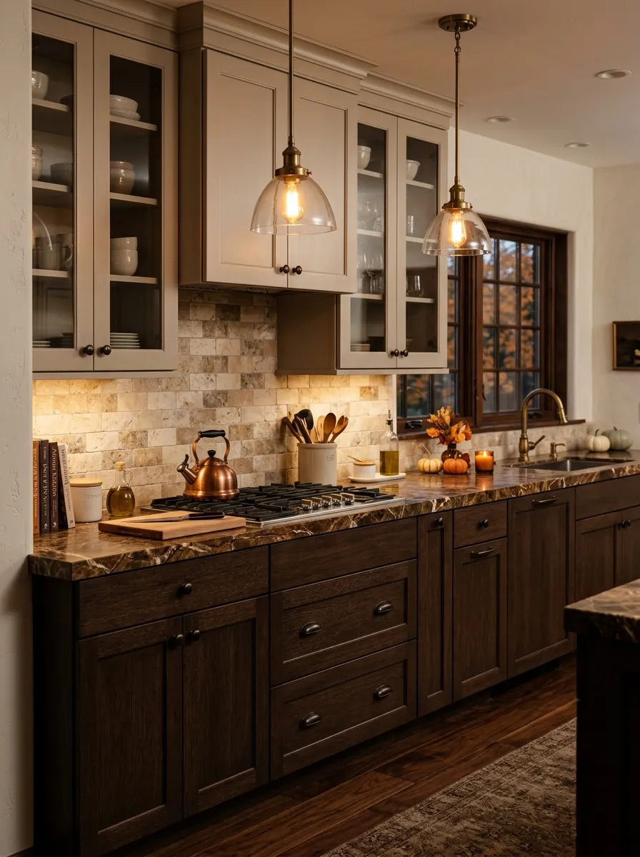
Warm greige and chocolate brown is the richest, most enveloping two tone kitchen cabinet combination on this list, and it is the one that makes a kitchen feel like the coziest room in the entire house. The deep chocolate lower cabinets bring a warmth and weight that feels both grounded and genuinely luxurious, while the greige uppers provide a lighter, sandy warmth that keeps the palette from reading as dark or heavy. I have seen this combination transform small kitchens into spaces that feel intimate and special rather than cramped and forgettable.
Oil rubbed bronze hardware on the chocolate lower cabinets is the detail that makes this entire look feel perfectly cohesive. It is warm, organic, and slightly antique in quality, which aligns exactly with the tone of both the brown and greige cabinet finishes. Brown veined marble or travertine countertops add a natural movement and depth that lifts the palette into something genuinely luxurious. Stacked travertine tile on the backsplash reinforces the warm, natural stone palette and creates a surface that looks more custom and collected than any standard tile choice ever could.
The Key: Greige only reads as warm when it carries a beige dominant undertone. A greige with too much gray cools the entire palette and disconnects it from the richness of the chocolate brown lower cabinets below.
16
Cobalt Blue and Crisp Linen
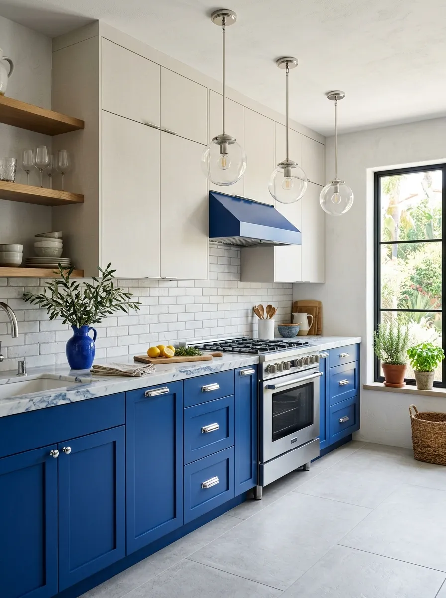
Cobalt blue is the boldest choice on this list, and it is the one that rewards confidence with the most visually striking result of any two color kitchen cabinet pairing. The deep, vivid blue lower cabinets command the room with a vibrancy that feels Mediterranean, artistic, and genuinely joyful, while crisp linen uppers provide a neutral softness that gives the eye a place to rest without ever competing with the boldness below. Trust me on this one: cobalt blue in a kitchen that gets good natural light is one of the most beautiful things you will ever see.
The linen upper cabinets in this combination must lean toward cool rather than warm to maintain harmony with cobalt blue, which is a cool, high saturation tone. A slightly gray linen prevents any yellow warmth from clashing with the purity of the cobalt, while still offering enough visual warmth to prevent the upper portion of the kitchen from reading as stark. White marble with blue gray veining is the ideal countertop choice because it pulls the cobalt blue directly into the surface and makes every element in the kitchen feel like part of one cohesive, considered design.
The Key: Do not add any warm metallics to a cobalt and linen kitchen. Polished chrome and brushed nickel maintain the cool visual language that keeps cobalt looking refined rather than loud.
17
Mushroom Taupe and Matte White
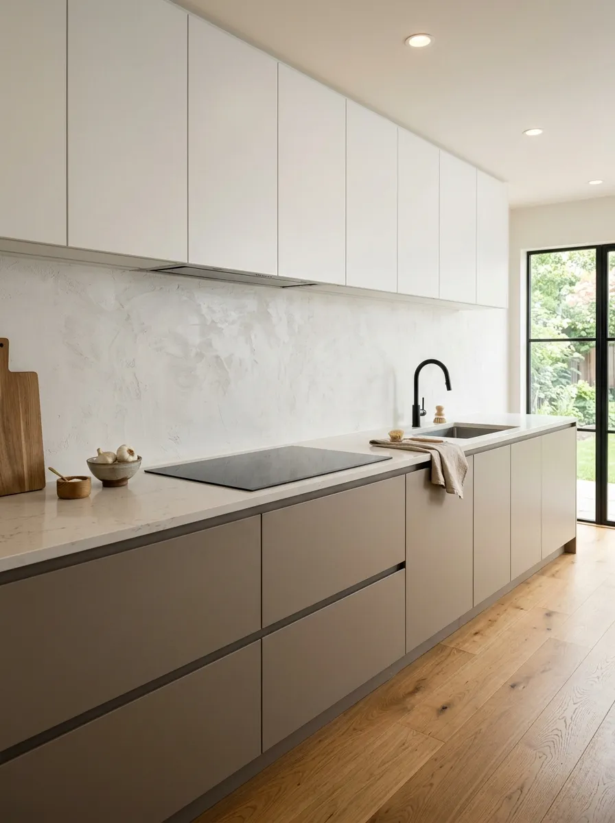
Mushroom taupe and matte white is the most restrained and quietly refined combination on this entire list, and it belongs in any kitchen where the design goal is calm, clarity, and a sense of intention over decoration. The mushroom taupe lower cabinets carry a complexity that neutral hating designers underestimate. It is not beige, not gray, not brown, but a sophisticated blend of all three that makes the lower half of the kitchen feel settled and warm without using any obvious color. Matte white uppers keep the overall space luminous and open.
What makes this upper and lower cabinet colors pairing so successful for Japandi and minimalist inspired interiors is the way both tones prioritize texture over visual noise. Integrated push to open hardware eliminates any metal element from the cabinet surface, keeping the design completely uninterrupted and deeply calm. A warm white engineered stone countertop continues the matte quality of the uppers into the horizontal surface, and a large format textured plaster backsplash adds tactile depth that makes the space feel considered and crafted without adding any pattern or color to compete with.
The Key: In a palette this minimal, surface quality is everything. Any fingerprint prone gloss finish or poorly fitted cabinet door will immediately undermine the refined, deliberate quality this combination requires.
18
Burnt Orange and Cream
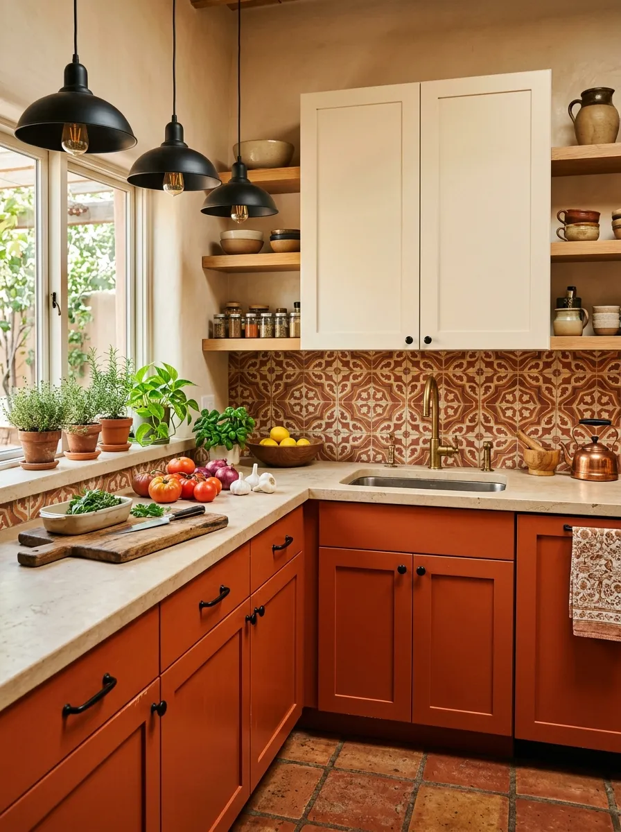
Burnt orange and cream is a combination that belongs on every mood board for a kitchen that wants to feel alive, warm, and full of soul. The burnt orange lower cabinets introduce the rich, spiced warmth of a Mediterranean kitchen, radiating energy and appetite in the best possible way. Cream uppers diffuse that energy upward and keep the room from feeling surrounded by heat, offering a soft landing for the eye above the countertop line. Personally, I think burnt orange is one of the most underused cabinet colors in the home decor world, and seeing it done well is genuinely exciting.
The success of this kitchen cabinet color combinations pairing depends on anchoring the warmth throughout every layer of the kitchen. Honed limestone countertops in pale warm beige sit naturally between the orange and cream without introducing any competing tone. An encaustic patterned tile backsplash in terracotta and cream adds artisanal texture and brings the two cabinet tones into the vertical surface in a way that makes the transition between the floors, walls, and cabinets feel fluid and organic. Matte black hardware on the orange lower cabinets sharpens the design and prevents it from becoming overly sweet or heavy.
The Key: Burnt orange needs strong natural light to read at its best. In north facing or low light kitchens, choose a slightly lighter rust tone to prevent the lower cabinets from absorbing too much of the available light.
19
Mint Green and Warm White
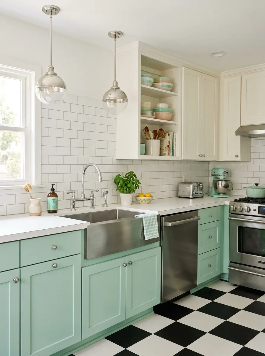
Mint green and warm white is the combination that takes a kitchen straight back to the cheerful optimism of a 1950s diner, but in the best, most considered modern version of that idea. The mint lower cabinets carry a cool, refreshing brightness that feels lively and playful without ever tipping into the garish territory that brighter greens risk. Warm white uppers hold the palette in a comfortable brightness that makes the mint feel fresh rather than cold. That same vintage mint and chrome energy is the foundation of the most beloved retro kitchen designs that feel nostalgic and genuinely joyful at the same time.
The retro quality of this two toned kitchen cabinets look calls for hardware that reinforces the vintage aesthetic intentionally. Polished chrome small round knobs are the detail that signals the design is referencing an era rather than accidentally landing there. A checkered black and white tile floor is the full commitment version of this idea, and it pays off completely when paired with mint lower cabinets. White subway tile with light gray grout keeps the backsplash clean and era appropriate without competing with the cabinet color, and a stainless steel apron sink rounds out the retro kitchen narrative in a detail that feels both practical and genuinely beautiful.
The Key: Warm white on the uppers is critical here. Cool white clashes with the warmth in chrome hardware and shifts the mint toward a clinical, institutional green that undermines the retro charm entirely.
20
Soft Gray and Bold Black Island
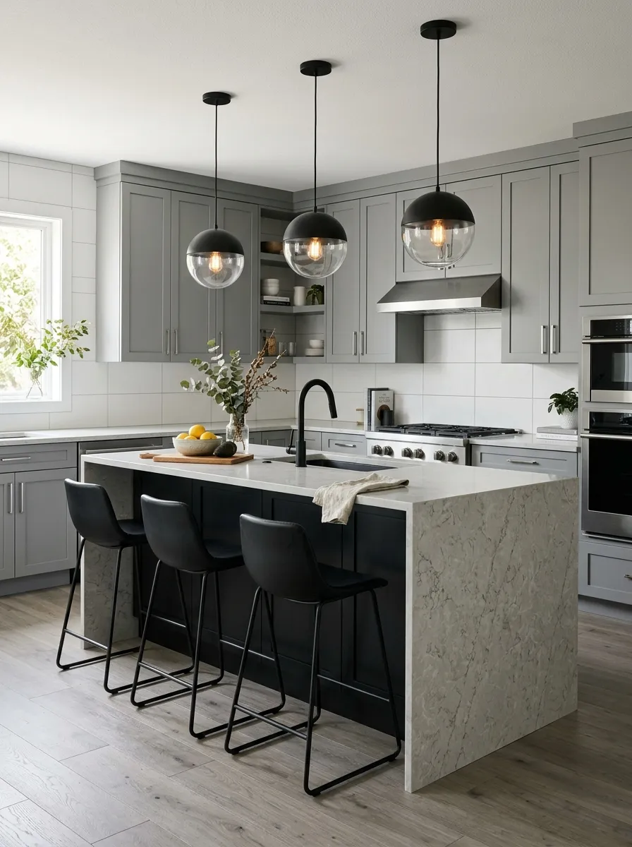
Soft gray perimeter cabinets paired with a bold matte black island is the version of two tone kitchen cabinet design that uses one dramatic focal point to elevate an otherwise understated palette. The soft gray throughout the perimeter creates a calm, unified backdrop that makes the kitchen feel spacious and settled, while the matte black island interrupts that calm in exactly the right way, drawing the eye directly to the center of the room and making it the undeniable star of the space. What I have noticed is that this approach gives homeowners the drama they want without requiring bold color throughout the entire kitchen.
The success of this design depends entirely on the quality and proportion of the island. It needs to be large enough to read as a significant architectural element rather than just a small interruption of the gray perimeter. A waterfall edge countertop in pale gray quartz connects the island to the perimeter palette while maintaining a high end material quality. Matte black pendant lights hung directly above the island create a visual column from ceiling to floor that grounds the whole design. This same bold island concept is also one of the most powerful moves in a confident colorful kitchen setup, where a single statement surface carries the entire personality of the room.
The Key: Match the countertop tone on the island to the countertop on the perimeter cabinets. Using two different countertop finishes breaks the visual coherence that makes this design feel unified and deliberate.
Choosing the right two tone kitchen cabinet combination is one of the most rewarding design decisions you will ever make in your home. Each idea in this article proves that two colors, chosen with care and balanced with intention, can transform an ordinary kitchen into a space that reflects your personality, suits your lifestyle, and makes every single person who walks in want to sit down and stay a while. Whether you gravitate toward the bold graphic contrast of black and white, the romantic softness of dusty pink and warm white, or the natural richness of forest green and oak, there is a pairing here that was designed with your kitchen in mind.
I hope these 20 ideas have given you the clarity, confidence, and inspiration to move forward with a kitchen update that feels genuinely exciting rather than overwhelming. Save this post on Pinterest so you can come back to your favorites whenever you are ready to start planning, and share it with a friend who has been dreaming about refreshing their kitchen space. The right color combination is out there waiting for you, and sometimes the only thing standing between you and your dream kitchen is the courage to choose a second color.