Living Room Color Palette
🏠 19 Real Ideas
⏱ Quick Read
🔥 Always Trending
19 Luxury Living Room Color Palette Ideas Using Designer-Approved Tricks for a Sophisticated Home
Walk into a truly refined living room and you feel it before you can explain it. That invisible pull of warmth, depth, and elegance isn’t a coincidence, it’s color strategy. A well-chosen luxury living room color palette can completely transform how a room feels, whether you’re starting from scratch or refreshing what you already have. Designers don’t guess; they follow a set of proven principles that make spaces feel curated and intentional. The good news? Those exact principles are laid out right here.
This guide covers 19 breathtaking luxury living room color palette ideas, each inspired by designer-approved tricks you can apply without a hefty renovation budget. Whether you gravitate toward moody jewel tones, soft neutrals, or bold contrasts, you’ll find a palette that speaks to your personal style. These combinations are chosen to elevate not just the look of your space, but the way it makes you feel every single day.
01
Cream, Taupe, Warm Gold
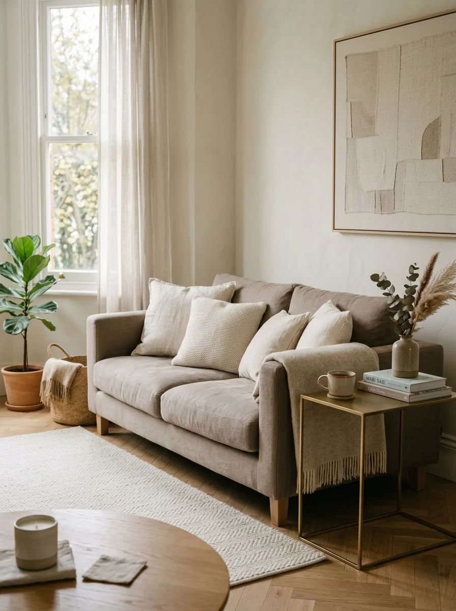
Cream, taupe, and gold is one of the most enduring combinations in high-end interior design. Cream walls open a room up visually, giving the eye room to breathe, while taupe introduces a grounded warmth that keeps the space from feeling sterile. Gold, used through brass fixtures or gilded frames, adds a touch of quiet opulence without overwhelming the senses.
The secret to making this trio shine is proportionality. Keep about 70% cream across your largest surfaces, 20% taupe in upholstery and rugs, and a restrained 10% gold as accent pieces. In my experience, even a single brass lamp or a pair of gold-framed art prints can shift an ordinary room into something that feels genuinely expensive and considered.
The Key: Lean on cream as your dominant backdrop, taupe as your grounding layer, and gold as the refined accent that pulls everything together effortlessly.
02
Navy, Slate Gray, Brushed Brass
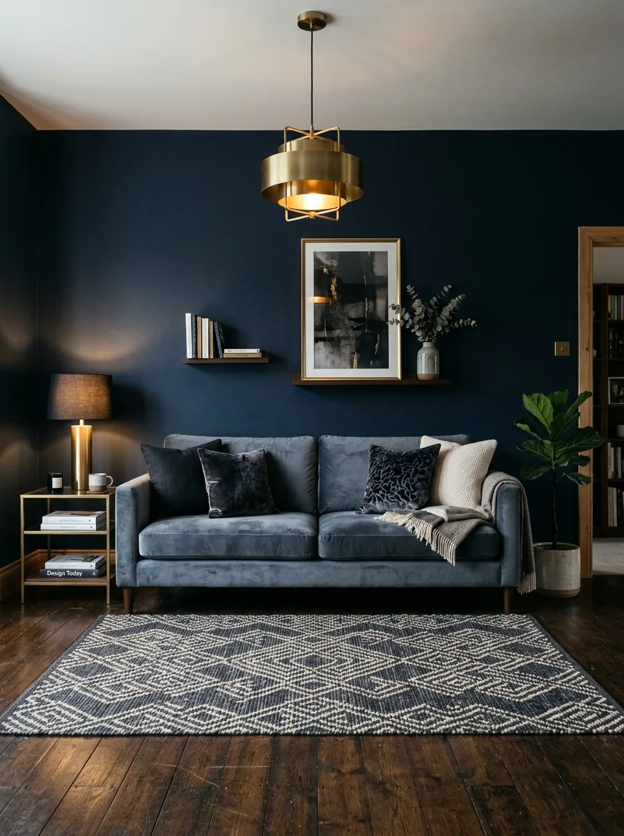
Few combinations command a room with as much authority as navy, slate gray, and brushed brass. Navy brings stability and depth, a color that interior designers associate with confidence and timeless sophistication. Slate gray acts as the perfect mediator, softening the boldness of navy while keeping the mood refined and controlled. Brass bridges the two with its warm metallic glow.
This palette works beautifully in both larger and more compact rooms. A single navy accent wall paired with a gray sofa and a few deliberate brass touches creates an atmosphere that feels intentional and polished. I have seen this combination work wonders in city apartments where creating a sense of drama without losing livability is the primary goal.
The Key: Navy carries the drama, slate gray adds calm, and brushed brass provides warmth. Together they form a living room color palette that’s bold yet balanced.
03
Soft White, Warm Beige, Emerald
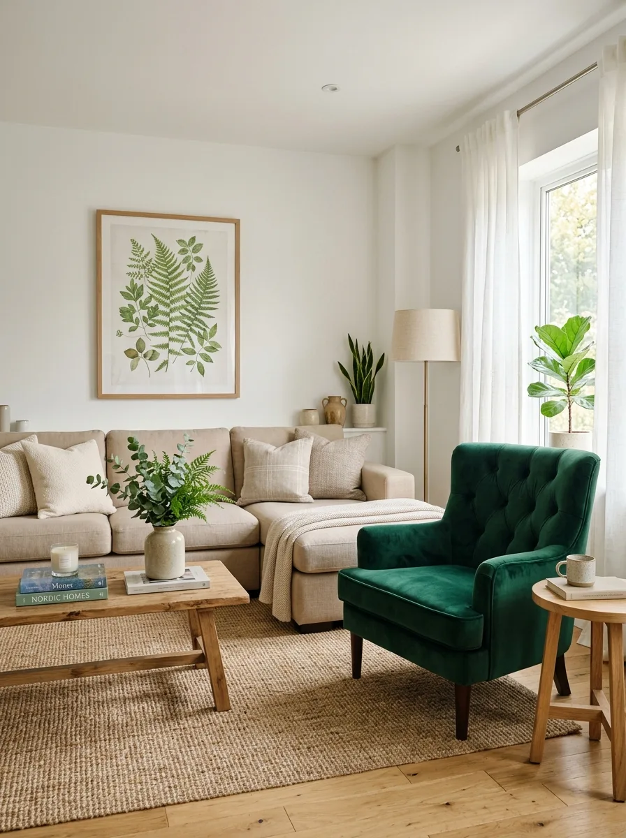
White, warm beige, and emerald is the palette that bridges organic calm with bold personality. White walls make a space feel larger and more open, while warm beige in upholstery grounds the room with a cozy, inviting quality. Then emerald walks in and changes everything. Rich, jewel-toned, and deeply saturated, it commands attention and adds an energy that neutral-only rooms often lack.
The key to this trio is treating emerald as your statement, not your background. One emerald velvet armchair, a set of throw pillows, or even a large piece of botanical art can anchor the entire composition. I have noticed that even renters who can’t paint walls can achieve this effect beautifully through furniture and accessories alone.
The Key: Let white and beige do the quiet work while emerald becomes the room’s personality, turning a simple elegant living room palette into something truly memorable.
04
Charcoal, Ivory, Antique Bronze
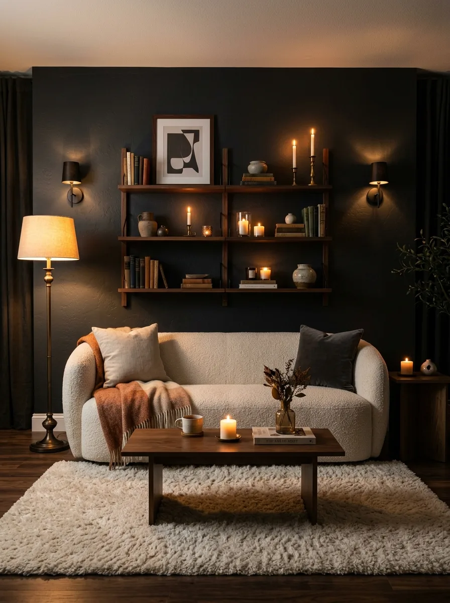
Charcoal, ivory, and antique bronze is for rooms that want to whisper sophistication rather than announce it. Charcoal creates intimacy and depth, making a room feel like a sanctuary rather than a showroom. Ivory softens the drama with its gentle luminosity, giving the eye somewhere calm to rest. Antique bronze adds a warmth that polished metals can’t quite replicate, a tone that feels genuinely aged and layered.
This is a palette that improves with texture. Pair a matte charcoal wall with a boucle ivory sofa and add bronze accents through lamps, vases, or curtain hardware. The contrast between rough and soft, dark and light, matte and metallic is what gives the room its magnetic pull and unmistakable sense of refinement.
The Key: Contrast is the backbone of this palette. Charcoal and ivory need each other; bronze is the finishing touch that makes the whole composition glow.
05
Blush, Stone, Champagne
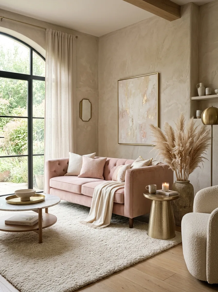
Blush, stone, and champagne is a palette that feels simultaneously calm and celebratory. Stone provides the solid, dependable neutral backbone, a tone that reads as both modern and timeless. Blush adds softness and warmth without the sweetness of traditional pink, keeping things refined. Champagne, with its subtle metallic shimmer, elevates the entire composition into something that genuinely feels like a luxury living room color palette.
This trio works particularly well in rooms that receive a lot of natural light, where the champagne tones pick up the sun and scatter warmth throughout the space. Use stone as your wall and large upholstery color, blush as accent cushions or a statement chair, and champagne in your lighting and table accessories for a result that feels effortlessly put together.
The Key: Balance is everything here. Stone grounds, blush softens, and champagne sparkles. Together they create a living room color palette that’s warm, refined, and beautifully cohesive.
06
Deep Teal, Cream, Aged Gold
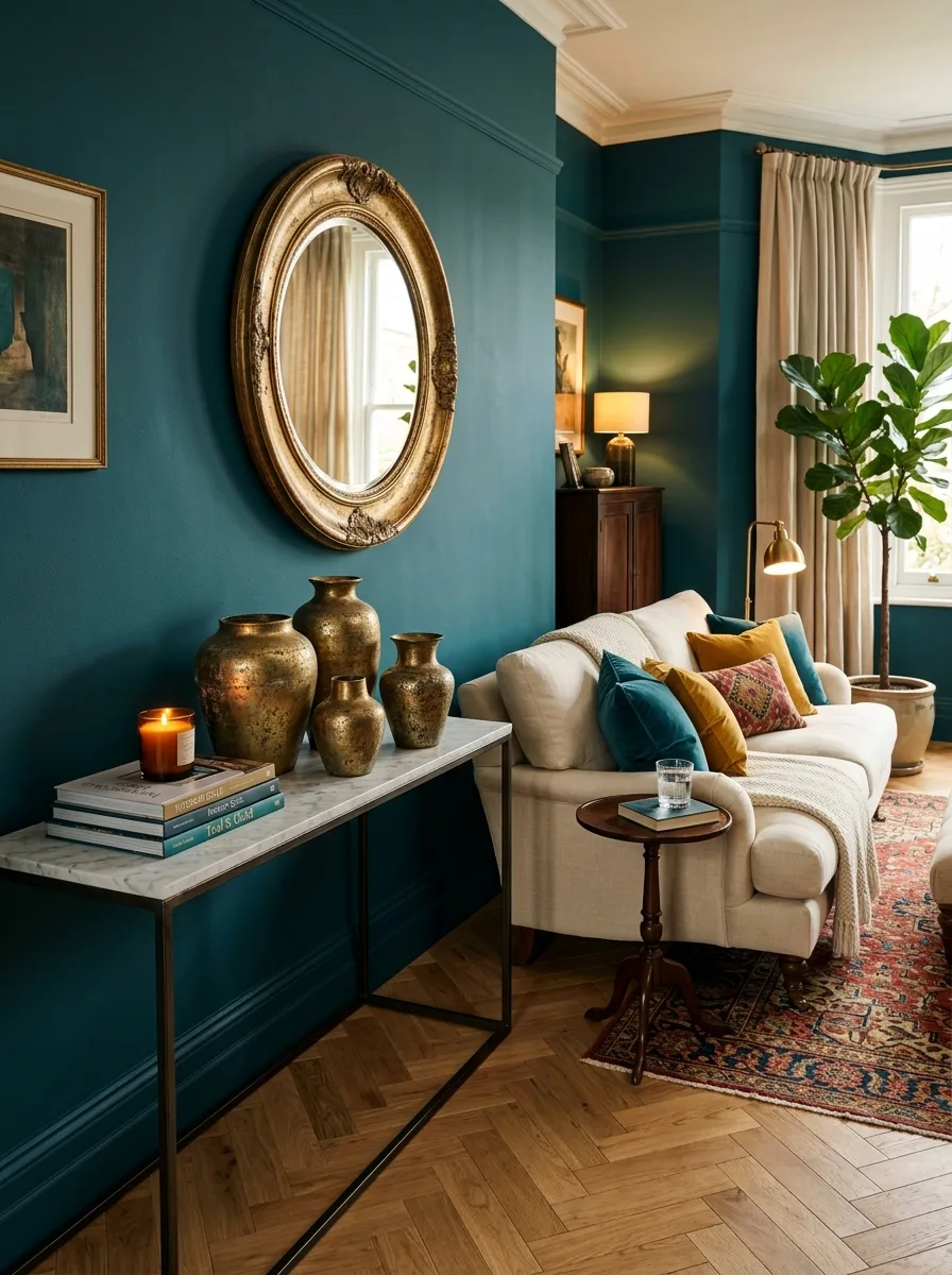
Deep teal paired with cream and aged gold is one of those combinations that stops people in the doorway. Teal carries a depth and richness that few colors can match, sitting somewhere between calming blue and energizing green in a way that feels inherently luxurious. Cream keeps the palette breathable and stops the jewel tone from overwhelming the senses. Aged gold introduces warmth and a sense of history that polished metals simply cannot replicate.
This palette rewards thoughtful accessorizing. A large aged gold mirror above a console creates a focal point that feels both grand and inviting. Cream upholstery in a natural linen or cotton weave adds tactile softness against the visual weight of teal walls. It’s a combination that genuinely rewards boldness and looks stunning in evening lighting.
The Key: Teal is the star here; cream and gold are its perfect supporting cast. Commit to the jewel tone fully and you’ll have a sophisticated color palette that commands admiration.
07
Warm Terracotta, Sand, Burnished Copper
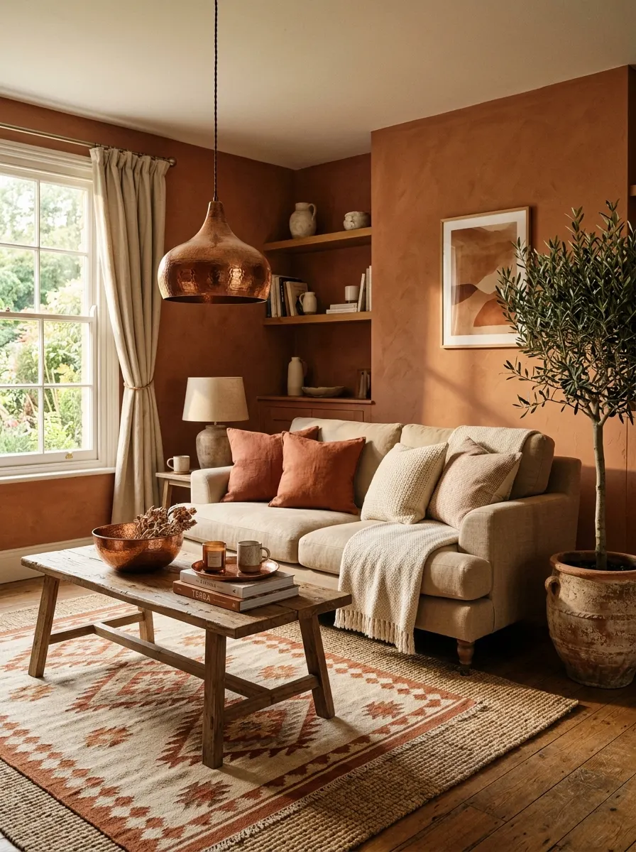
Terracotta, sand, and burnished copper is a luxury living room color palette that draws directly from the earth, and it shows. Terracotta has made a strong return to high-end interior design because it carries warmth, personality, and a sense of global sophistication that few other colors offer. Sand keeps the palette grounded and airy, while burnished copper introduces richness and a handcrafted quality that elevates the whole room.
This combination works beautifully in homes with natural materials like rattan, linen, or reclaimed wood. The colors layer together the way a well-told story does, each building on the last without competing. A terracotta wall, a sand linen sofa, a few copper pendant lights, and some potted greenery is genuinely all you need to create a living room that feels warm, grounded, and unmistakably stylish.
The Key: Embrace the earthiness of this palette fully. The richer and more layered the natural textures, the more elevated the whole scheme will look.
08
Midnight Blue, Blush Pink, Silver
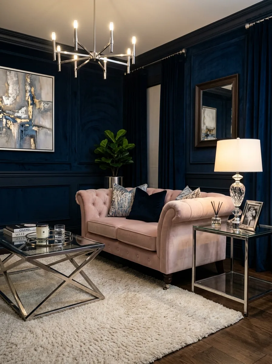
Midnight blue, blush pink, and silver is a palette that leans unashamedly into drama and femininity. Midnight blue provides an almost theatrical depth, making walls recede and furniture pop. Blush introduces warmth and softness, a counterbalance that keeps the moodiness from feeling cold. Silver ties it all together with its cool, reflective sheen that catches light and adds movement to the room.
This trio thrives in rooms where evening ambiance matters. The interplay of midnight blue and silver under warm artificial light creates a depth and richness that is genuinely show-stopping. Use blush in upholstery and cushions, silver in metallic accessories and lighting, and let midnight blue set the emotional temperature of the entire space through an accent wall or statement sofa.
The Key: Midnight blue sets the stage, blush brings the warmth, and silver amplifies the light. This is a luxury living room colors formula that feels genuinely glamorous.
09
Sage Green, Linen White, Walnut Brown
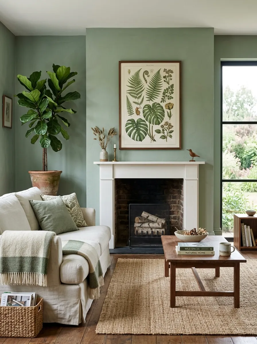
Sage green, linen white, and walnut brown is a palette that feels like a deep breath of fresh air. Sage carries a quiet sophistication that is uniquely contemporary, bridging the gap between earthy and refined in a way that trends have been chasing for years. Linen white keeps the room fresh and light-filled without the harshness of pure white. Walnut brown introduces the tactile warmth that makes a room feel genuinely lived-in and intentional.
This palette rewards natural materials above all else. Walnut wood furniture with visible grain, linen fabric with a slightly textured weave, and sage walls with a slight chalky finish all work together to create layers of visual interest. It’s understated in the best possible way, the kind of room that feels more elegant the longer you spend in it.
The Key: The power of this palette is in its restraint. Every element belongs, nothing is forced, and the result is a sophisticated color palette that never goes out of style.
10
Dusty Mauve, Greige, Rose Gold
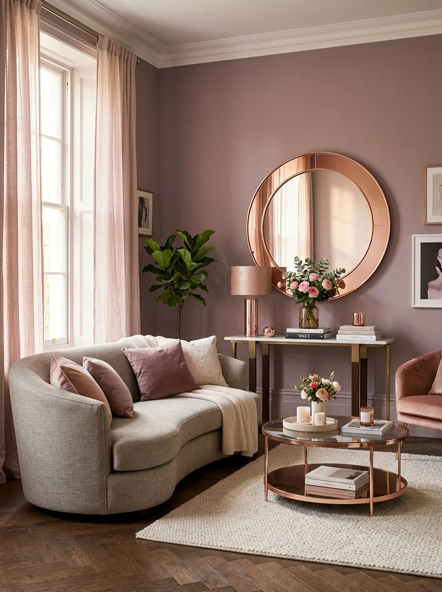
Dusty mauve, greige, and rose gold is a palette that gets the balance between warmth and sophistication exactly right. Dusty mauve is nuanced in a way that ordinary pink simply isn’t; it carries a maturity and softness that translates beautifully into living room walls or large upholstered pieces. Greige, that perfect blend of gray and beige, acts as the ideal neutral backbone. Rose gold adds the delicate metallic sparkle that ties the whole palette together.
Together these tones create a room that feels romantic without being saccharine, polished without being cold. I have noticed that this palette tends to perform particularly well in rooms that rely on layered textiles. A greige curved sofa, dusty mauve velvet cushions, and a rose gold lamp create exactly the kind of layered warmth that premium interior designers spend entire consultations trying to achieve.
The Key: Dusty mauve needs the neutrality of greige to shine. Rose gold is the final layer that signals this is a truly considered elegant living room palette.
11
Black, Ivory, Warm Walnut
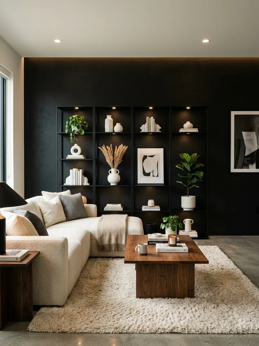
Black, ivory, and warm walnut is a palette that demands confidence and rewards it fully. Matte black creates a backdrop of extraordinary depth, making everything placed against it look intentional and elevated. Ivory provides the luminous counterpoint, a soft brightness that prevents the black from closing the room in. Warm walnut wood adds the organic, grounded element that stops the palette from feeling too stark or editorial.
This combination works best when textures are thoughtfully varied. A matte black wall against a boucle ivory sofa and a handsome walnut coffee table creates a tactile richness that is deeply satisfying to spend time in. As part of a luxury living room color palette, black should never be feared; when balanced well, it is one of the most sophisticated choices you can make for a living room.
The Key: Black makes everything around it look more intentional. Pair it with ivory and walnut and you have a luxury living room colors formula that is timeless and genuinely striking.
12
Caramel, Cream, Brushed Nickel
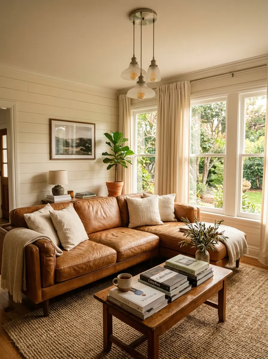
Caramel, cream, and brushed nickel is one of those quietly refined combinations that doesn’t need to shout to be heard. Caramel brings an immediate warmth and richness through leather, wood, or fabric, a tone that reads as both indulgent and approachable. Cream layers on top with its soft brightness, keeping the palette light and airy. Brushed nickel introduces a modern metallic note that reads as sophisticated without the flamboyance of gold or brass.
This palette suits living rooms that want to feel relaxed and luxurious simultaneously. It works beautifully with natural wood furniture, linen fabrics, and layered rugs. The nickel tones in lighting, cabinet pulls, or picture frames create a subtle thread of cool refinement that keeps the warm caramel tones feeling current rather than dated.
The Key: Caramel is the soul of this palette; cream is its lightness; brushed nickel is the modern edge that keeps a warm living room color palette feeling fresh and refined.
13
Forest Green, Cognac, Natural Brass
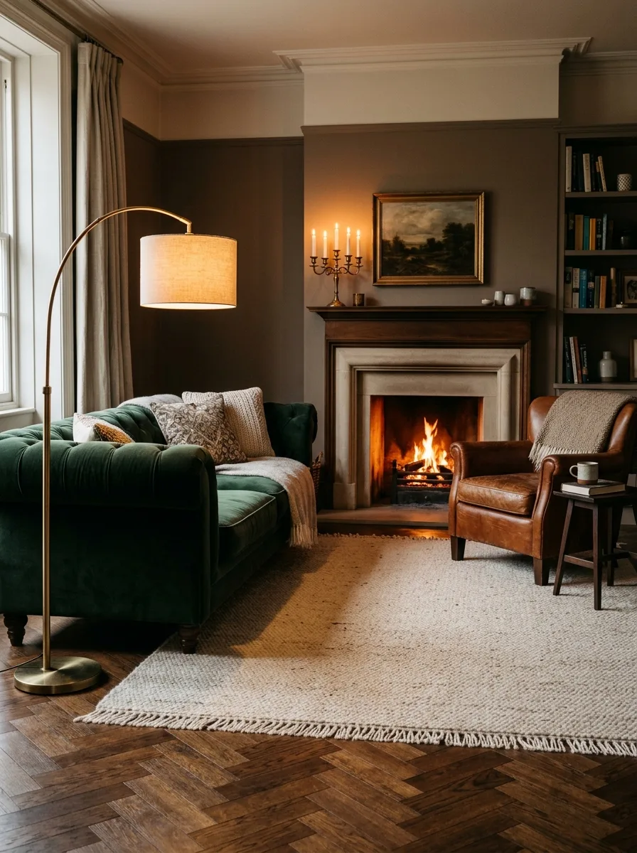
Forest green, cognac, and natural brass is a combination that feels like the inside of a private gentlemen’s library translated into a modern, livable living room. Forest green carries an undeniable sense of opulence and depth that jewel tones are celebrated for, while cognac leather introduces warmth, texture, and a slightly lived-in quality that makes a space feel genuinely inviting. Natural brass ties the two together with its warm, honey-toned glow.
This is a palette for rooms where richness is the goal. Layer velvet, leather, and wood to build a tactile experience that matches the visual depth of the color combination. Brass accents through floor lamps, side tables, and hardware add sparkle without softening the masculine confidence of the forest green and cognac base. It is a luxury living room color palette that rewards going all in.
The Key: Richness builds through layering here. Each material and color adds a new dimension, creating a luxury living room colors scheme that is deeply immersive.
14
Pale Blue, White, Chrome
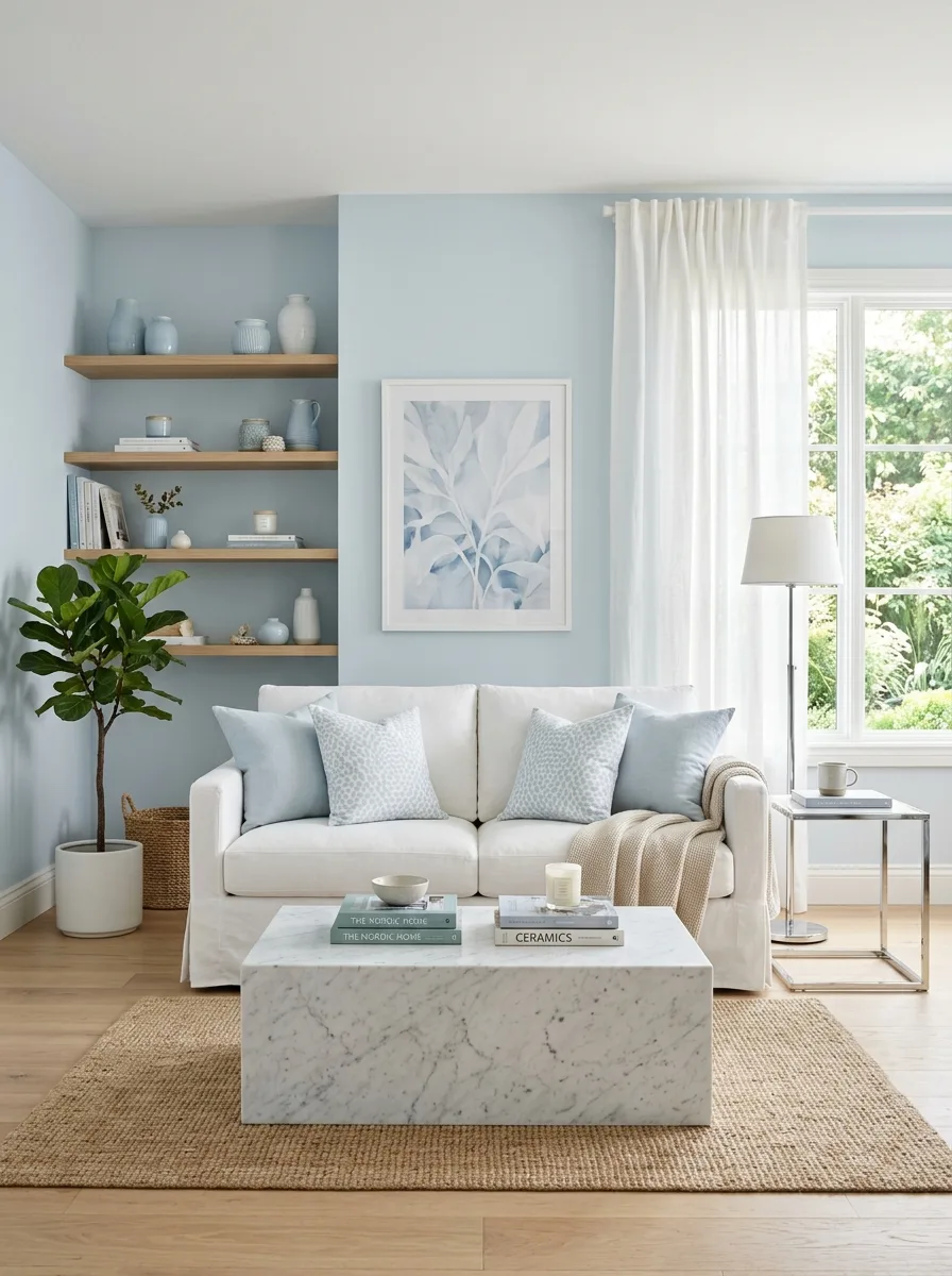
Pale blue, white, and chrome is the ultimate palette for achieving a sense of calm, openness, and clean luxury. Pale blue carries a soothing psychological effect, genuinely reducing stress in a way that warmer tones don’t quite replicate. White amplifies this by maximizing light reflectivity, making even smaller rooms feel expansive. Chrome adds a cool, sleek metallic note that keeps the palette feeling contemporary rather than simply pastel.
This combination works beautifully in coastal or modern Scandinavian-influenced spaces, where clean lines and a sense of calm are the primary goals. Chrome in furniture legs, lamp bases, and mirror frames creates a thread of reflectivity that keeps the light moving through the room. Against pale blue and white, it reads as sophisticated and intentional rather than cold or industrial.
The Key: Pale blue and white create the serenity; chrome sharpens it into something polished and modern. Together they form an elegant living room palette that is endlessly fresh.
15
Burgundy, Taupe, Antique Gold
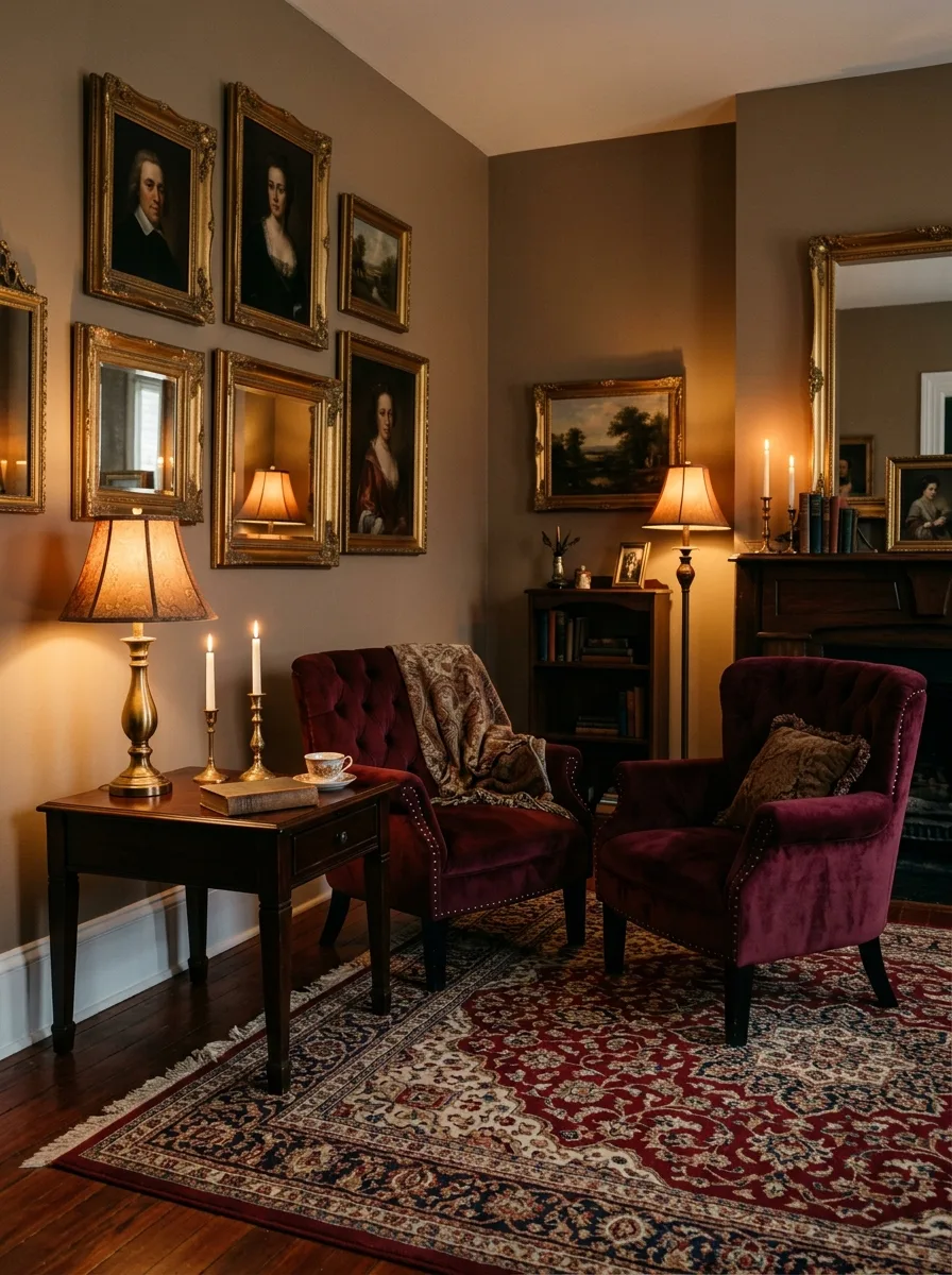
Burgundy, taupe, and antique gold is a palette that fully embraces the art of old-world luxury. Burgundy is a deeply sophisticated color, carrying associations with refinement, richness, and a quiet kind of boldness that commands respect in any room. Taupe provides the necessary calm, neutralizing the intensity of burgundy without dulling it. Antique gold adds a warmth and heritage quality that turns the entire combination into something that feels genuinely curated.
This palette works especially well in larger living rooms where there is enough surface area to let the burgundy breathe. Layer a Persian-style rug with deep red and cream tones underfoot, taupe walls overhead, and burgundy in upholstery, then scatter antique gold through picture frames, lamp bases, and decorative objects. The result is a room that feels like it has a genuine story to tell.
The Key: Burgundy is a confident choice that pays off richly. Balanced with taupe and antique gold, it creates a sophisticated color palette with real depth and personality.
16
Warm Gray, Off-White, Matte Black
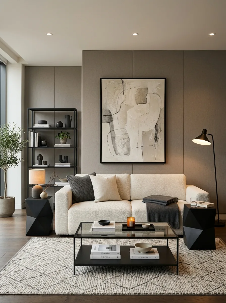
Warm gray, off-white, and matte black is a palette for those who believe sophistication lives in restraint. Warm gray is the perfect backdrop, neutral enough to let furniture shine but rich enough to give a room genuine depth. Off-white in upholstery adds a softness that pure white cannot, carrying subtle warmth that makes the space feel genuinely inviting. Matte black provides the structural contrast that anchors the composition and prevents the palette from feeling undefined.
This is a palette where the editing is everything. Every piece should feel deliberate. A clean-lined off-white sofa, a matte black coffee table, warm gray walls, and a few carefully chosen art pieces in black or charcoal frames will create a room that feels like a luxury hotel suite in the very best sense. As a living room color palette, this combination is endlessly versatile and works across nearly every architectural style.
The Key: This palette’s power is in its precision. Every element earns its place. The result is a luxury living room color palette that is quietly stunning.
17
Ochre Yellow, Ivory, Aged Brass
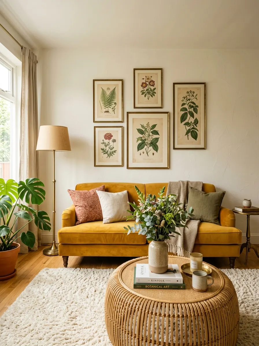
Ochre yellow, ivory, and aged brass is the palette for anyone who wants their living room to feel joyful without sacrificing sophistication. Ochre is not the sugary yellow of a child’s bedroom; it is a deep, golden, saturated tone that has been used in art and architecture for centuries. Ivory provides the calm, luminous backdrop that allows ochre to glow rather than overwhelm. Aged brass introduces texture and warmth, grounding the palette with its imperfect, hand-crafted appeal.
This trio performs beautifully in rooms with good natural light, where ochre deepens and warms with the changing sun throughout the day. Use ochre as a statement sofa or accent chair rather than as a wall color for maximum impact with minimum risk. Pair it with ivory linen and aged brass accessories and you have a living room color palette that feels deliberately joyful, effortlessly stylish, and genuinely distinctive. For more warm, golden palette inspiration across the fall season, our fall living room décor ideas feature several ochre-based arrangements that translate directly from this palette.
The Key: Ochre is the surprise element here; it adds personality that neutral palettes often lack while staying within the refined vocabulary of a sophisticated color palette.
18
Slate Blue, Warm White, Driftwood
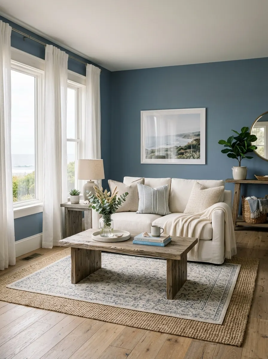
Slate blue, warm white, and driftwood is the elegant living room palette for anyone who wants to feel like they live somewhere beautiful every single day. Slate blue is sophisticated without the weight of navy, carrying a gentleness that feels both calming and refined. Warm white keeps the room luminous and airy, while driftwood-toned wood introduces the natural, organic element that makes the whole combination feel grounded and genuine.
This palette works across a wide range of home styles, from coastal to contemporary Scandinavian to relaxed European farmhouse. The natural wood grain in driftwood tones adds visual texture that neither slate blue nor warm white can provide on their own. Together, these three tones create a living room that feels like a sanctuary.
The Key: Slate blue and warm white create the serenity; driftwood grounds it in nature. The result is a luxury living room color palette that feels effortlessly peaceful.
19
Chocolate Brown, Ivory, Copper
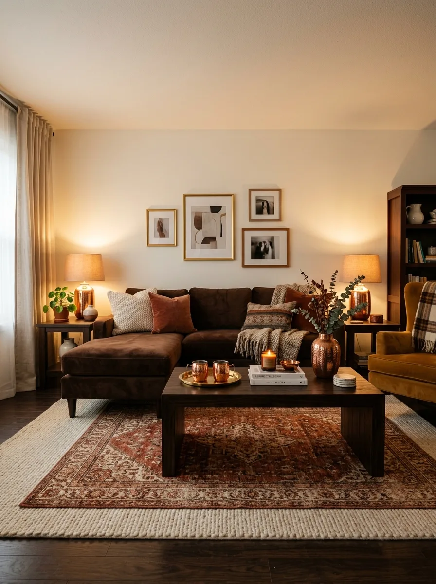
Chocolate brown, ivory, and copper is a luxury living room color palette that wraps you in warmth the moment you walk through the door. Chocolate brown is one of the most underrated luxury tones in interior design, carrying a richness and depth that makes upholstered furniture look genuinely expensive and inviting. Ivory walls keep the room bright and prevent the deep brown from making the space feel enclosed. Copper introduces a glowing warmth that gold sometimes misses, catching light in a way that makes a room feel alive.
Layer textures generously with this palette. A chocolate velvet sofa, ivory cotton cushions, a warm terracotta and cream rug underfoot, and copper table lamps create a room that feels deeply comforting. It is the kind of living room you never want to leave, which, when you think about it, is the true measure of a great color palette.
The Key: Chocolate brown is warm luxury at its most elemental. Paired with ivory and copper, it creates a living room color palette that is rich, inviting, and deeply refined.
Choosing the right luxury living room color palette is one of the most powerful design decisions you can make, and as these 19 ideas show, there is a combination for every style, every room size, and every personality. From the quiet elegance of sage green and walnut to the dramatic depth of midnight blue and silver, every palette here is built on the same designer principles: balance, proportion, and intentional contrast. The colors you choose don’t just decorate your walls; they shape how you feel in your home every single day.
If you found an idea that sparked something, save this post to your Pinterest boards so you can come back to it whenever you’re ready to make your move. Better yet, share it with a friend who’s been talking about redecorating, because the right luxury living room color palette deserves to be discovered by as many people as possible. From my own experience working through these combinations, the best palette is always the one that makes you smile every time you walk through the door.